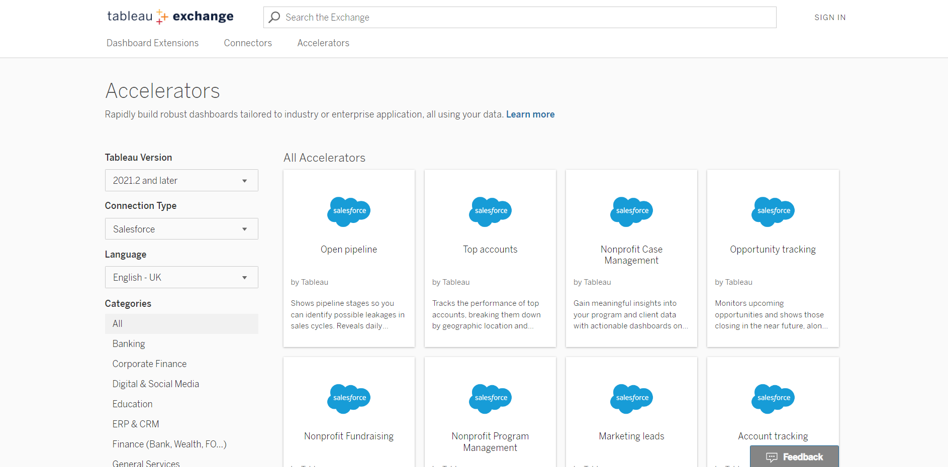
When starting off using Salesforce, the amount of raw data provided can be quite daunting as there are often multiple tables with many fields within them. Fortunately, Accelerators are available online as templates to help provide some examples of typical visualisations that can be made from this data. The page of different accelerators can be found on the following link (https://extensiongallery.tableau.com/accelerators?version=2021.2) which has already been filtered to Salesforce connections, so should give you the following options:
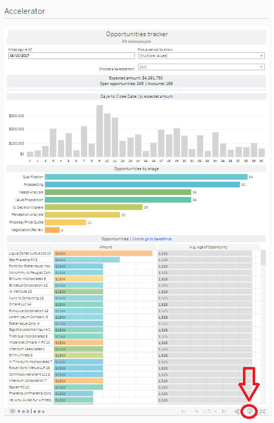
Once you've opened one of these you can see a description of the dashboard, have a look at a tablet view and then the accelerator itself. From here, a good challenge is to try and recreate the dashboard from scratch simply by looking at it online, however an alternative approach is to download the workbook using the highlighted button below:
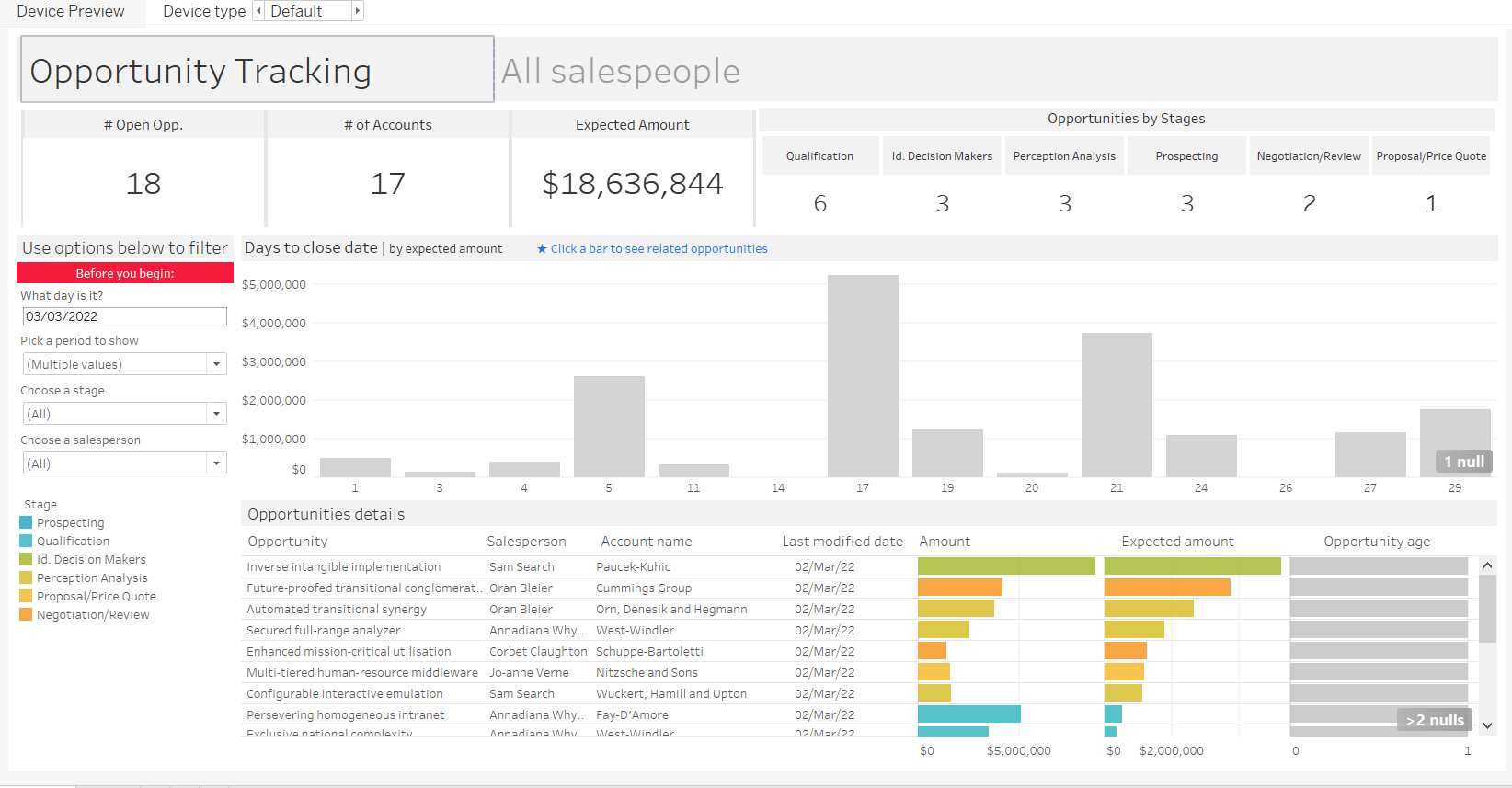
Once downloaded, you can then change the data being used and make any formatting changes etc. I've shown my example below where I've put in my own data which is in the same format (so literally just replacing the data source) so this is quite basic, but hopefully should give a good idea of how simple this can be!