Our challenge for day 4 of dashboard week was a bit of a curve ball, the data was very straight forward and required little prep but we had to use a BI tool other than Taleau. As it’s probably the most popular tool on the market other than Tableau, I opted to use Microsoft’s Power BI, and I would say that the results of my efforts were a mixed bag all in all.
The Data
The data for today consisted of phone complaints made to the FCC for a number of reasons, and it was simply a case of downloading it into csv format. We were only allowed to use Tableau prep to carry out the data preparation work, but as it was so clean I made probably the shortest prep flow that I’ve ever seen.
I used a few calculations to split out the lat and longs and clean up the dates and that was it, next step dashboarding!
Power BI
I’ve had some experience with Power BI in the past and even tried (unsuccessfully) pass the certification exam, but to say that I was a little rusty would have been a gross understatement. For me the biggest difference between the tools is that while Tableau excels at on-the-fly visual analysis, Power BI is far more suited to building structured reports, so this was the approach I tried to take with my visualisation.
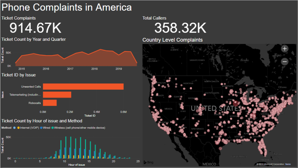
My imagined use case was that I was a manager in charge of monitoring phone complaints and needed a report that would display the number of complaints coming in and where they were coming from, so I created a map chart using the lats and longs and a line chart showing the number of complaints over time. I thought it would be useful as well to create a histogram to show which times of day have the most complaints.
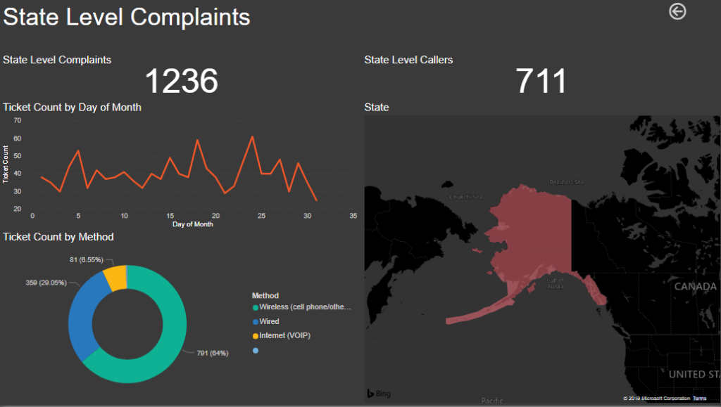
I created a second page as well to act as a state level view in which the user could view the data at the state level and see which days of the month complaints are happening in.
I think overall both views are serviceable but not that visually impressive, and lacking in analysis.