Part one of this post can be found here; Last time out, we connected to data – The first step into a brave new world of visually analysing numbers through quick-fire analytics.
A change of plan for part two.
After discussing with fellow data schooler Hashu, I’ve decided against re-creating one of my first Tableau visualisations; Instead I am going to use Tableau’s sample data superstore sales to re-create the demonstration visualisation that we do when practising at the Data School.
Just an overview on this; Every two weeks, Coach Kriebel has us practice a combined Alteryx and Tableau demo, so we get comfortable with demonstrating the software, explaining it clearly and effectively and really showing off the capabilities of it. It’s also a really good way to develop our soft skills like presenting to an audience. Given that I commute, I’ve attempted to practice this on the train into London (Note; don’t try and demo Tableau to a grumpy commuter on the 06:44 from Ipswich)… But then again, I also gave an Alteryx demonstration at the Alteryx User Group – Which was actually quite a daunting experience, though I got some really awesome feedback from some of the attendees.
Anyway, enough about demonstrations and sleep-deprived commuters – Let me talk through the Tableau demo.
The premise for our demo is simple; show how simple Tableau is, how magic the drag and drop is, and show the capabilities. Using Superstore, what we create is a bar, a line and a map – then shove them all on a dashboard.
So what I’m going to do is create this dashboard in Tableau, show the components of each view, and then attempt to replicate this within QlikSense. Should be fun!
Let’s talk about how each view was created;
The Map
Tableau mapping uses (as I mentioned) an online service render a level of granularity that the user provides, and each point is plotted using ‘generated’ latitudes and longitudes – You can tell these are generated by seeing the title in italics in the ‘pill name’.

Anyway; from the dimensions pane, all I did was double click the ‘State’ pill which brought generated Latitudes and Longitudes to the rows and columns shelf, and then by putting Profit on the colour mark, Tableau recognises that the best thing for me to create here is a filled map. Also, given that geography has been defined as a hierarchy, I can drill up and down out of the Location – Country to State to City to Postal Code.
NB; Given I am on a train again at the time of writing, the Map (as it is rendered using the internet) is not displayed – However, I’m making the reasonable assumption (I think!) that most people who read this post can spot the shape and state-lines of the USA.
The Bar
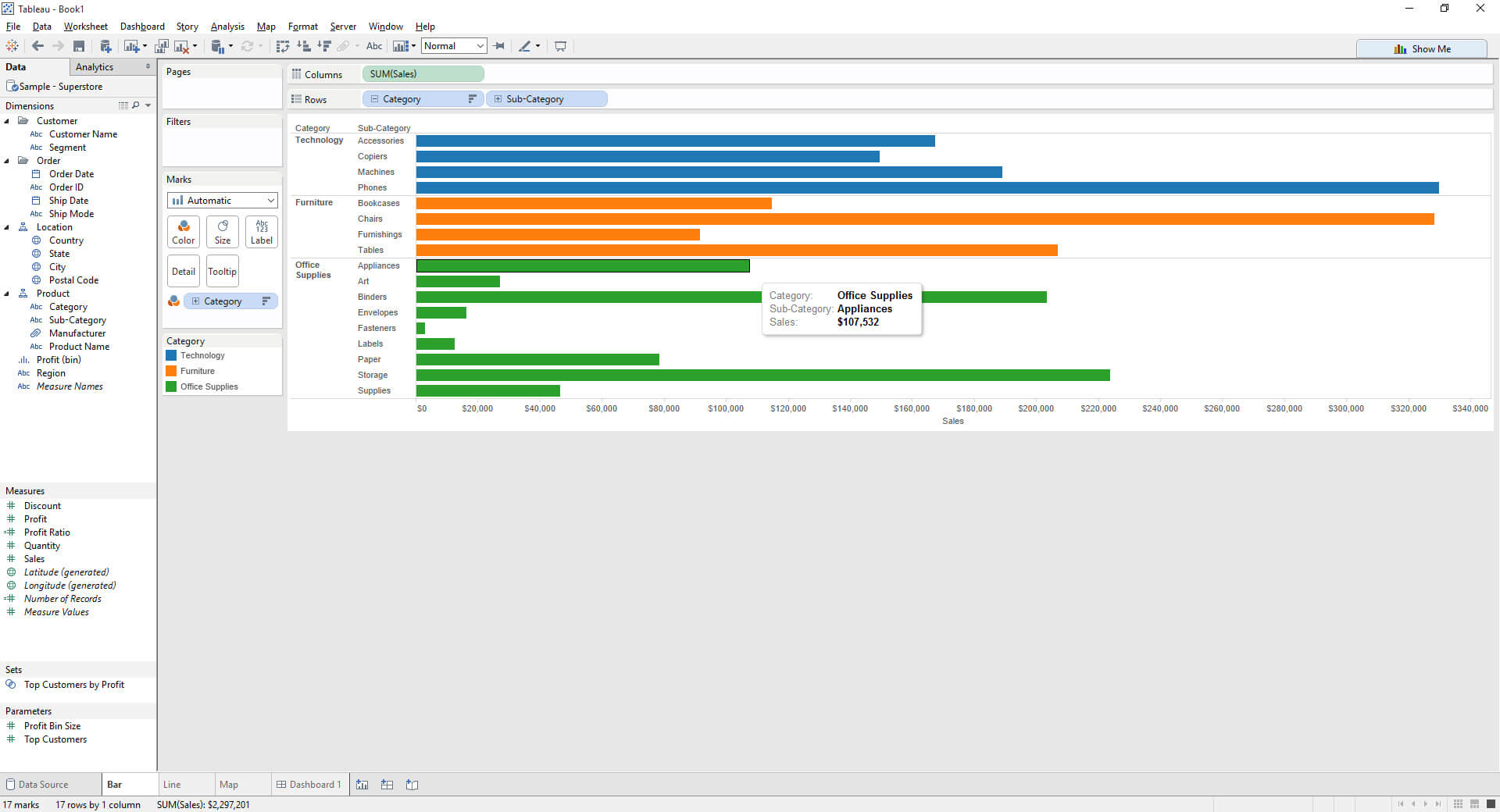
Bars are so important (That’s a Few-ism if I ever saw one) – This was very simple to create as well, simply double clicking on sales to create the most simple bar chart ever, then slicing the measure by category, pivoting it to be horizontal using the swap axis button and finally adding category on colour. Once again, the Category field is the top of it’s hierarchy, so we are able to click on the little plus button again to drill down to the sub-category level. Note, that the category colour scheme remains.
The Line
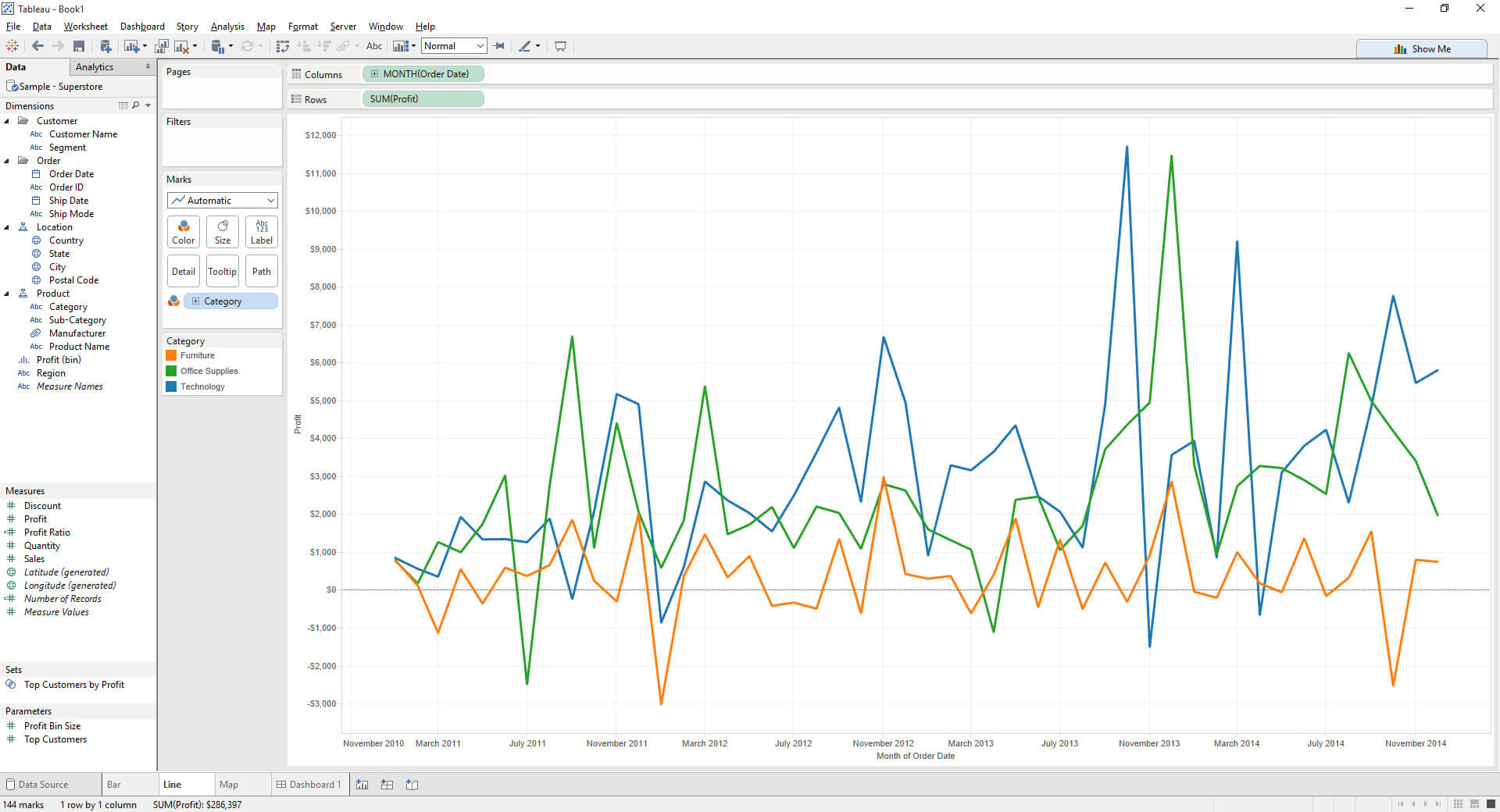
Line charts are a great way to show trends over time, so this is what I used to map the profit over time for each category. I firstly added the date as a continuous time field, but truncated to a month level, added profit to view and then sliced it again by category – The neat thing here is Tableau remembering the colour coding for each Category so I don’t have to change it. So smart, they grow up so fast…
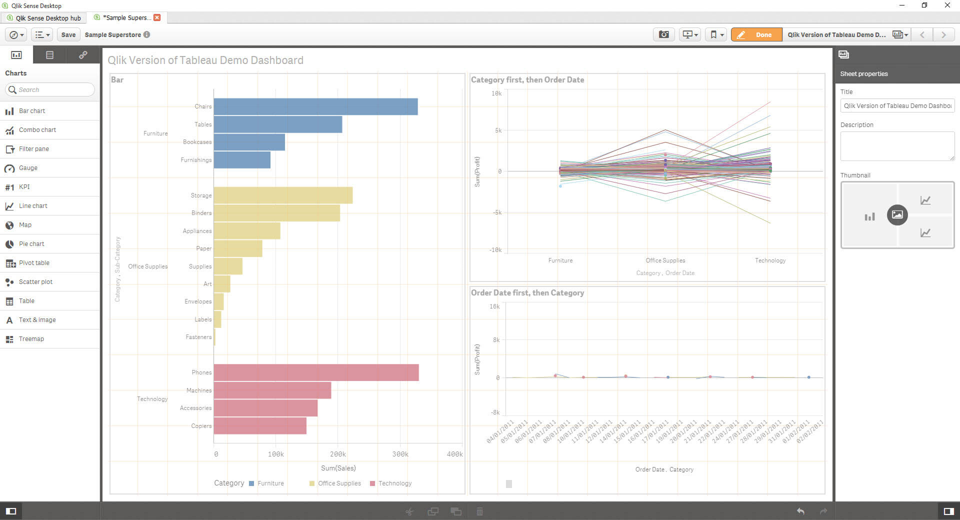
Next part? Let’s shove this all neatly onto a dashboard and make it look kinda neat and organised. Double click, move, add title. Bazinga, we have a dashboard.
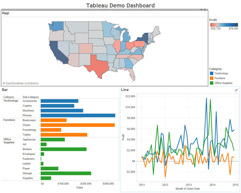
As you can see above, the ‘demo dashboard’ shows a map indicating profitability of Superstore by profit, a bar showing technology & subcategory by sales and finally, category by profit over time.
How does this feel to do in QlikSense?
Let’s try…
This is where the fun begins
Qlik my old friend, it’s like I was never away.
I’ll skip the connect to data hand holding as we covered that last time; lets create some views. (I find it annoying to have to navigate through that archaic ‘connect to data’ interface… So many clicks! Or should I say… Qliks…)
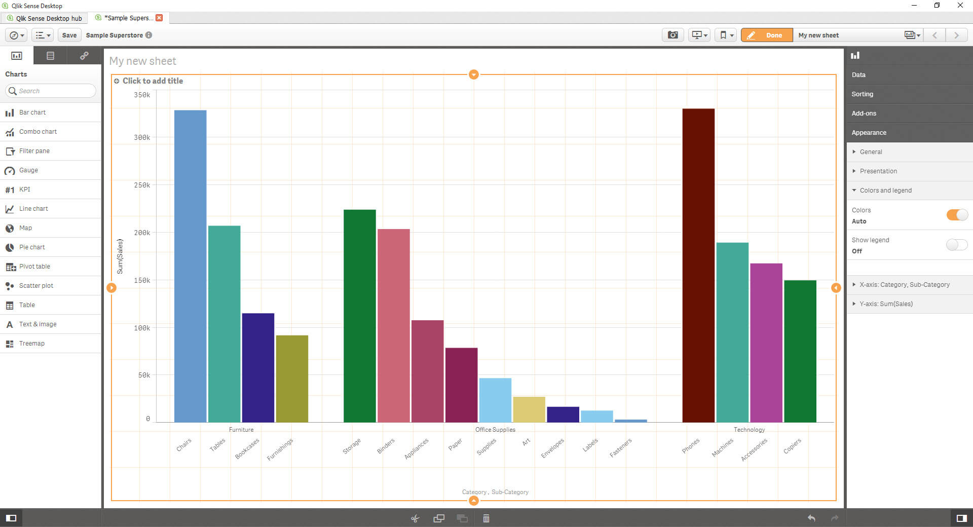
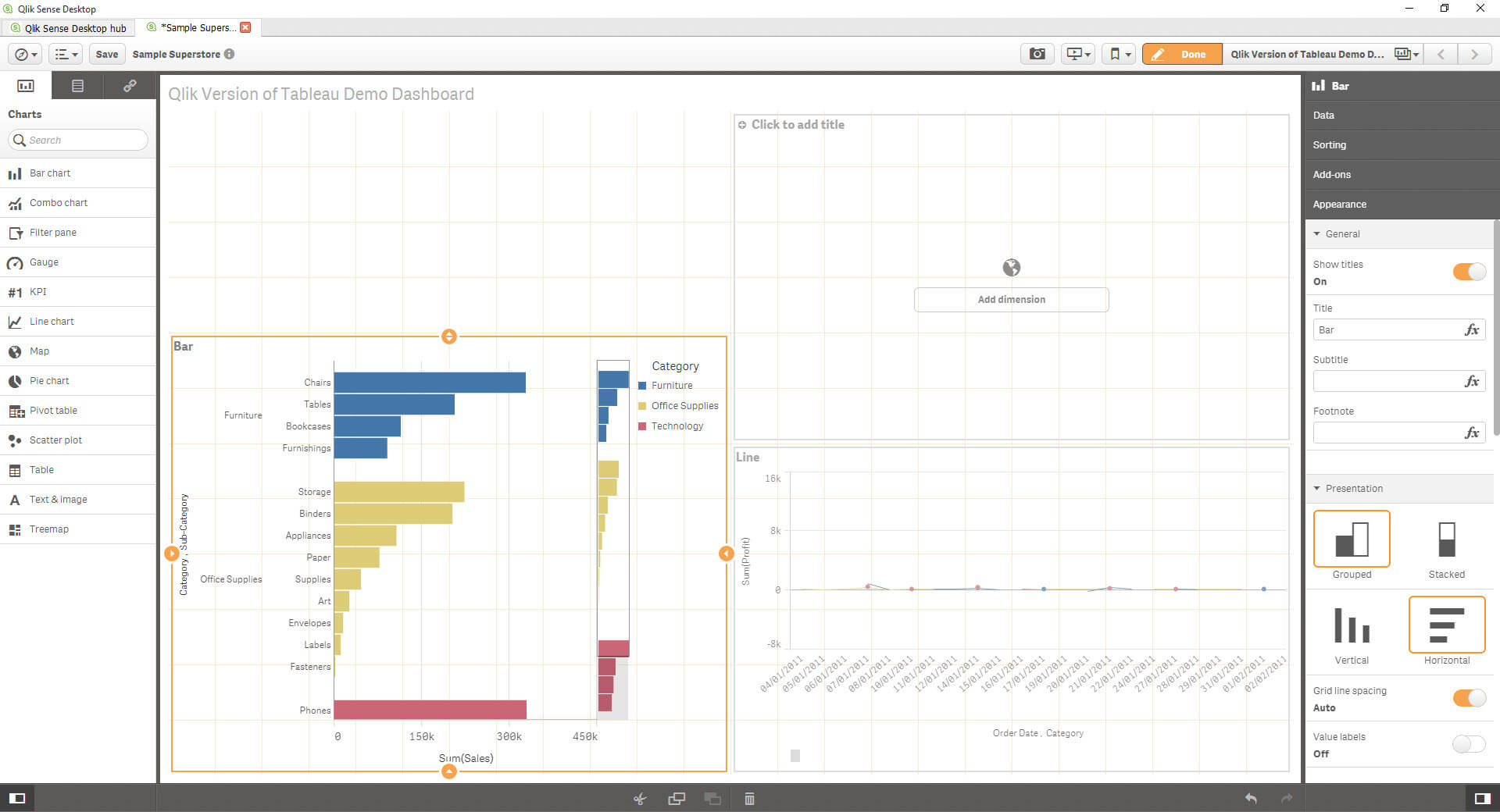
Nice; now let’s start building. The first thing I’ll do is create the same bar chart again – So Category, sub-category and sales with the bars colour coded by category.
First, I have to drag ‘Bar’ onto the sheet; This is what it looks like if I click and drag..
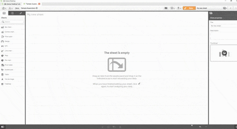
And if I double click the bar chart button, it populates the entire canvas.
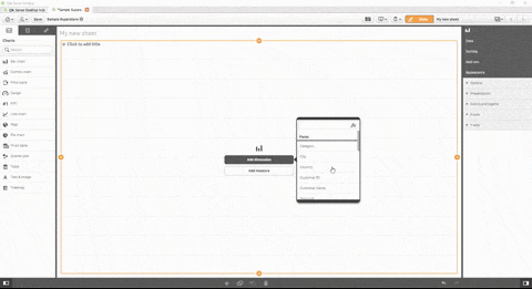
The click and drag looks like a Tableau Dashboard function, but I just want to see my bar. So I’ll add that in. Once you get past that, Qlik shows you the ingredients to create your bar – a dimension and a measure.
What I found is that the dimension and the measure isn’t sorted like it is in Tableau – Which I guess drops the confusion of how you can change a dimension to a measure and vice versa.. But the small dialog box which pops up with a scroll bar is annoying. I’ve seen Tableau workbooks – And indeed, the football data I use from WhoScored, with so many dimensions/measures; I get that there is a search function, but it’s still hard to find, and I’m not able to organise things into Folders like I am in Tableau.
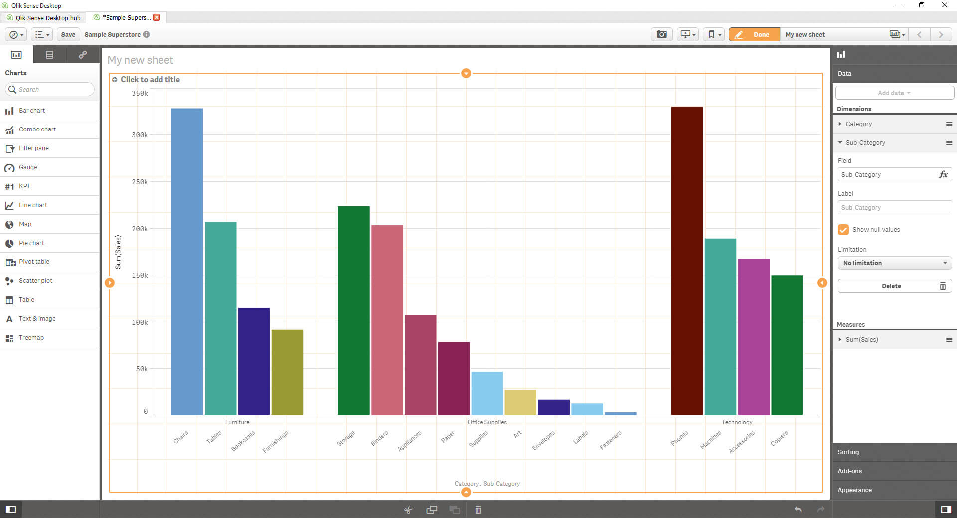
Anyway, once I added Category and Sales, I have my first bar chart! But how do I add the sub-category? I’m not a heavy Qlik user so I’m not going to go hunt for a solution to create a hierarchy (plus what if Qlik doesn’t do them? I’m very conscious of not trying to make Qlik do things it clearly wasn’t designed to do or offer). But there must be a way.
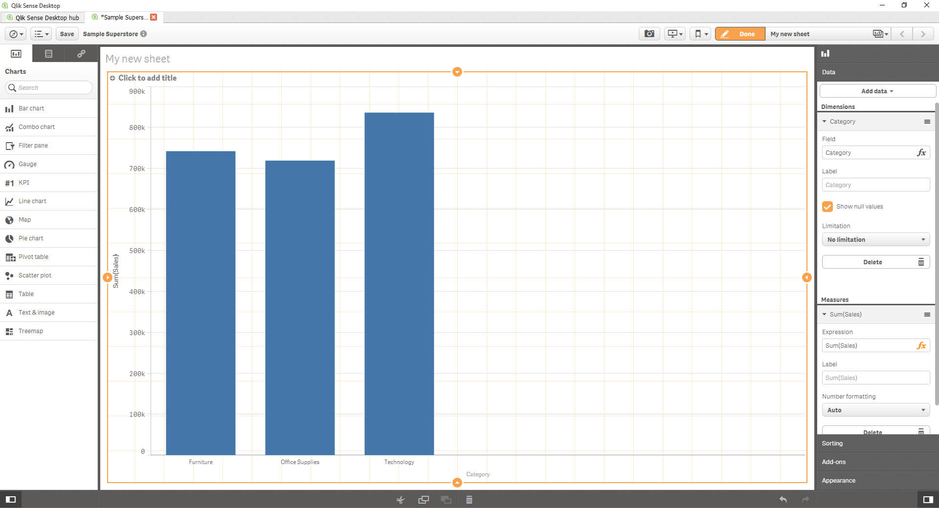
So you can see on the right hand-side there is this pane. This has all the properties I need for this visualisation – There’s a visual cue telling me this refers to the bar chart at the top, then the ‘Data’ pane where it has an ‘Add Data’ dropdown. Bingo! This is where I can add an additional dimension or a measure*.
(*I did an experiment on measures in this step which I’ll come back to later in the post)
This looks pretty. But I’m not sure what the colours are doing…
But! That should be easily investigate-able/changeable. At the bottom, you might be able to see the ‘Appearance’ tab. This takes me to…
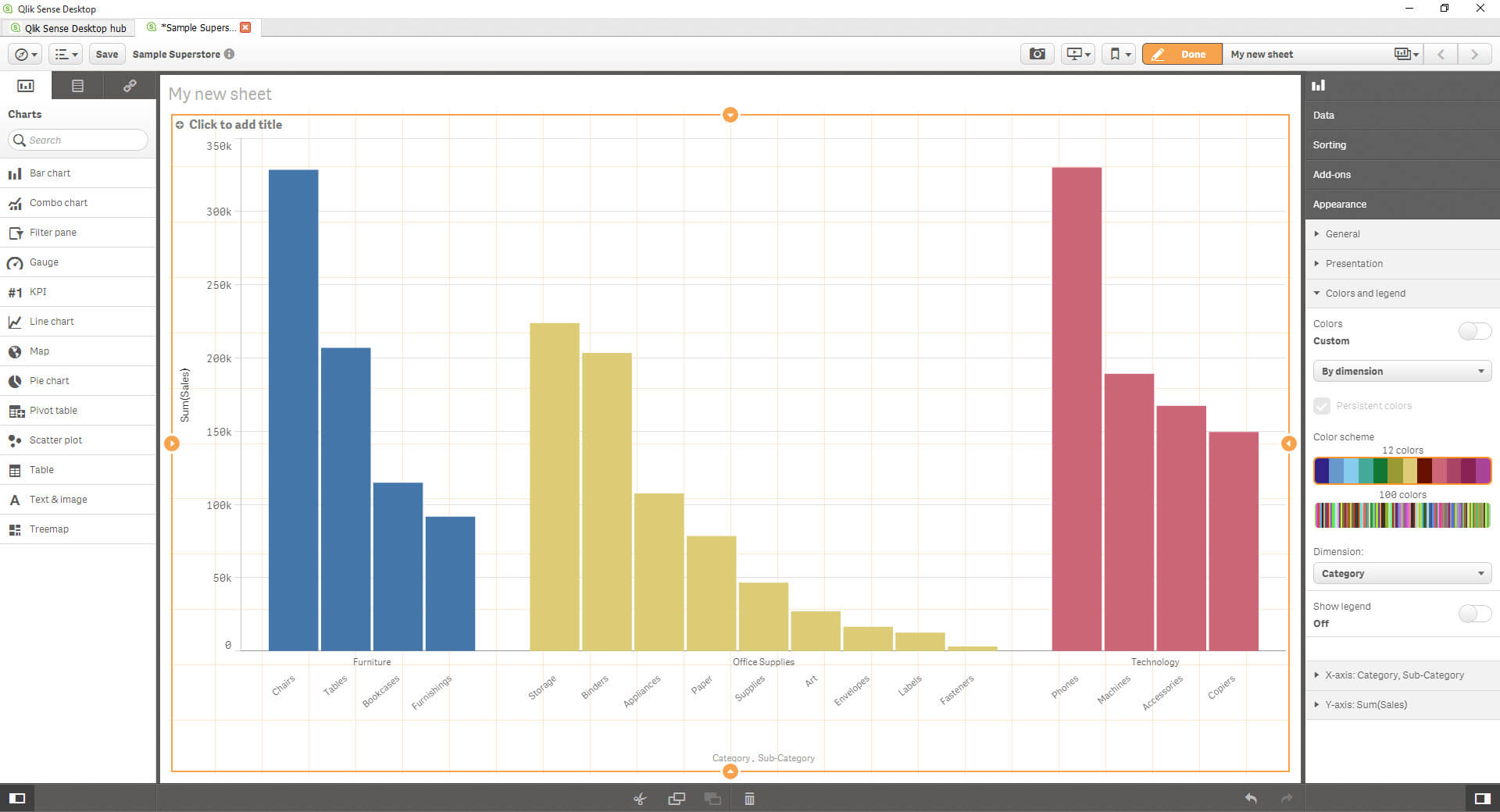
This. The colour is currently set to auto – Let’s see if I can change it to be coloured by a dimension, in this case by Category. There are just two colour palettes, which aren’t easily customisable; I have a 12 colour palette, and a 100 colour palette – I’m sure there is a way (using coding, I’d imagine? Worth looking into) to add custom palettes and custom colours, but it’s not *as* easy as you can in Tableau.
Nice! Now the final step is to pivot it.
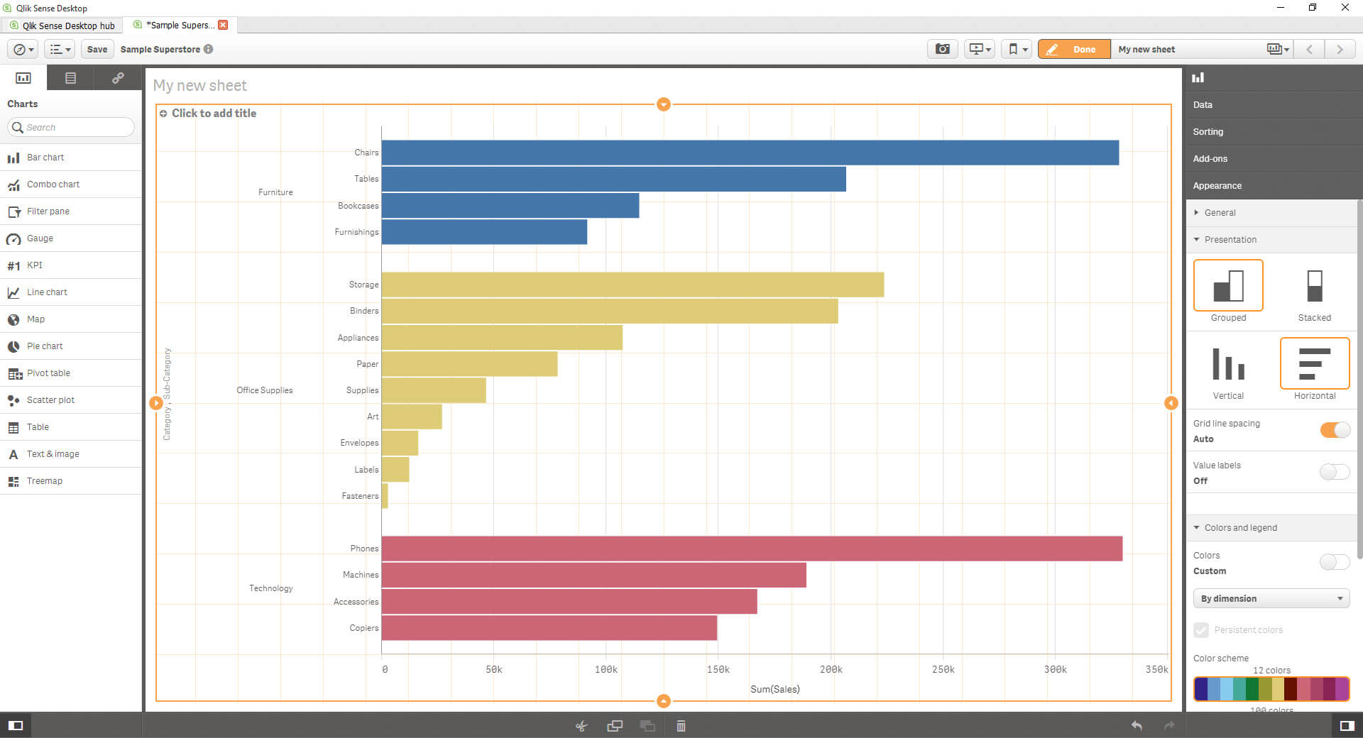
Nice – That’s the first one done.
Next up? The Line.
So I’m going to let slip a secret – between finishing the bar and starting the line, I dived into the demo apps. I was exploring this to show how Qlik does ‘dashboards’ – It turns out that they don’t have separate dashboard/sheet settings, but instead you create the dashboard on the sheet canvas here. Which actually explains the weird drag and drop function. Is it better? Again, it’s about preference.
Therefore, instead of adding a new sheet, I’m simply going to drag and drop the line next to the bar – Following the dashboard design I had on my Tableau dashboard.
I’ve dragged in Line – But I’ve had to stop and think; Is my dimension order date or is it category? Intuitively, I want to use order date, and profit, but how does category fit?
But the beauty of iterative business intelligence?

I did it but…
I wanted NEITHER of these. I definitely don’t want to put category first, so I can blow that away – but the bottom one… I can’t easily truncate up to a month level, I can’t make the lines fit in the entire view… ***there’s a scrollbar***
But let’s leave that as it is..
Moving onto my map..
WHAT ARE THOOOOOOOSEEE!?!?!?
What is happening?! Why are the rest of my bars on the right hand side?!! I can’t actually see what the scale is, so what’s happened is that the rest of the red bars are populated – And I have no idea how to fit the chart to the size of the view.
So I created a video to show how this is created – but halfway through I realised that the weird bars on the right? They’re scroll bars! Who knew. (Weirdest. Scroll bars. Ever.)
Pablo and Hashu then spent about 5-10 minutes trying to make the chart fit the view, and after clicking around (like I had) they gave up. Why would you want to scroll your bars? How will I be able to compare the top bar which disappears when I scroll?
Let’s leave it.
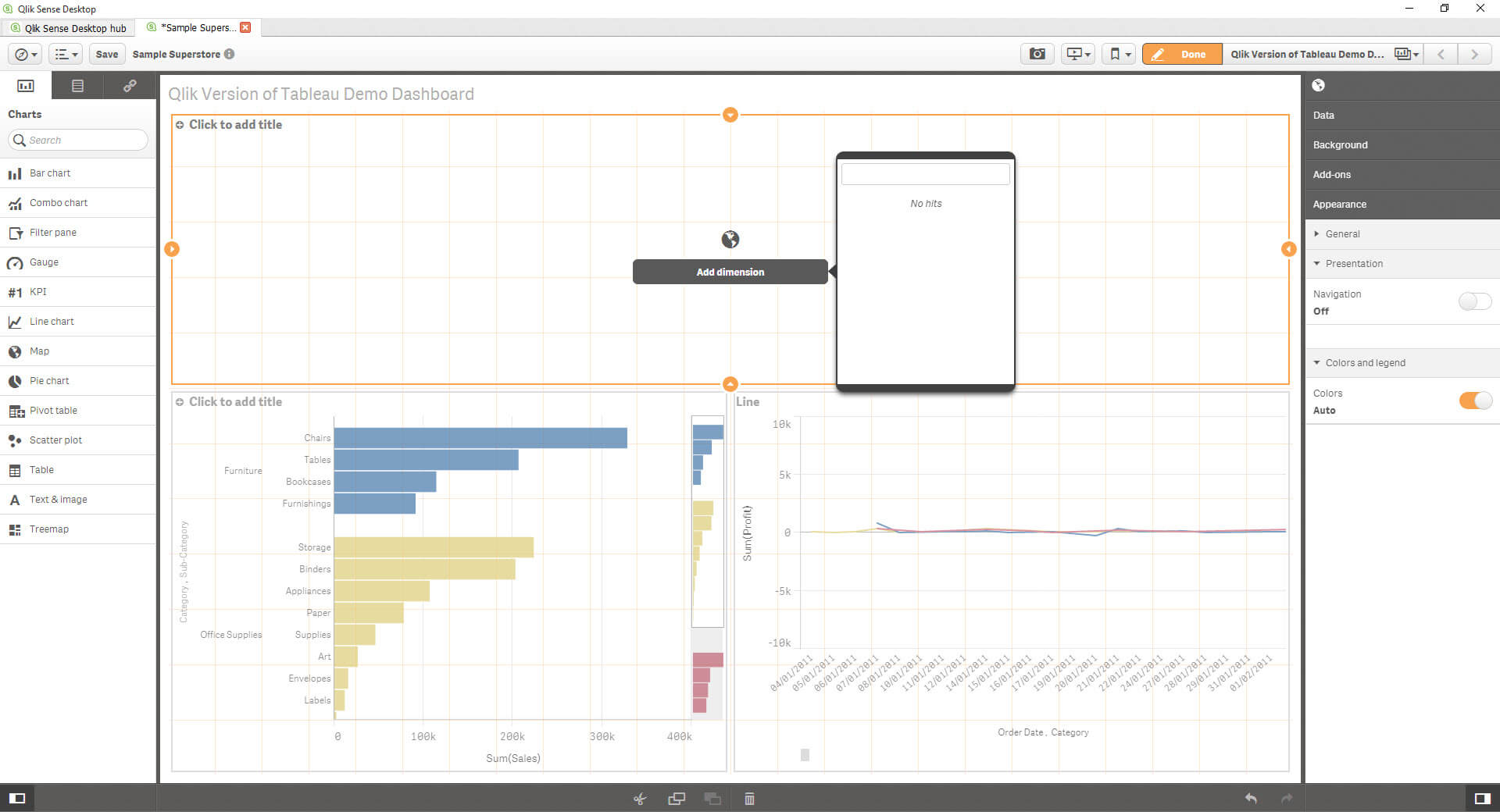
Oh, so I can’t add my states either? Nice. Nice, nice, nice. No map for me then!
Conclusion:
I think this is a fairly unfair test, I’m trying to make Qlik do something which isn’t native to it. However, I feel like to do anything in Qlik is less visual than in Tableau – the organisation of the Tableau cards and shelves isn’t hidden in panes and drop downs; all your tools and options are largely right in front of you. In QlikSense, I found myself clicking around a lot to simply change the colour.
And the stacked bar chart issue (as well as the scrollable line) – Why? I still have no idea how to make sure it fits the entire view – And I was disappointed to not be able to quickly compare the mapping functionality of QlikSense versus that of Tableau.
How do I solve these problems? I can dive into the Qlik Community.
Next time, on Qlik vs. Tableau.
Footnote;
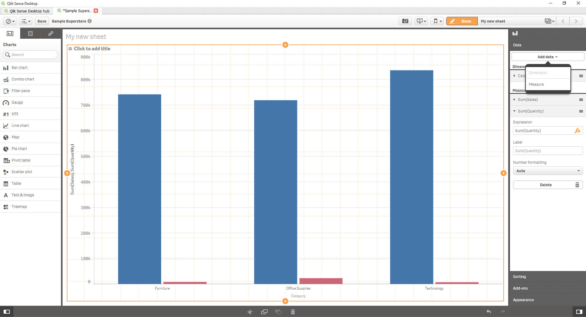
*Going back to what I mentioned earlier – when I added the sub-category dimension, I was also faced with the measures part; within this, I then experimented with adding a measure instead of a dimension – This is the result.
Whereas I get this if I do the same in Tableau
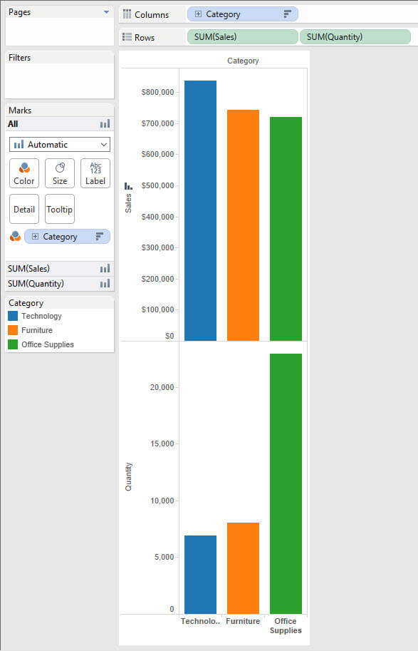
Is this another example of best practice? I think it certainly tells a better story than the Qlik version, as you’re able to compare the size of the bars on different axis (because hey, they’re different measures)