The UN data challenge’s deadline is just a few weeks away now, and using the data was the first time we we had to do some level of data preparation. This was due to the dates of the dataset making it quite a fat and short dataset, and we needed to pivot the dates into one column to create a date field. This was done beforehand, but compared to the other datasets, we had more to do before starting putting dashboards together.
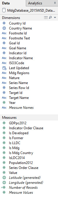
With this one, after the data was pivoted, there was *A LOT* of measure fields; as you can see if you go on the UN Data website there is a number of measures within each level of the ‘Goals’ field in the metadata.
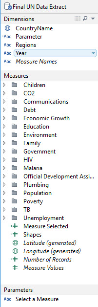 So on the left, you can see the .txt file which Tableau can interpret intelligently, and then the extract that we worked on as a team sorted out into folders.
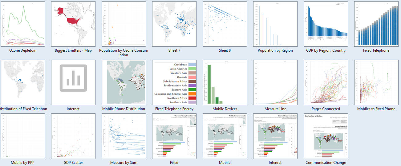
I really wasn’t sure how to approach this task, so there was a lot of messing around putting different charts together.
The dimensions are the same, I’ve just added in a parameter calculation to allow the user to toggle the measure they are looking at; I created one or two parameter calculations, but only ended up actually using one; which in itself wasn’t actually that useful overall, as I used the story-points function to tell my story.
The shapes measure allows me to add in a custom shape or two.
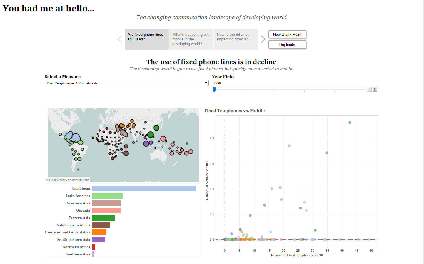
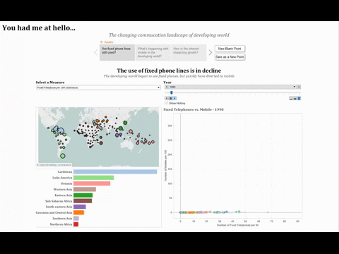
So after putting all of these very different views together, I ended up going for a theme to do with communication; to see how communications have unfolded in developing countries. Therefore, I am using a global filter to exclude the developed countries as defined by the dataset, and looking at how things have developed/changed since 1990-2014 (I excluded anything before as the tech age has come in the last 25ish years, and 2015 wasn’t a full dataset)
The most interesting thing for me was using the pages shelf; I’ve added an animation below so you can see the story unfold; this shows the fact that shows the movement firstly toward fixed phone lines, then away toward mobile phones after they exploded and became more popular and more affordable. This is a trend which actually makes sense, as developing countries may not have the infrastructure to develop the fixed phone lines, and the start-up cost to do so may have been higher than the cost (and ease) of buying and using a mobile telephone.
My second and third dashboards looked at the correlations/causations which could have been drawn between mobile phones per 100 inhabitants, and the purchasing power parity of the developing nations. This, and the dashboard after which looked at GDP versus internet users, were fairly weak dashboards, but this weakness was more to do with the time element, than the dataset not being robust.
This again, was an important lesson – I feel I could have approached this from a question first angle, but that required knowing about the dataset itself, or perhaps taken a more simple approach to the data and looked at a very obvious question and used data to explore it.
When I published to Tableau Public, given the limitations, I was unable to add the animated pages shelf to the final piece. However, I’ve added in a parameter which allows me to move through 5 year intervals to show the movement of the countries, but without the trailing history lines that the pages shelf provides.
Check it out below, and any feedback is of course appreciated.