First, check out my post on Tableau 8.0.0 here
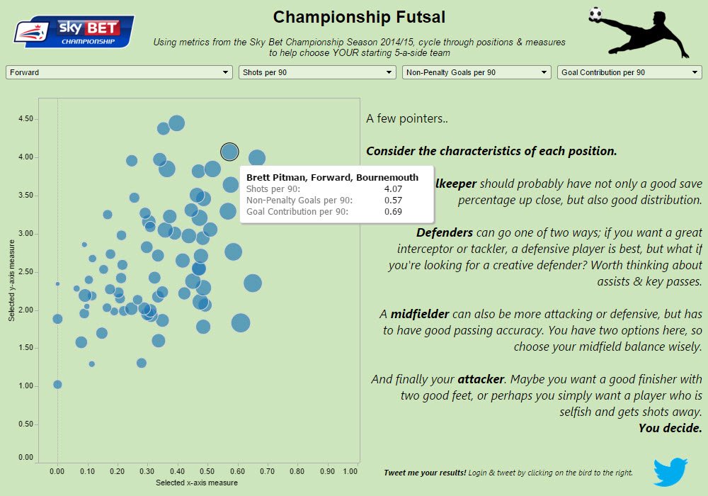
Following the small differences with Tableau 8, I almost expected 7.0.0 wasn’t going to be so bad. And it wasn’t – For me, it performed much better in terms of speed than 8.0.0 did.  Visually though, there were some huge differences. But what was our task? For this version, we had to do a makeover of something we had originally created. My choice? Something sports related, to continue the theme. So, as an Ipswich, I had got Sky Bet Championship data from WhoScored.com and over the summer, I wrote a blog for fun which looked who would make a 5-a-side football/futsal team. (to read my initial blog post setting the scene is here (http://bit.ly/1PSN9dt) and my visualisation showing the results is here; http://bit.ly/208QppN)
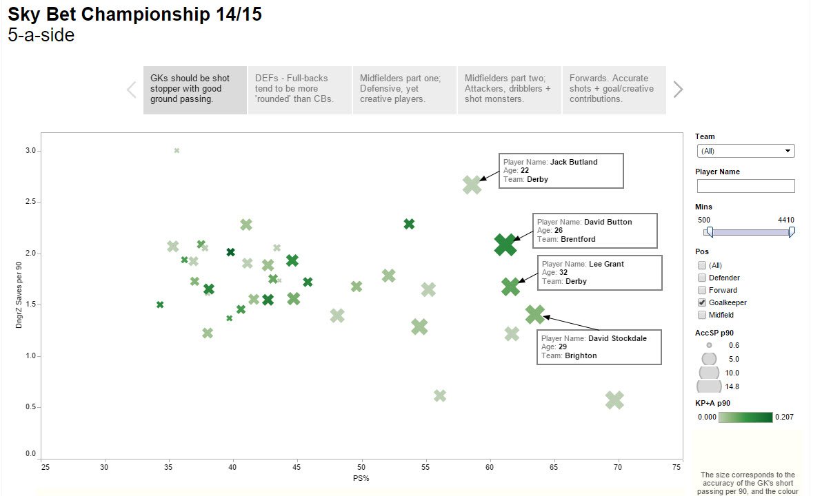
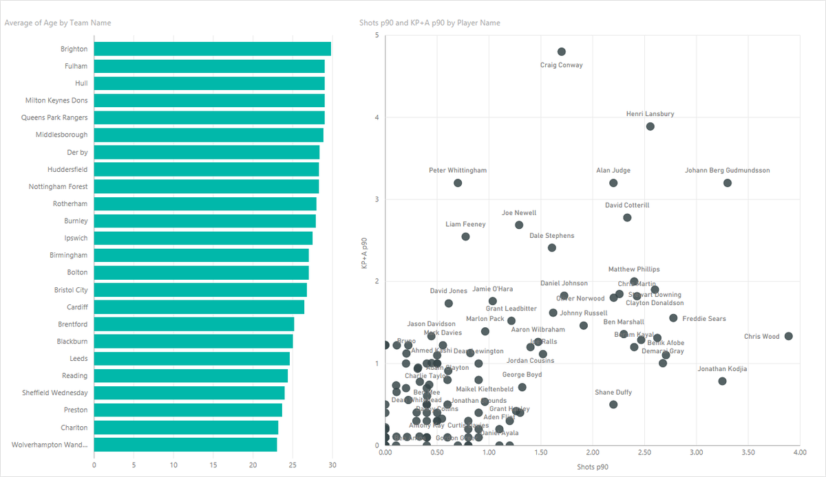
Original Viz (made in Tableau 9.0.something)
So what were my key findings when playing with Tableau 7? There was a lot which had changed in terms of user interface, but also small nuances in functionality which I had come to enjoy and had gotten used to. For instance, my dataset which I imported had a lot of different columns, but given the nature of my dataset, there were themes I could group them under for aesthetic pleasure. But no – The ability to group by folder wasn’t there! I was shocked and annoyed. Secondly, when I was creating my parameter, I wasn’t able to click off the calculated field to change the values to see what I had written. I ended up doing this to help me was screen-shotting the parameter window in order to help me remember the names I’d given each field!
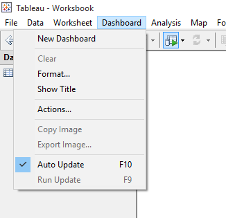
And this is how you guys used to create a dashboard? With two clicks, not one? No wonder RSI is common amongst desk workers ;-). Another dashboard nuance was this;
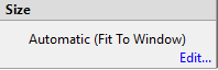 which lead to
Two things, which I believe are now do-able simply within the dashboard view. Interesting, nothing really stopped me creating a half-decent visualisation. One of my favourite Tableau features, Tooltips, was actually not on the marks card – You have to navigate from the menu bar.
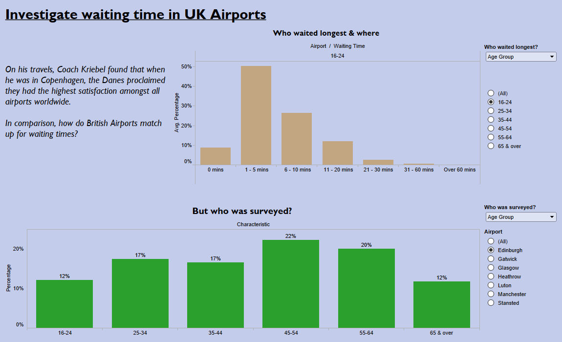
Madeover in Tableau 7.0.0
So what was next? Tableau 6.0.0 and a really not-so-nice dataset.
Let’s get the worst part over with… Here’s my dashboard.
Anyway, more importantly, how did I find Tableau 6.0.0 – Once again, more toys were taken away from us, but I though that Tableau 6 was quite cute. It still had quite a familiar Microsoft feel about it, and some really nice little quirks which made me smile while using it. See a couple below.
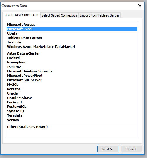
The way you connected to data was different, and much more like what I’ve found QlikSense to be in those posts I’ve created. But still, a good host of datasources supported.
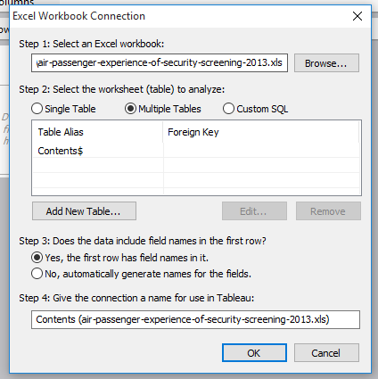
Again, a different way to see what Tableau asked you with a familair dialog box. I think this was actually present in Tableau 7.0.0 as well thinking back. And maybe 8.0.0… But anyway, it’s different from what we are used to in 9.0.0
This was adorable. Like, I love this. When you drag and drop data onto the table, and you get the Show me!… There’s a little circle in the middle which yells show me in an oval! Is it in Comic Sans? Who knows, who cares. I loved this little nugget.
The interface was just different. No new page view button, no tooltips, no new dashboard button. Tooltips aren’t customisable (I don’t think)
I loved this. Me and Nicco thought this was awesome, and we want it back in Tableau 10! When you drag something onto the dashboard, these arrows popup to tell you how much space it will take up – it’s a nice visual touch.
So that finishes up my experience with Tableau 7.0.0 and 6.0.0 – After Coach Kriebel actually started playing with previous versions, most notably Tableau 6 (his workbook looks really good though, he got the maps to work as well) he saved us from actually playing with 5.0.0, instead half of the Data School took on Power BI and the other half QlikSense. Given that I’d already experienced Qlik, I had a go with Power BI, and created this.
I liked Power BI – You’re able to connected to a good amount of data sources, including some web connecting capabilities – what really caught my eye was being able to connect to GitHub repositories. This is something I couldn’t get to work in the timeframe, but I really want to get it to work, given the amount of data on GitHub.
The interface is very Microsoft, so any computer user is good with it, understands what’s going on and what each aspect should/will do. And further more, the customisability is easy, it’s interactive and the transitions are slick. Sure, it didn’t have the customisable potential that Tableau has, but I think it has it’s place in the market – and it’s continuously developing. I particularly liked the ‘Cards’ visualisation, and the neat labels on the scatterplot. Colour customisation was difficult, but overall, I was fairly impressed!
So that ends Back to the Future week – An exercise which made opening Tableau 9.1 on Friday morning a sight for sore eyes!