For this project, I wanted to explore Spotify listening data. Before starting, I looked at many dashboards on Tableau Public. There were many interesting ideas, but I wanted to look at this topic from a different angle and build a dashboard that answers my own questions. I did the project in the following steps:
Understanding the Data
The dataset came from one Spotify user. It included information such as listening time, device type, and skip behavior as well as track information such as artist, track name and album. The data was downloaded from the Spotify platform as several JSON files for a timespan of about 15 years. During the project, I had to think carefully about which insights were realistic and which charts could still show meaningful patterns.
My main goals were to understand:
- Which genres are listened mostly
- How listening patterns change over time
- How device choice and skipping behavior influence the listening experience
The dataset did not contain genre information, so I created this manually. I explain this part “Preparing the Data” section below.
Planning the Dashboard
I decided to focus on qualitative insights instead of deep statistical analysis. I wanted the dashboard to feel simple, visual, and easy to read.
So I planned the dashboard in three main parts:
- Genre and long-term trends
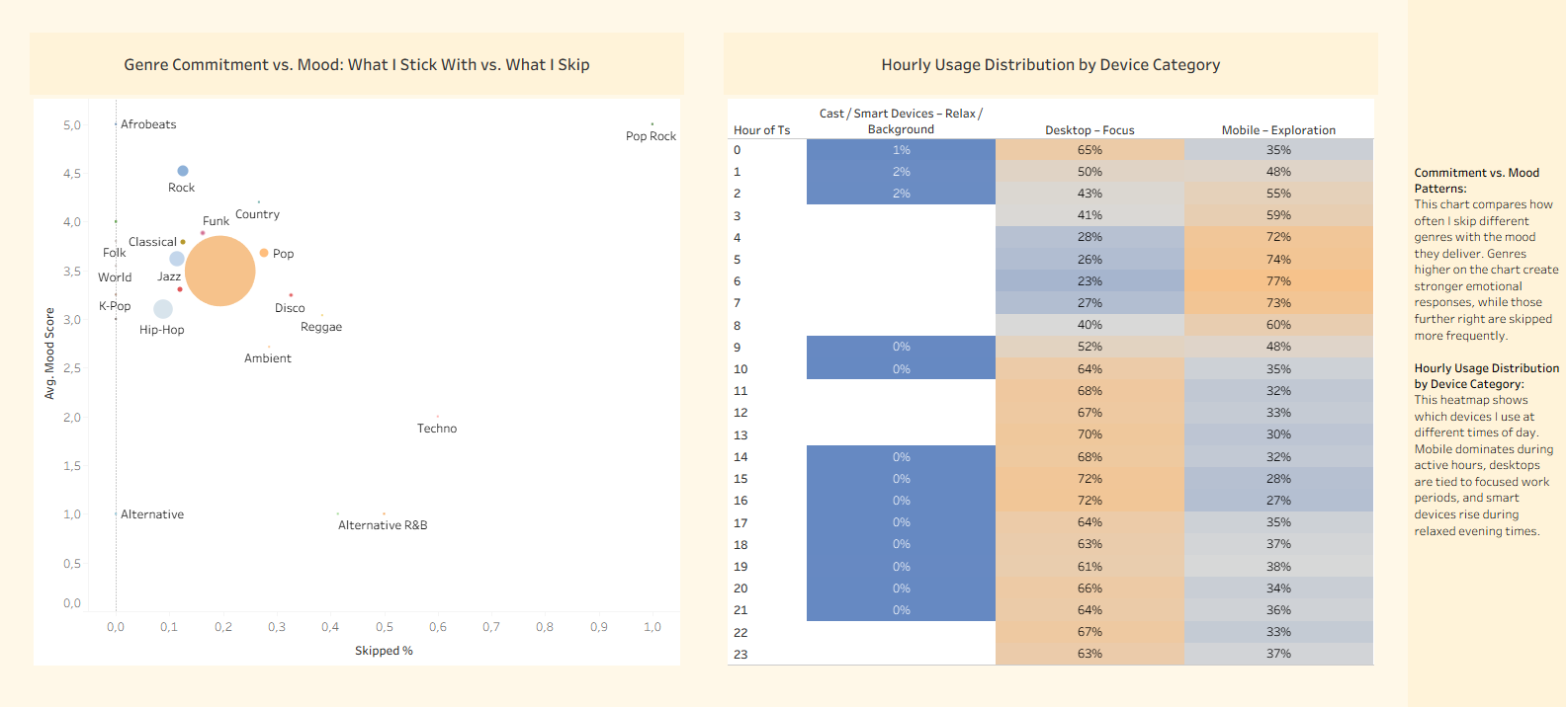
- Mood, commitment, and listening habits
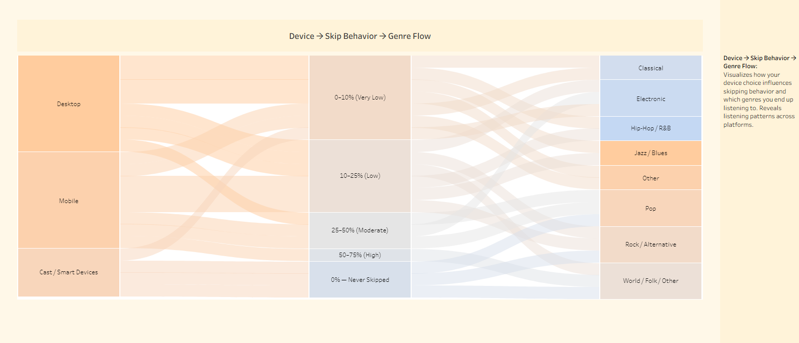
- Device behavior and how it connects to skipping and preferred genres
I also chose soft background colors and subtle tones (yellow and orange) to keep the dashboard warm and easy.
Preparing the Data
Even though the dataset was not large, it needed preparation. I created:
- Calculated fields for skip categories
- Mood categories
- Genre
- Device groups
- A simple genre category field
I also tested different chart types to see what worked best. Some charts I worked on earlier were not included at the end because the dashboard would become too crowded.
Since genre information was not included in the dataset, I needed to create it myself. I exported the list of all distinct artist names using Alteryx, saved them in a text file, and used Gemini to help generate a calculated field for genre using a long IF block. I chose this approach because of limited project time, but a better solution in the future would be to pull genre data directly from Spotify’s API based on track or artist metadata.
I also decided to work with artist names instead of track names. The number of artists is much smaller, and since each artist usually has only a few genres, this gave a good enough approximation to extract genre-related insights from the dataset.
Designing the Charts
I used several chart types:
- Treemap to show genre share
- Line chart to show long-term trends
- Scatter plot to compare mood and skip behavior
- Heatmap to show hourly usage by device type
- Sankey flow diagram to connect device → skip behavior → final genre
For all charts, I tried to use the same color palette so the dashboard looked organized.
Finishing the Dashboard
After placing the charts, I added short explanations in the margins. These small texts help the reader understand what each chart means.
There were also many steps in the background that are not shown on the dashboard, such as working with filters, testing other visualizations, and cleaning the data.
Below some screenshots from this dashboard and you can access the dashboard here on tableau public plattform:


Ideas for Improvement
If I continue the project, I can add more filters, compare different periods, or even bring in more users to study wider listening patterns.
