


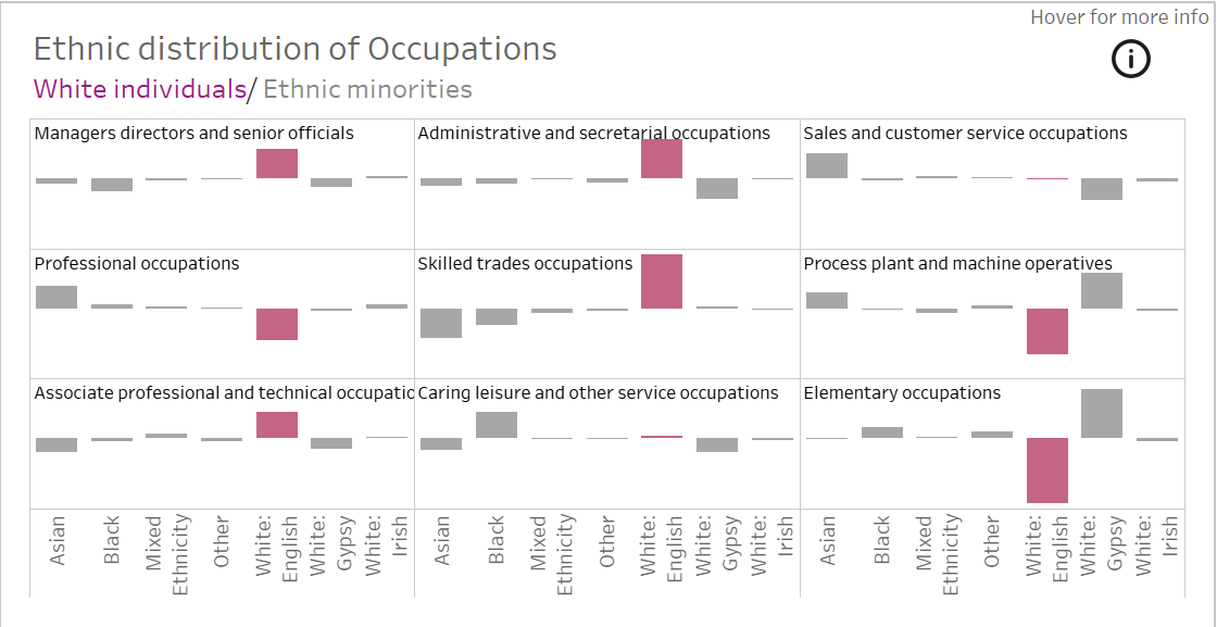
In Part 1, I explained how to create a trellis chart in tableau to make more concise visuals. In this blog, I'll explain how to add the titles to each chart.
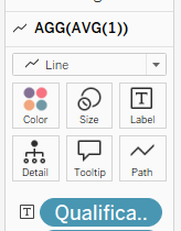
Step 1: Create an avg(1) calculation
Within your rows, create an avg(1) calculation straight in the pane.
Avg(1)
Once you click enter, it should look like this.

Step 2: Add label to marks
In the marks card, on the right. An agg(avg(1)) table should come up. This is where you will drag the dimension onto label that you could like to be the title.
Step 3: Format
This is where you have a play with the formatting of the title to make it look how you desire.