After a fun first day of the Data School in which our data viz tools were crayons and paper, day 2 signified the opening of our laptops and the start of our Tableau journeys. The first big task was to take on a Makeover Monday challenge, one of the most popular ever, a look at how climate change is impacting global temperature change.
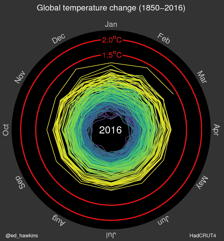
Although I appreciate what the original creator is attempting to achieve with the spiralling animation of their viz, I felt that the interesting aspect of the data was the speed at which temperature was increasing each year and felt that including the monthly information took away from this somewhat. There is also the obvious limitation of a radar chart in its inability to distinguish differences between different months.
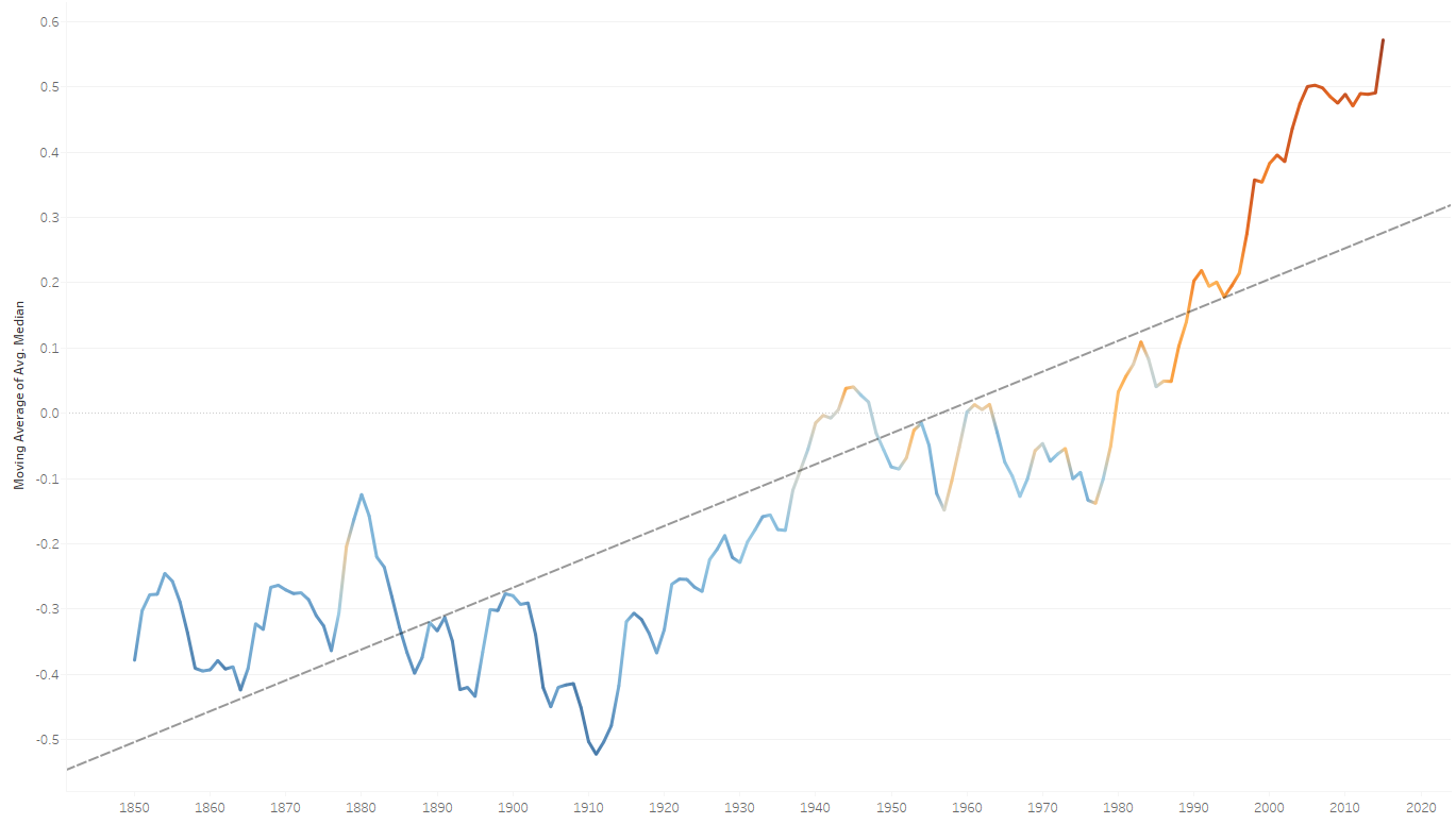
To try and focus the attention on the year on year increase my original plan was to create a bar graph of temperature against year for the data. I had a play around with moving average and line colour but I felt that it was lacking in visual impact.
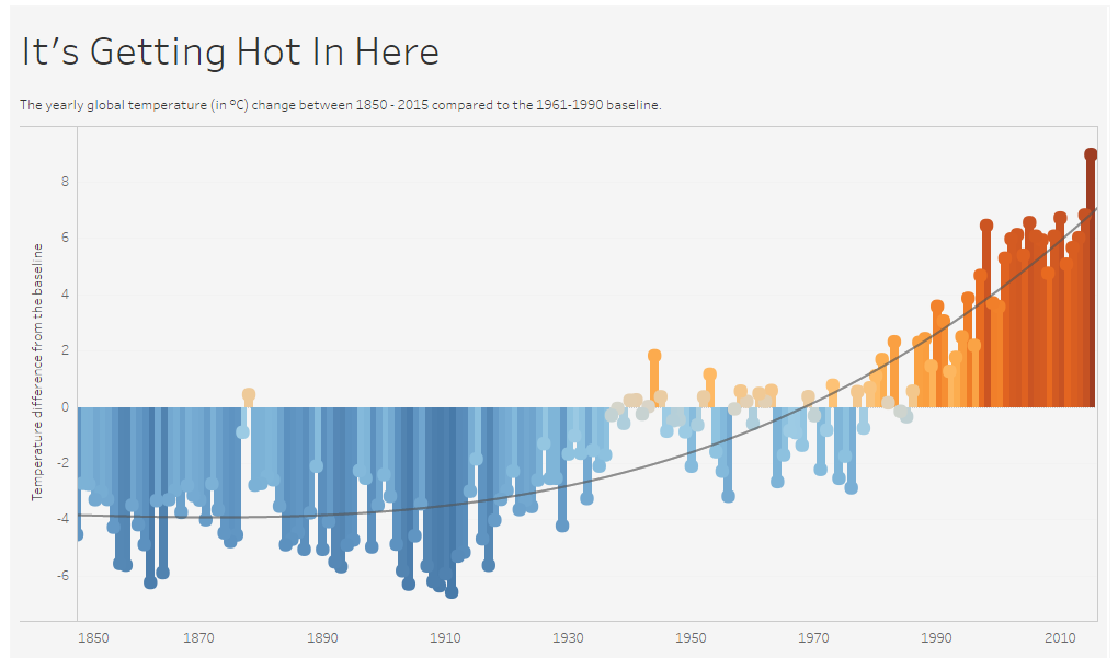
The final iteration of my visualisation is a straightforward bar chart displaying the difference in temperature each year. The shape is the same as what is represented in the line graph but I feel that it is more visually appealing to have the block of colour for each year. To add emphasis to the message I added a colour range for the temperature and a trendline to show how rapid the change has been in recent years.
Check out the full visualisation here.