During the Tableau London Conference 2015, Robert Kosara made a great presentation about data visualization and storytelling, and one of the examples he talked about, was this article from the NYT that shows the trends in time of auto fatalities related to the vehicle miles driven per capita using a connected scatter plot. As you can imagine, this is also possible to do it with Tableau, and it’s much more easier than you can expect.
For the next example I’m going to use the World Indicators dataset available with Tableau Desktop:
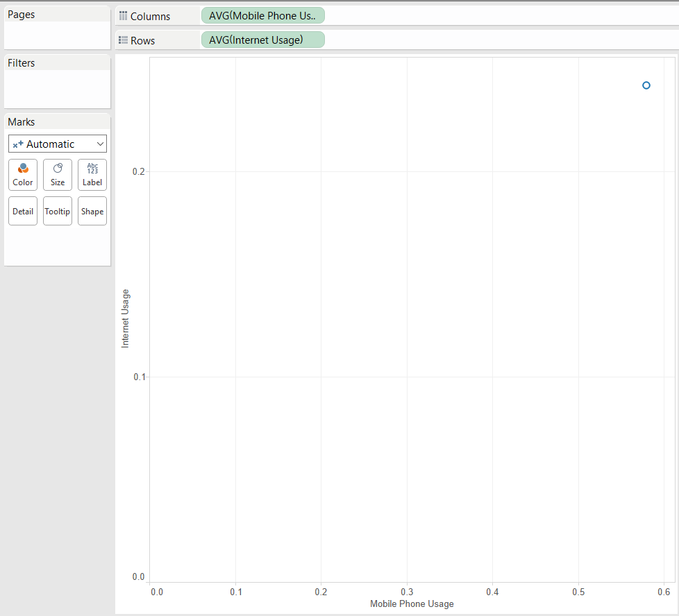
1) First of all, create your scatter plot with the two measures you want. In this case I’m going to use Internet Usage and Mobile Phone Usage, so I just double click in each of them:
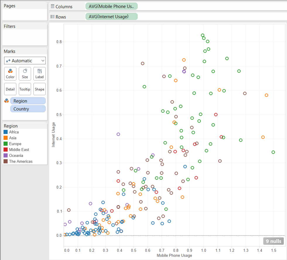
2) I want also to see all the countries in my viz, and color them by region, so just add Country to the Detail shelf in the Marks Card, and Region to the Color shelf.
3) And then change the Mark Type to Line. we will then see something like this:
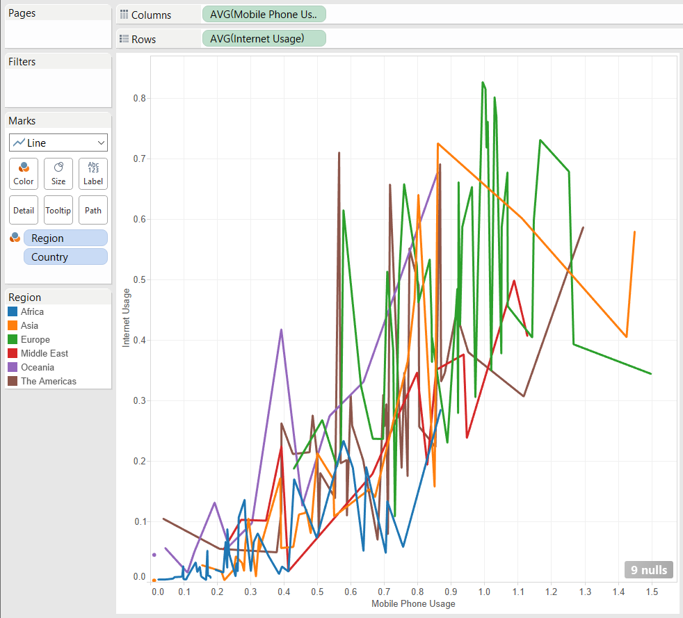
4) One final step can be just to drag the Year dimension and drop it in the Path Shelf of the Marks Card, so we will see the trends for each Country color by Region like this:
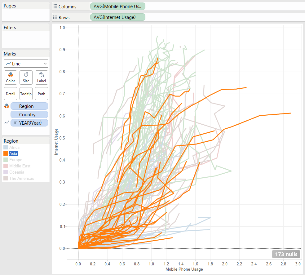
4) But, we can also animate this visualization. To do this, just change again your Mark Type from Line to Circle, drag the Year dimension that it’s on the Marks Card and drop it in the Pages Card. Then we only have to click on Show History and maybe also click in there to change how we want the trend to be shown, selecting to show All the marks, both Marks and Trails, and add a little bit of transparency in the Color shelf of the Marks Card, so we can have a viz like this that by just clicking Play will show us in a very nice animation the trends for all the Countries colored by Region:
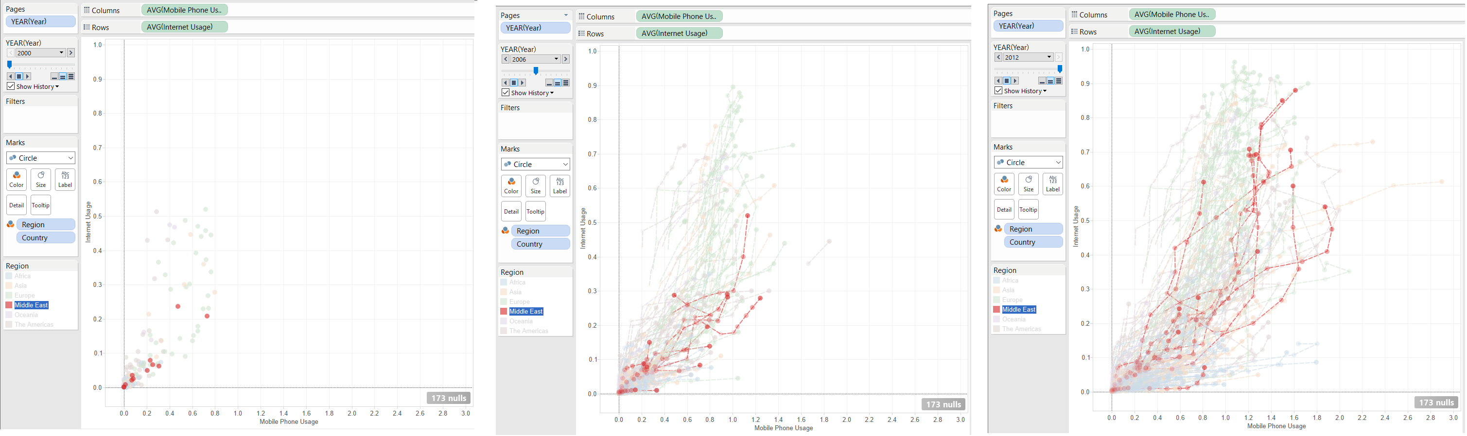
Maybe it’s also useful to double click on both axis and uncheck the Include zero option to zoom in the axis. As you can see, it’s a very good way to show trends in time between two measures with a very big level of detail. I love this chart!