Scatter Plots are one of my favorite chart types and is amazing all the things you can do with them in Tableau. Today’s tip is to explain how to use parameters to have dynamic reference lines and use another parameter to change the color of the points based on the points position based on the four quadrants generated by both reference lines, like in this example:
The first step is to create the Scatter Plot, so in this case we are going to open the World Indicators dataset that it’s available with Tableau, and:
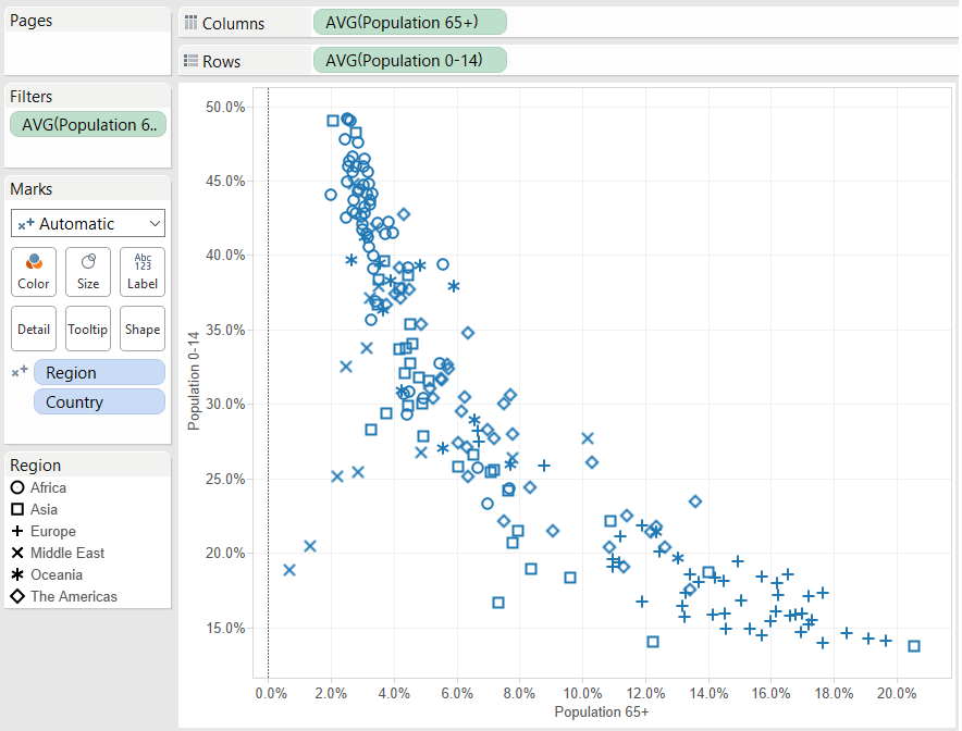
- Drop Population 0-14 to rows and Population 65+ to columns
- Drop Country to the Detail Card in the Marks Shelf
- Drop Region to the Shape Card in the Marks Shelf.
- Also, double click on each axis and uncheck the Include Zero option.
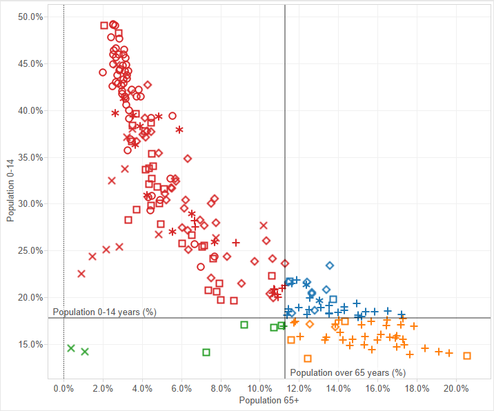
We will have then a mark for each country (with a different shape for each of the regions) and the relation between the percentage of population from 0 to 14 years old (vertical axis) and percentage of population above 65 years old (horizontal axis) that looks like this:
Now we will add the reference lines. To do so:
- Go to the Analytics pane, drag Reference Line to the Scatter Plot and drop it to add the line in your first axis.
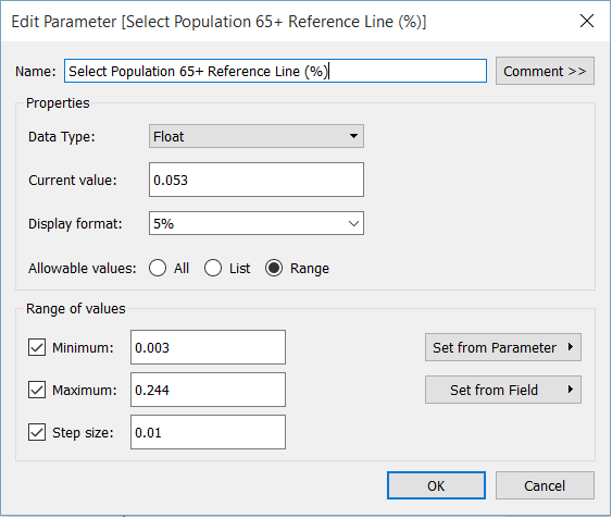
- In the Line Value choose Create a new Parameter and name it (Select Population Over 65 Reference Line for example).
- Change the Allowable Value to Range. And in the new options that are shown click on Set from Field and choose your measure (Population 65+ in this case). This will set automatically the minimum and maximum values of the parameters to the ones of the field.
- In this case we also have to change the display format to a percentage and the step size to 0.01 so we can change the parameter in steps of +1%.
- Repeat the process, but in this case for the other axis and using the other field in the parameter edition window.
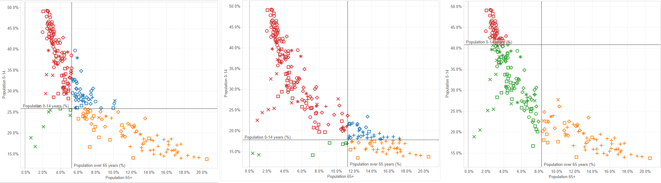
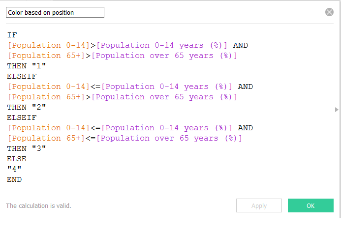
Now we only have to be able to change the color dynamically based on the position of each country in relation with the four quadrants generated by those two reference lines. So we create a calculated field that classifies the countries based on the value of both measures compared to the value of both parameters:
Now we just have to drag the new Color dimension just created and drop it into the Color Card, and the color of each country will change based in it’s position in four quadrants created by both reference lines, changing dynamically if we change the reference lines.