Yesterday we started in the Data School the Tableau Dashboard Week: one dashboard each day with a different dataset, and the first one was about the Olympic Games and medals won by country.
Andy gave us a dataset with these fields and a few hours to create the dashboard:
- Host City
- Host Country
- Year (from 1972 to 2014)
- Game (summer or winter)
- Country
- The number of bronze, silver, gold and total medals for each country
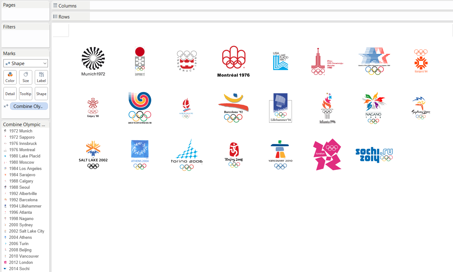
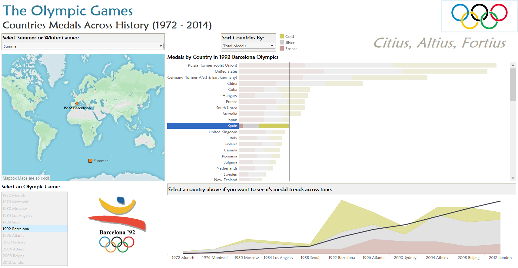
I decided to create something simple respecting the analysis and focus on a cool and clean design, so I started searching for all the Olympic games logos in Internet and finally found them in this webpage, with the idea of adding them to my Tableau’s shape folder and show each logo with the interaction of the user. A simple sheet with shapes as mark type and the Game field in the shape card it’s the fastest way to do it, and then edit each shape to it’s official logo. And added another sheet to show a list of all the Olympic games, so the user can choose one an visualize how many medals each country won in that concrete game.
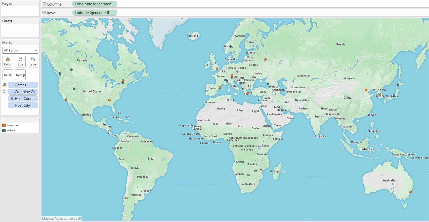
After that I created a simple map with dots showing each host city, but to make it a bit more unique I used mapbox to create a customized TMS map, and then colored each city by the type of Olympic game (summer or winter).
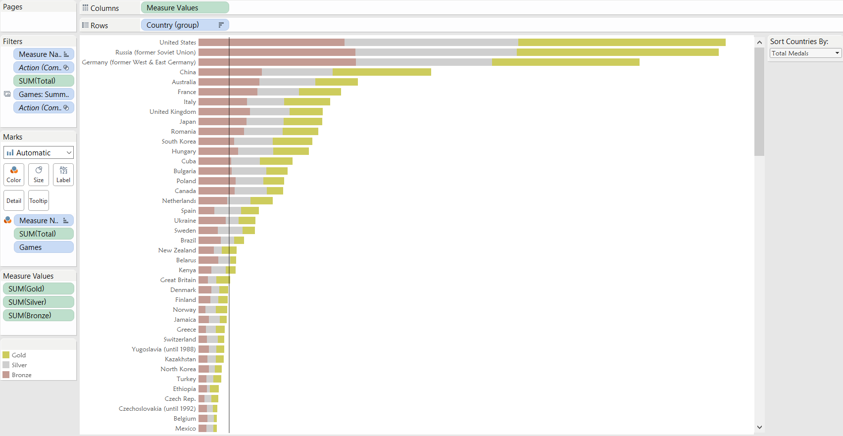
Once the map was ready it was time to start with the medals, so I created a simple stack bar chart showing the bronze, silver and gold medals for each country and a reference line showing the average medals won by country.I also edited the colors to make it easier and faster to identify the type of medal, added a parameter so the user can sort the chart by the total number of medals or by each type, and finally grouped some countries that changed their name during the dashboard’s time period (Russia and Soviet Union, Germany and West / East Germany, etc).
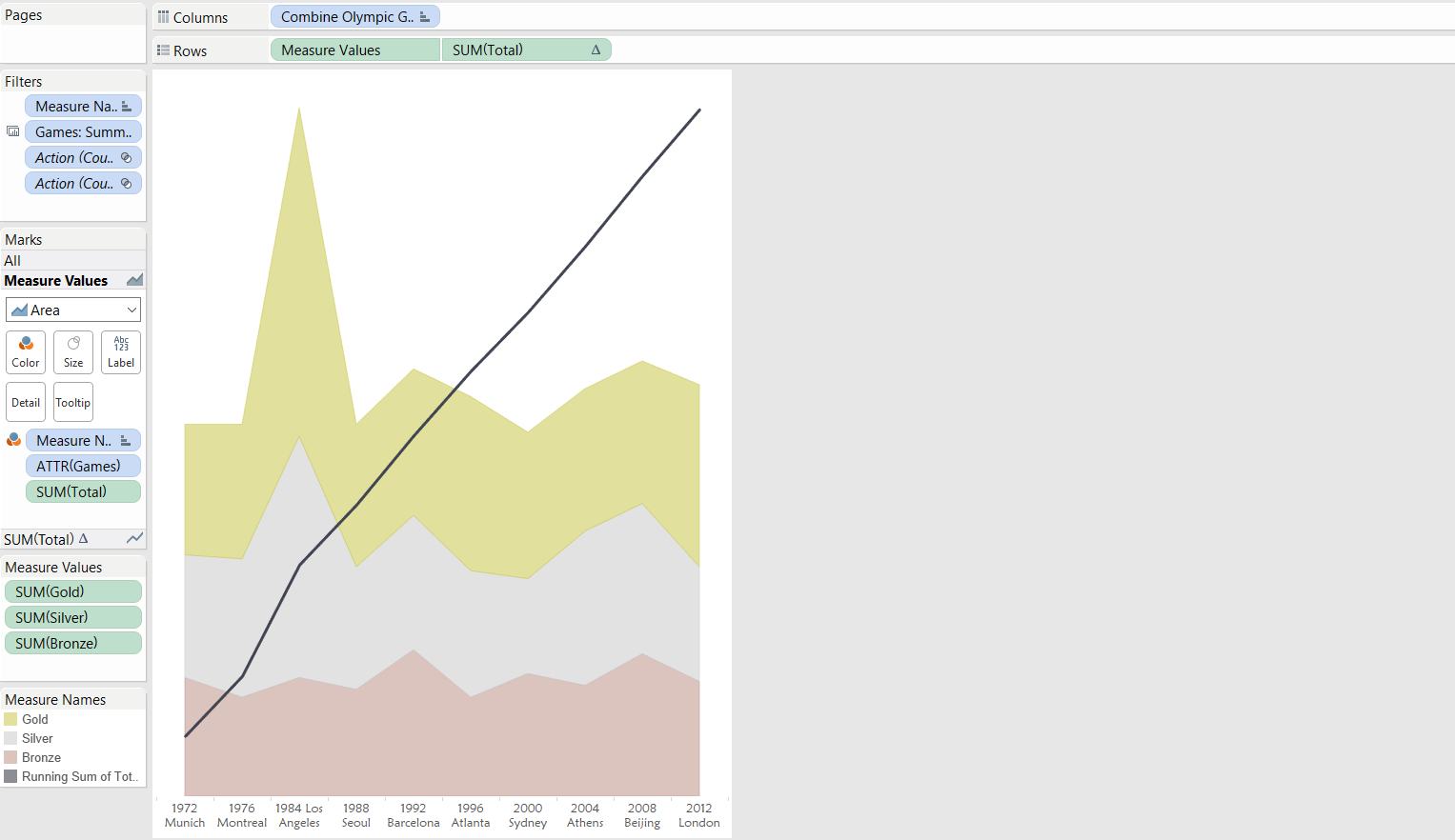
The last sheet was an ares chart, showing the trends of a country across time and a running total of medals during all the Olympics that country has participated.
With all my sheets ready it was dashboard building time. I selected a Greek Looking font, added the Olympics logo and motto: Citius, Altius, Fortius (Faster, Higher, Stronger), added all the sheets, edited the filters to highlight them a little bit and define all the actions, so all the dashboard is filtered by a summer game / winter game filter, the user can select a game from the map or the games list and the medals list by country it’s updated and that game’s logo appears, and select a concrete country to see it’s medals evolution. This is the final result.
You can also see it in action in my Tableau Public profile.