Today was day 2 of dashboard week, which was centred around intentional design and accessibility.
The brief I went for was to submit a pitch using real-world data to showcase a dashboard which meets WCAG 2.2 and GDS accessibility standards. I chose to use a Tube station dataset which had spatial data on all of the tube stations, along with some information on accessibility features e.g. step-free access, number of accessible toilets etc. I knew that scoping would be difficult today given the time-restraints, and because I had never researched the WCAG and GDS standards before, I knew I needed to be realistic with my time.
Research:
First I carried out some research on the WCAG and GDS standards, and took some time to fully understand my specific brief. The requirements included conforming to colour contrast rules for colour-blind safety, ensuring keyboard and screen-reader navigation worked properly, using descriptive headings and ALT text, and maintaining clear language with no abbreviations without explanation.
After this, I decided I would create a dashboard looking at a single Local Authority and its tube stations (Westminster). I wanted to display the amount of accessibility amongst the tube stations of Westminster as that was on theme and geographically relevant to the audience, and I could use that as the vessel to focus on creating accessible design that met the brief as much as I could.
Data Preparation:
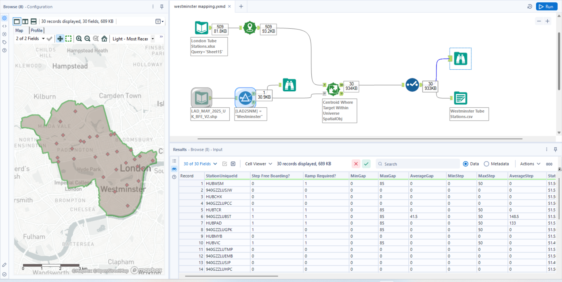
To do this I needed to do a bit of data preparation in Alteryx in order to match all of the tube stations within the local authority of Westminster, as this information was not present in the current dataset. I did this by downloading a ShapeFile of all of the local authorities in the UK and filtering to just Westminster, as I only wanted that as a spatial object. Then I used a spatial match tool with the local authority Westminster outline as the universe, created points from all of the tube stations using the longitude and latitude on the other branch, and then made the spatial match tool check which targets were within the 'universe' of the Westminster local authority. After that I did some quick cleaning to remove columns I did not need, checked datatypes, and then outputted my Westminster-only tube station dataset.

Then I set about sketching a plan of some charts I could create in the time remaining, deliberately keeping this simple so that I could focus more time on meeting accessibility requirements on the design side. If I had the chance to do this project again, I would have liked to have taken a more analytical route and not compromised more detailed analysis in order to focus on accessibility design, as they are not exclusive things and both can be done. Due to the time constraints and the fact I was completely new to designing in this way, where every element is intentional, I did focus more on design this time.
The Final Product:
For my final product, here are all of the choices I tried to deliberately make in order to meet those accessibility requirements and make something as inclusive and accessible as I could:
- Clear and descriptive title that immediately tells users what the dashboard is about
- No jargon, clear and accessible language throughout the dashboard
- Introductory text to summarise the whole dashboard where it fully describes everything. Normally I wouldn't detail everything or include this much text at the start, but I thought it would be helpful for text-to-speech users and for general accessibility
- KPI to contextualise the data and help with the overall understanding of the dashboard straight away
- High contrast map which I used Funkify to sense check against multiple different forms of colour blindness (not just red-green) and checked that it was visible from all of them
- Colours for the charts selected based on WCAG guidelines and checked with the Funkify app to make sure colours could be differentiated and the contrast between different colours was sufficient
- Maintained consistency in colours across different charts where I had a red colour for 'bad' things, a cyan colour for 'good' things, and a final different shade I used as well
- Kept legends at the top of each chart for easy reference
- Data labels on each pie chart in order to see exact values, and made the dashboard size big enough so that all labels were always visible and never got hidden due to size constraints
- Axis titles, grid lines and tick marks all left on to maintain that the bar chart was easy to understand
- Alternative text for each element so that when using a narrator it would clearly state exactly what the chart is and what it shows
If I Had More Time...
If I had more time, I would have definitely built in some interactivity and thought about the most accessible way to implement that. I would have also fixed the ordering of how the elements get tabbed through when using it hands-free, which also makes sense when using text-to-speech navigation.
