Dashboard week is over! The past five days have been undeniably intense, but also incredibly rewarding and enjoyable. As a sort of #ReflectiveLog I thought I’d look back over the past week, show all my dashboards in one place and also talk about what I’ve learned this week.
Monday – Roamin’ Holiday
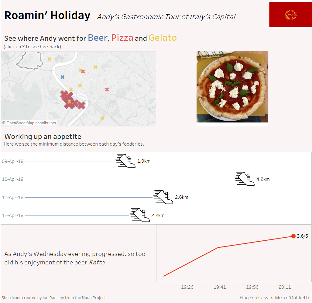
Monday taught us the hard way to expect the unexpected. Finding out after 3pm that we couldn’t use the data set we spent all day finding/scraping/cleaning could have been a crushing blow. Thankfully we at DS8 are a hardy lot and took the challenge of using Andy’s backup data with good humour. Not going to lie, Monday was a pretty late night for me as I went to the Alteryx User Group that evening when I had precious little made in Tableau. This was a recurring theme of Dashboard week, that I would spend too long in Alteryx – which is something I’ll speak about later.
This dashboard was my first time using web objects in Tableau. I was very happy with how they turned out, until I uploaded to Tableau Public where, for some reason, all the images were massively zoomed in.
Tuesday – El Niño
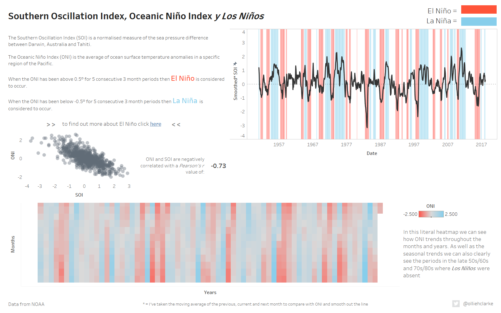
When Andy gave us our brief on Tuesday morning he mentioned that doing some predictive analytics might be a cool thing to do. So off we went blithely into Alteryx’s Time Series tools. However, accurately predicting Los Niños is serious business and none of us was able to create a satisfying prediction. Robbin came closest with a model which accurately predicts the seasonality whilst managing to get almost every actual value wrong. Nonetheless I was pretty happy with my overview dashboard which looks at a measure which strongly correlates with Los Niños. I think Tuesday was the day where my time management was best. Despite trying the time series tools, once I realised that I wouldn’t be able to get them to work, I quickly moved on and tried to makes something which wouldn’t rely on them.
Wednesday – Rick and Morty
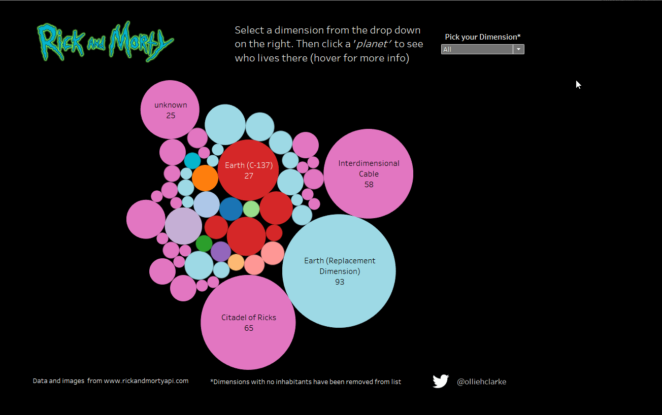
Wednesday was a very good day. I watch Rick and Morty, so I enjoyed exploring the dataset. It was also my first time connecting to an API (thankfully a very user-friendly one). Importing images as custom shape files to speed up the image in tooltips was also a really cool idea which I will almost certainly use again. In terms of my dashboard, while I like the way it looks, I think as a way of visualising a catalogue style dataset it probably isn’t that effective. Certainly Robbin’s dashboard does a much better job – if you haven’t seen it already, check it out here.
Thursday – American Crude Oil Imports
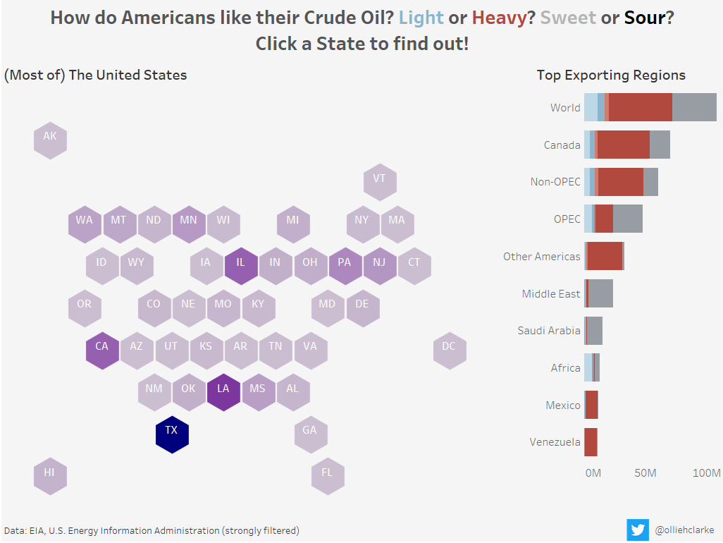
This was my last dashboard of Dashboard Week as I was helping Carl with some teaching on Friday. It is also my least favourite. Almost all of the lessons I have taken onboard to improve in the future were to be found in my work on Thursday. These can be winnowed down into 3 main points:
- Don’t waste time in Alteryx
- The dataset we got from the EIA website needed a lot of cleaning. I’m pretty task orientated – I like solving problems which is why I like Alteryx so much. However, I definitely lost focus of my main goal – to build a dashboard. Instead I spent far too much of the day in Alteryx cleaning and restructuring and solving small, possibly irrelevant problems.
- Have a plan
- It seems counter-intuitive at the time, but it is much more efficient to delay starting ‘work’ on a viz by thinking and drawing on some paper what you want to make. Data exploration is a necessary step, but I found that too often I was making graphs without putting a huge amount of thought into why I was making them. I’m definitely going to be stricter with myself going forward to try and minimise this in future.
- Tell a story
- It’s much easier to make exploratory dashboards. Often that is exactly what we should be making, but in this case I think an explanatory dashboard which tells a clear story would have been more interesting. This week I made exploratory or overview dashboards but was missing the final step in a couple of places to go and find/show a story within the data.
Final Thoughts

Courtesy of Gaby Av
In the early weeks of Data School, Dashboard Week felt like some mythical impossible task that put DSers through the wringer. Having come out the other side I can say that it is definitely not a cake walk, but it is a great experience. The amount I’ve learned this week is enormous – both in terms of Tableau and Alteryx skills, but also in terms of project/time management, planning and my own foibles. One thing is certain – the past week would have been immeasurably harder without the 7 other people around me to lean on, learn from and receive help from.
As always you can find me on twitter @olliehclarke
Chequered flag image courtesy of Ben Sutherland