It is often necessary to update graph headings, axis labels or other informative information depending on interactive filters and even when no filter is applied to data. In this blog I will be referring specifically to a #MakeoverMonday that I did on girls’ and women’s issues of five countries. The interactive dashboard can be found here.
Why update a label with a filter?
When a filter is applied it is not often clear what the changes are and what is indicated by the results. By updating a label with a filter, the data being shown is clearly labelled. As an example, I want the label marked with a red box below, to display ‘All Countries’ when the filter is not applied – thus showing the overall demographics for all countries and to make sure the user realise that this is what is being displayed – or to display the name of the country when the filter for a specific country was applied.
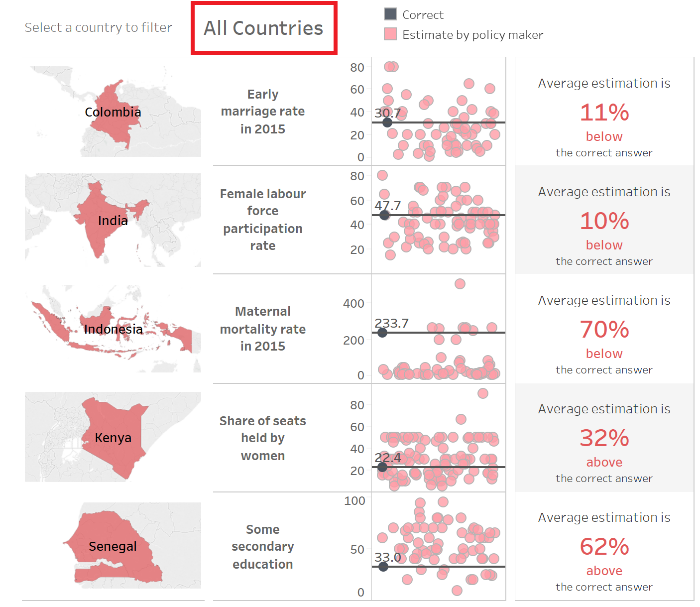
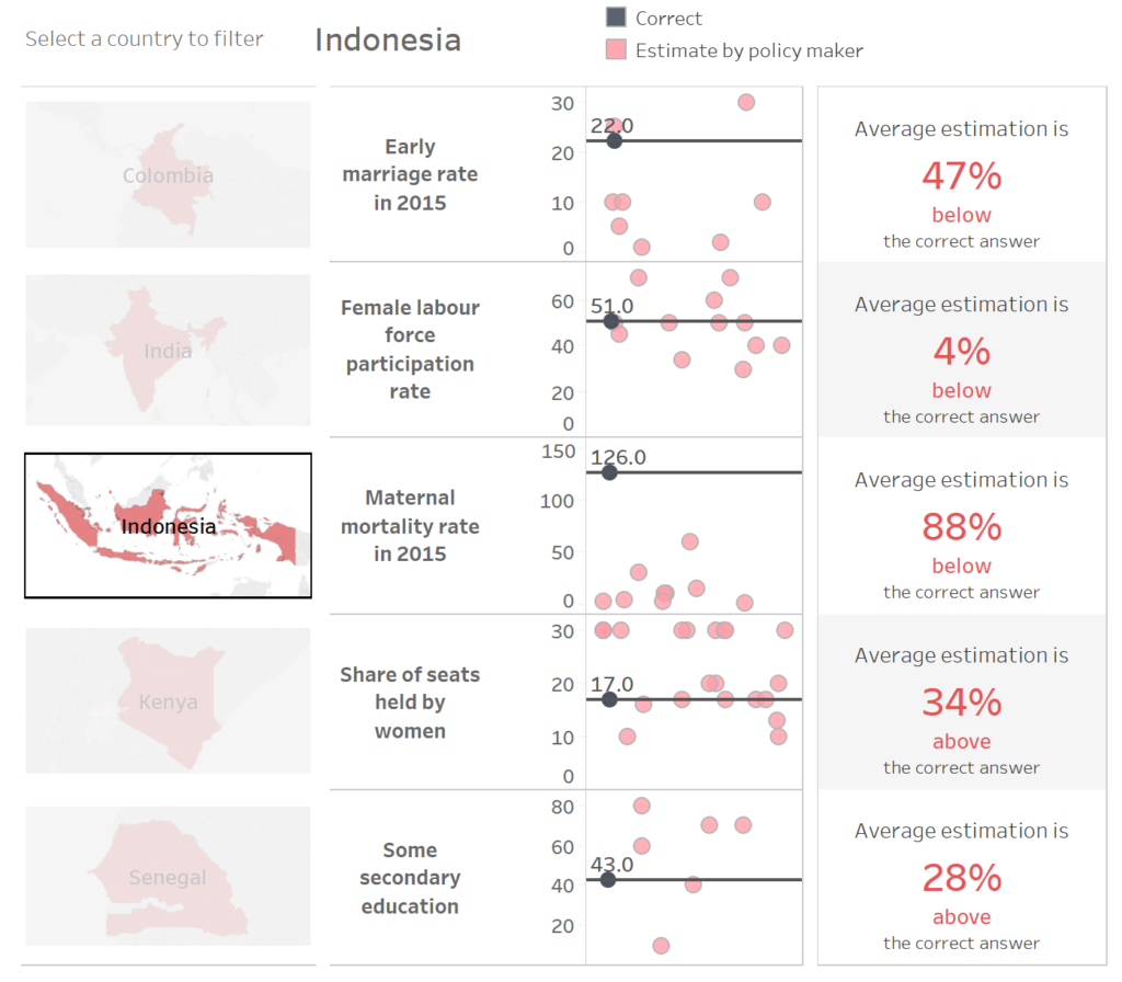
The image of each country acted as the filter. By selecting a certain country, a filter is applied, and the label is updated with the name of the country selected, as shown below.
The process
A calculation is needed to monitor whether a filter is applied or not. If a country is selected then the name of that country must be returned, else it is necessary to display another line of text.
Create a new calculated field: I named it ‘Country to Display’ and enter the text below.
IF COUNTD([Country]) = 1 THEN ATTR([Country]) ELSE ‘All Countries’ END
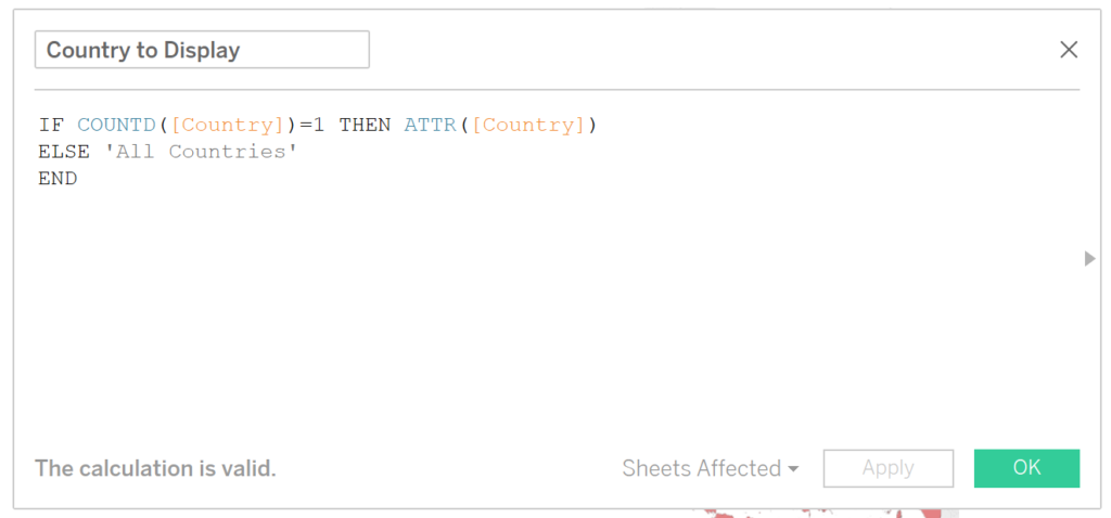
When the filter is not applied, the distinct count of the countries will be 5. By selecting a single country, the distinct count of the countries will be reduced to one, and the name of that country is returned. If more than one or none of the countries are selected than a value of the expression returns the string ‘All Countries’.
Incorporating the new calculated field
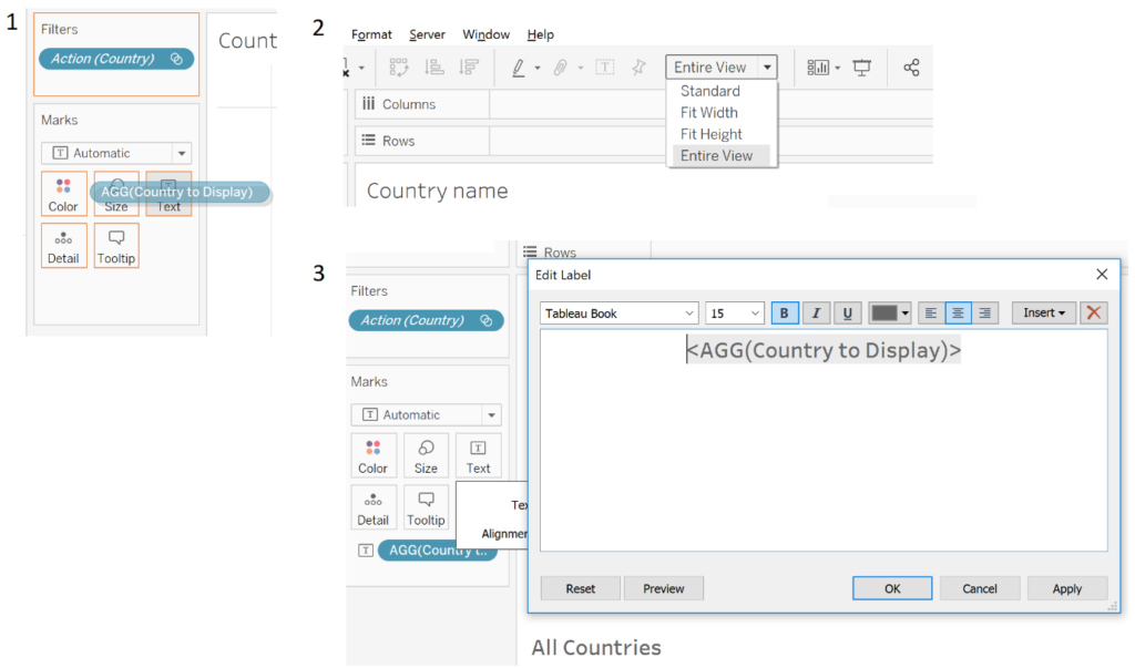
The next step is to incorporate the text into your dashboard as a title or heading. Normal titles cannot be updated using a calculation (as far as I’m aware), but it is possible to update the text in a sheet with a calculation. Therefore, create a new sheet and place your calculation on the Labels shelf in the Marks card. Change the view of your sheet so that the text fills the entire view and format the text as you would like it to display on your dashboard. The text in the created sheet will act as your heading or label that will be updated as you select a filter.
Add the new sheet to your dashboard
The final step is to bring the dashboard together and apply the filters to influence the different sheets on the dashboard. It is important to realise that now it is still possible to select more than a single filter which will display ‘All Countries’ instead of displaying a single label for a country.
When the dashboard is complete, select the Dashboard tab > Actions… > Add Action > Add action > Filter. A dialogue box will appear in which you can change how different filters are activated and which sheets they influence.
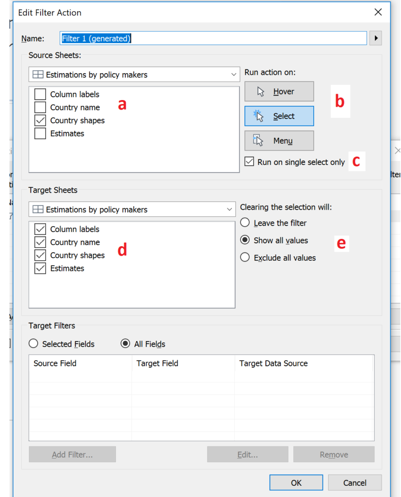
For my example, only the country shapes are used as the filter and therefore only the country names sheet is selected under the source sheets section (a). In the top-right corner (b), the ‘Select’ tab is selected because the filter needs to activate when the country shape is selected. Right below this option, a tick-box is available to ‘Run on single select only’ (c). This is selected as this option allows for a single select and will not allow for more than a single select in the filter. Under the target sheets (d), all the options are selected. In the middle-right (e), the options for what clearing the selection will do, are available. In my case, I wanted to show all values when clearing the selection. To apply the added action and all its properties, click OK.
Finally
Your dashboard is now ready. You will find that this technique lends towards a better user experience and it enables people not familiar with the data to immediately understand what you are communicating.
If you have any thoughts, please feel free to contact me on LinkedIn or Twitter.
Featured image: Stocksnap