An interesting task was brought up during our client project last week. We had created a control chart highlighting outliers based on a selected standard deviation. However, the client thought that since the audience for the dashboard would not be statisticians, it would be simpler to have the choice be a percentage of the total points in the view.
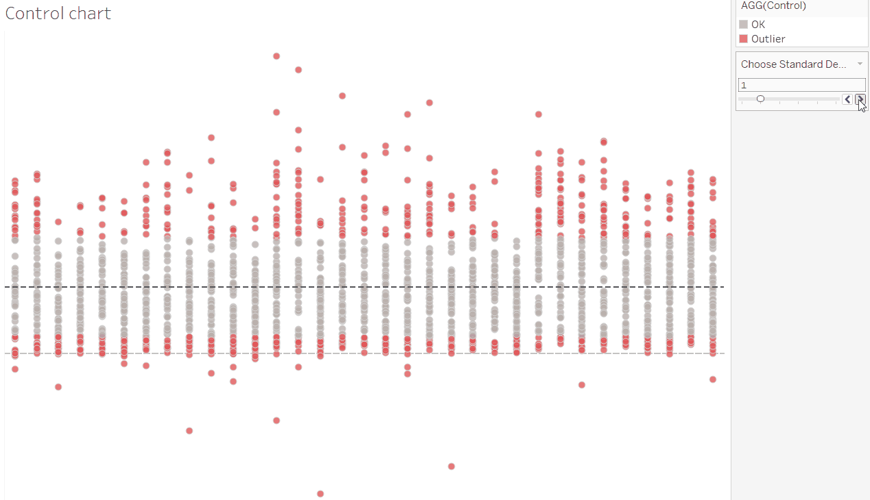
The original chart, with a slider to change the number of standard deviations beyond which to highlight
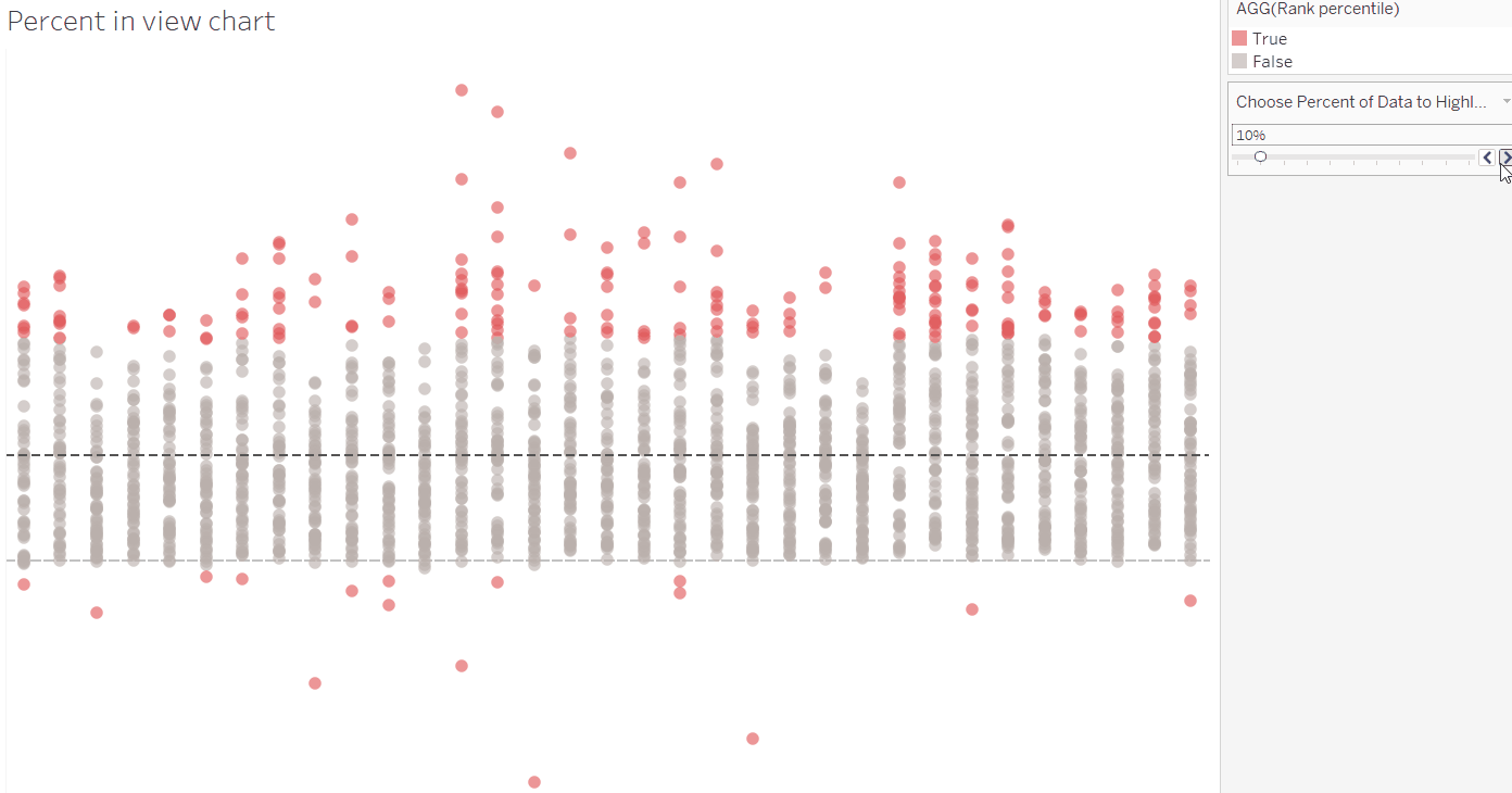
The aim – a chart with a slider to select the percentage of points furthest from the average to highlight
While I’ve built standard deviation control charts before, I had never tried one based on percentage before. Allow me to walk you through the process I followed. (Shout out to Gwilym for the assistance in wrapping my head around this one!)
The first step is to consider how far away each point is from the average, regardless of whether it is above or below. This can be done using the ABS function which returns the result as a positive value. The difference from average is calculated as follows using the table calculation function WINDOW_AVG:
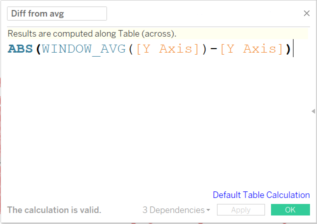
Calculation to return the absolute difference from the average for each point
Now that we have the difference, we need to rank each point by the percent away from the average that it is. This can be done with the RANK_PERCENTILE function, another table calculation.
Rank Percentile function descriptions in Tableau
When set to calculate at the cell level, this table calculation function assigns each point a percentage value away from the average, with the furthest point being 100%, and points at the average being 0%.
In this case, we need to compare the point’s percentile rank to the percent we want to highlight, so we’ll also need to include a parameter.
Rank Percentile boolean calculation to return true if a point is in the outer selected percent of points
The Choose Percent of Data to Highlight parameter is just a range of decimals (formatted to be percentage) from 0 to 1, with steps at 0.1 (10%) intervals.
The opposite of the percent parameter (1-[Parameter]) has been used in the calculation so that the outer points are the ones highlighted.
So with this calculated field on colour, we can choose the percent of points away from the average to highlight!