A radial graph is a graph rotating around the axis like a clock face. I took inspiration from Mina’s Clock Chart blog (/mina-ozgen/make-clock-chart/) to use Alteryx and Tableau to make years worth of data into circles; as I thought this was a good way to visualise the changing sizes of polar ice caps (a Makeover Monday dataset https://nsidc.org/arcticseaicenews/charctic-interactive-sea-ice-graph/). I will take you through how I used the tools on hand to make what I had envisioned.
The dates in the Excel file are given in normal format, however the DateTime tool in Alteryx can convert these dates into the day numbering of the year like so:
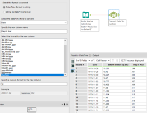
Once the dates are split into the day number of the year and the file is outputted for use we can move over to Tableau. Tableau can use either Radians or Degrees, coming from a mathematical background I prefer using Radians but if Degrees are your preferred measure then wherever 2Pi appears then replace this with 360.
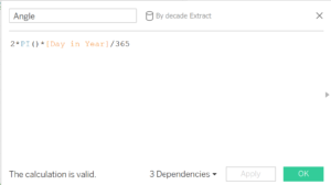
Our first step in Tableau is to set up the angle that will be used in later calculations. The calculated field for this angle is 2*PI()*[Day in Year]/365, this breaks the circle down into day segments and then multiplies this by the day number that is being plotted (as long as your days in the year field set to being a number).
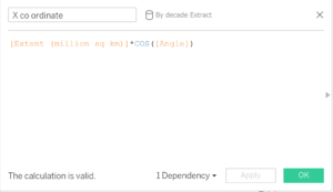
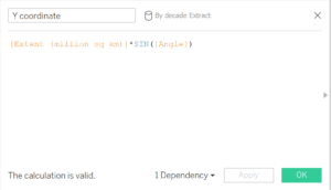
Then to plot the points on a graph we will need an x-coordinate and a y-coordinate, if you know some of that pesky trigonometry then you might recognise this. The x-coordinate will have the calculated field: r*COS([Angle]), and the y-coordinate will have the calculated field: r*SIN([Angle]), where r is the distance you want the point to be away from the centre (or the radius for a circle). In my example r will be the area of the ice cap on that day of the year.
Putting the y-coordinate to columns, the x-coordinate to rows and Day in Year to detail should then give you are circle. With this dataset going along exactly as followed in this blog then you should produce a graph that looks like this:
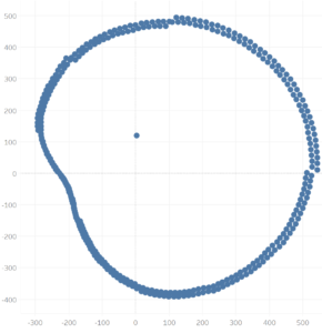
Whist this is messy due to the nature of the data, it can be cleaned up quite easily by breaking up the dates into years or decades to produce something like this:
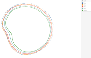
So it look like our ice caps are getting smaller…. And also September is consecutively the month of the year where the caps have the smallest area of ice.
I hope this blog helped you make the radial graph you wanted from your year, and hopefully will remind you to help treat the environment a little better!