Once again we started off the day by presenting our dashboards from the previous days, everyone got to proudly show off their Power BI creations! I showed off my dash about where the foreign monetary gifts were coming from and going to. (https://app.powerbi.com/view?r=eyJrIjoiMTE4Y2VhMzctZDUxYS00ZmMxLThlNDYtOGRiYzZhZTEwYjU5IiwidCI6ImNlZjk5OTUzLWM0OTYtNGE4MS1iMDYxLTNlYmU1ODRjY2ZjYyIsImMiOjh9)
We then were given our dataset, which was data about bike usage in Seattle (the city containing the Tableau head office!). More specifically it was data from points around the city where sensors had been set up to record how many bike (and for some how many pedestrians) were passing through that point on the road/track. I took data from 10 points around the city, which involved downloading and unioning together 11 files, one from each location plus an extra. As a challenge and to get a bit more used to the software, I did this in Tableau Prep. This ended up with a workflow looking like:
Due to the structure of the files the columns needed to be pivoted, and to be safe I did this before the union. The last file to be joined was a file containing the latitudes and longitudes of each of the stations, hand found by Ellie whilst I was attempting a different way of getting locations (which didn’t work).
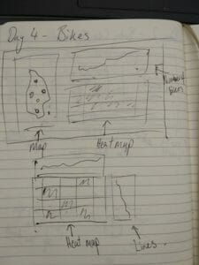
I started by drawing out what I imagined my dashboard could look like, and the dashboard the came out at the end was very close to what I drew. The drawing was:
The added surprise I threw in for myself was to add a sheet to tooltip, something that I had not done before. I tried my best to structure the dashboard in a way that I could see more overall information without the tooltip then the tooltip could be used for a more in depth view. The tooltip actually ended up showing me the areas that were mainly for commuters and those more for pleasure at weekends, so after pooling some ideas from around the office I made some LODs to calculate the bikes on weekdays and on weekends. Subtracting one from the other then gave me a scale that I could colour my station dots with to show if they are used more for commuting or pleasure. This viz ended up being one that I was actually super proud of as someone who isn’t too good at design, definitely one to be pinned on the Tableau Public!
The end dashboard looked like:
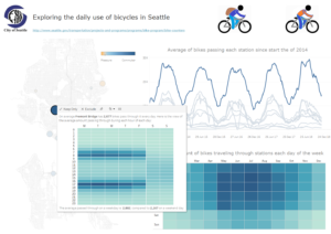
You can check it out here:
Thank you for reading and join us again tomorrow for a half day of rushed madness!