Since today is Monday, and every Monday is a MakeoverMonday, I thought this is the perfect time to share my approach to viz makeovers. During the first few days in DS5 we were doing lots of makeovers, and the week’s highlight was to present the makeover of our initial applications to Data School.
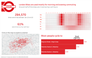
My application viz was about London bicycles based on the historical usage from TFL data, which I prepared back in November.
The first thing that pops out to me now is that there is no story, no interesting facts. It’s just a bunch of data in graphs and charts. Otherwise I kind of liked what I did, and it was difficult to overcome my attachment to the original viz.
Step 1. Analyse the original
When we do a makeover at DS, we start by defining what was the intent of the visualisation, what works well and what doesn’t work.
- My intent was to show London bike rentals (I know there is still no story in here).
- I liked that the viz was interactive and that everyone could explore and relate to the area they know.
- I think that it was a bit confusing and ambiguous
Thus the goal was to preserve interactivity but make the viz easier to understand, and of course find something interesting in the data that is worth telling a story about!
Step 2. Deconstruct the original
After identifying my goals, the makeover slowed down. I still could not figure out what other chart types I should use … or even what to show exactly. I still had no question to answer.
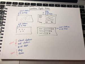
I didn’t want to diverge much from the original or to use additional data. To avoid any distractions, I “deconstructed” my original viz on paper, and noted what dimensions and measures would go into each chart.
After listing all the components, it became obvious what my data is showing.
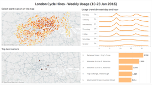
Step 3. Choose an appropriate chart type
At this point my focus was to visualise where and when bikes were hired. While exploring this data an interesting fact surfaced: more than half of the bike hires occurred during rush hour.
I find that choosing a chart type is a relatively easy task after you know what you want to show, especially when you have Chart Chooser cards. I always turn to them for inspiration if I want to make anything other than a bar chart!
Step 4. Ask for a feedback
I always ask a few people for feedback, as it shows if the viz is easy to understand and you might get some great new ideas.
Step 5. Publish it on Tableau Public