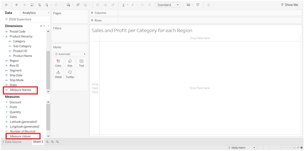
Both Measure Names and Measure Values have always been something of a mystery to me when using Tableau. I didn’t understand what they were used for or why they popped up in various areas of my view. However breaking the process down to understand how they work has really helped me!
Measure Names and Measure Values are placeholders that are automatically created by Tableau and will appear at the end of the dimensions and measures columns (see below). They are very useful in cases where you would like to see not just one but multiple measures on the same graph.
Example:
If we wanted to create a simple table showing the total sales SUM(Sales) and total profit SUM(Profit) for each product category in each region in US, we would start by creating the below:
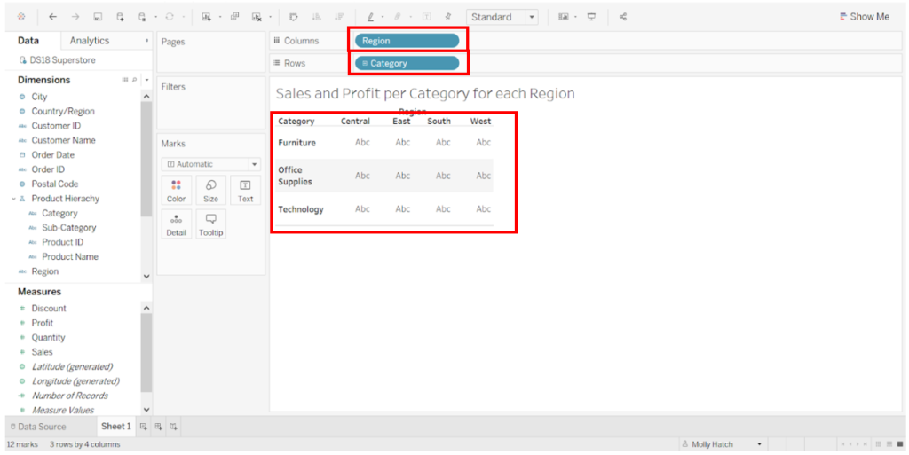
We can see that both Region and Category are coloured blue in the column and row shelf as they are discrete fields. They have broken down our view into 4 columns (for each region) and 3 rows (for each category). This creates 3*4=12 cells.
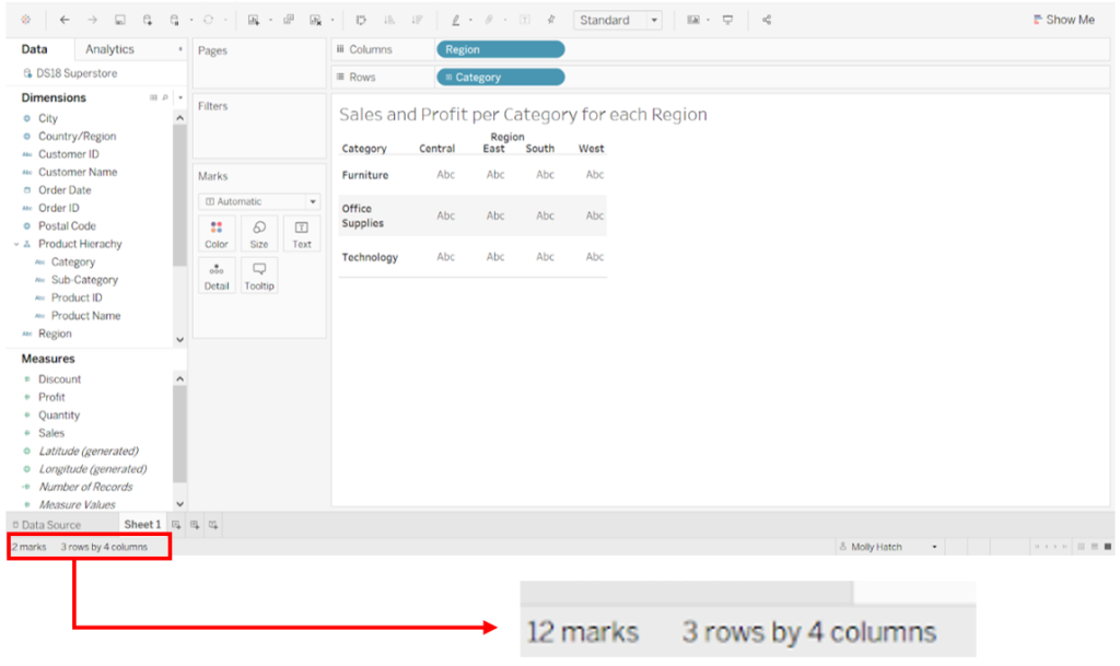
This is illustrated in the bottom left hand corner: 12 marks, 3 rows, 4 columns.
To show total sales in this text table, we would drag sales onto the text marks card:
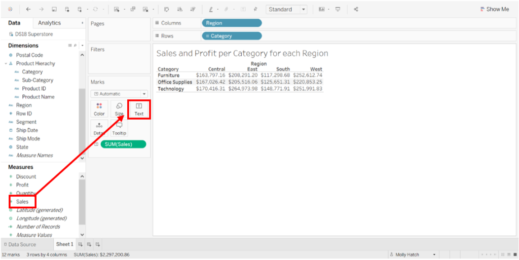
Now we can see total sales for each category in each region. Notice the bottom left hand corner has not changed – it remains as 12 marks, 3 rows and 4 columns.
If we now wanted to add total profit into this view, we would drag profit on to the text marks card:
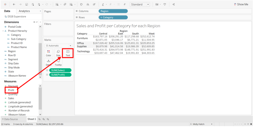
By adding profit into our table and using the logic applied above, we would assume that although the columns would remain 4, the rows would become 6 (as we are breaking down each category into total profit and total sales) and the marks value would become 24 (as we are doubling the amount of values).
To summarise, we would expect: 4 (regions) x 3 (categories) x 2 (Sales and Profit) = 24 cells.
However we can see that the bottom left hand corner still reads as 12 marks as each cell contains both Total Sales and Total Profit.
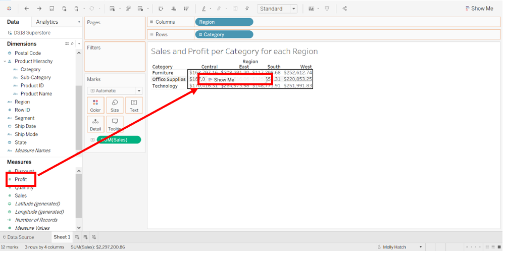
In order to correct this, we would need to break each category down to separate Total Sales and Total Profit.
We therefore need a dimension, as they help us categorise and divide up our data. Instead of dragging Total Profit onto the text marks card as we did previously, we would drag it directly onto the pane:
We can now see the following:

Notice that we have achieved what we were aiming for: 24 marks and 6 rows and we can clearly see both total sales and total profit separated in our text table. Success!
We can now see that Tableau has automatically added multiple elements to our view such as the Measure Names on the rows shelf (notice how it is now blue which signifies discrete data) and Measure Values on the Marks Card.
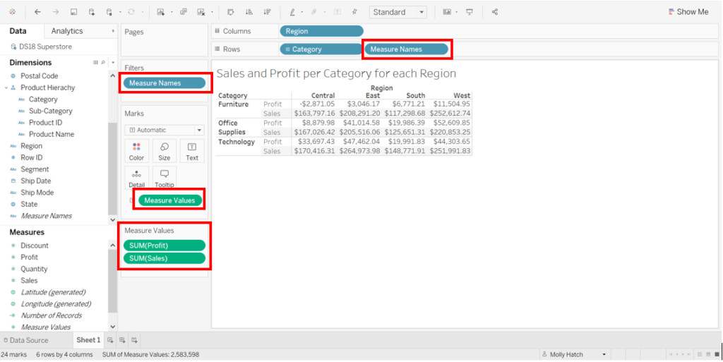
Tableau has also added the Measure Names onto the filter shelf. Looking further into this we can see that only sales and profit are ticked as these are the measures we have dragged directly onto the pane.
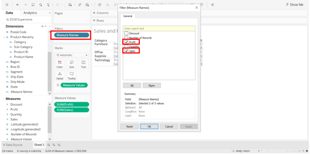
We have now successfully achieved our text table which shows the Profit and Sales per category per region!

Photo by William Warby on Unsplash