For this topic, I will be using the Makeover Monday ’19 Week 1 NHL dataset.
I had produced a very simple dashboard that compares the Home Attendance and Road Attendance for every NHL team, filtering by each season. The chart shown in my dashboard is a butterfly chart, if you would like to know how to produce a butterfly chart then click here.
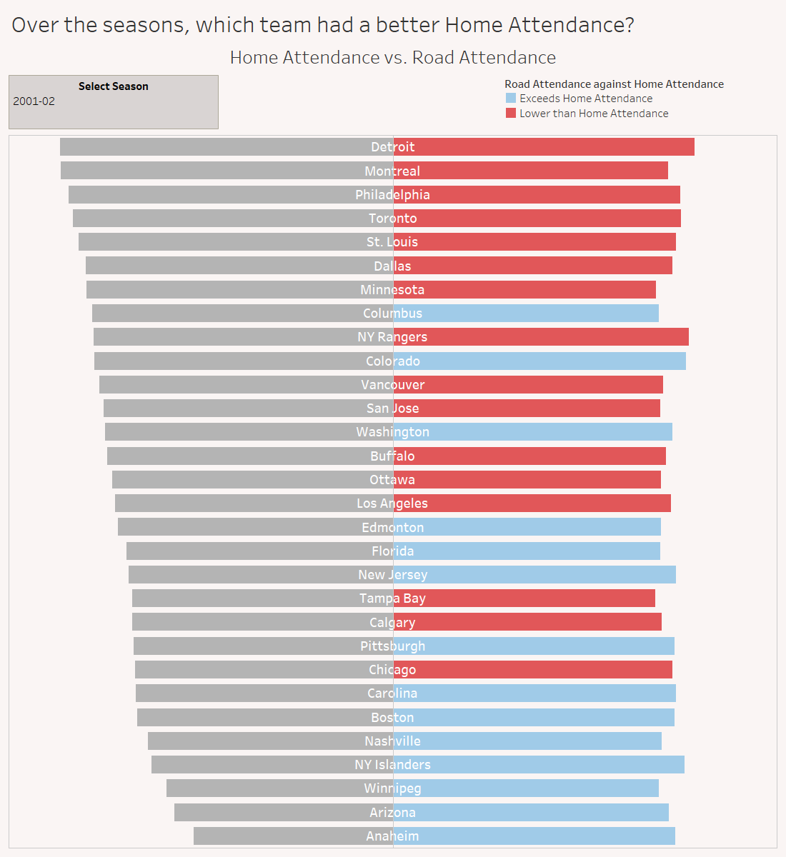
Image 1 – Dashboard on Makeover Monday ’19 W1 filtered on Season 2001-02.
With my viz, I wanted to show, by colour, which teams had exceeded (or not) Road Attendance over Home Attendance.
How do you do this?
Firstly, the chart will look like Image 2.
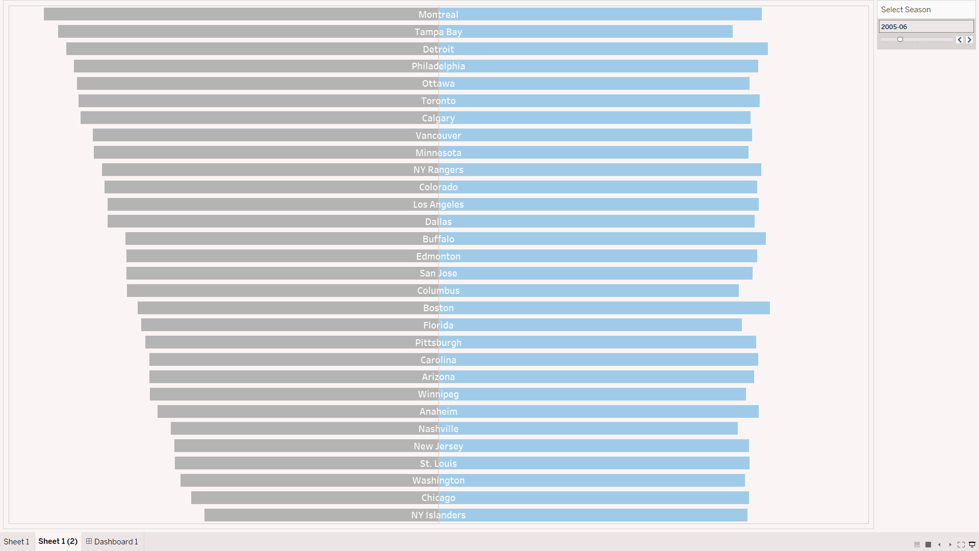
Image 2 – Butterfly chart comparing NHL Road Attendance and Home Attendance.
To make the Road Attendance side of the chart change colour, create a calculated field and type as follows in Image 3.
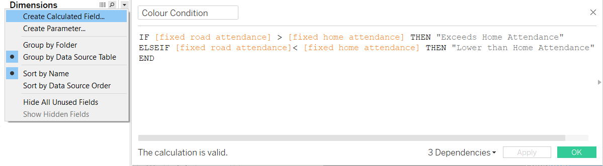
Image 3 – Colour condition calculated field entry.
This calculated field is simply assigning corresponding string values to when you meet either [fixed road attendance] > [fixed home attendance] or [fixed road attendance] < [fixed home attendance].
The calculated field will appear in the Dimensions section in the Data pane. Drag and drop the field into Colour in the SUM([Road Attendance]) Marks card.
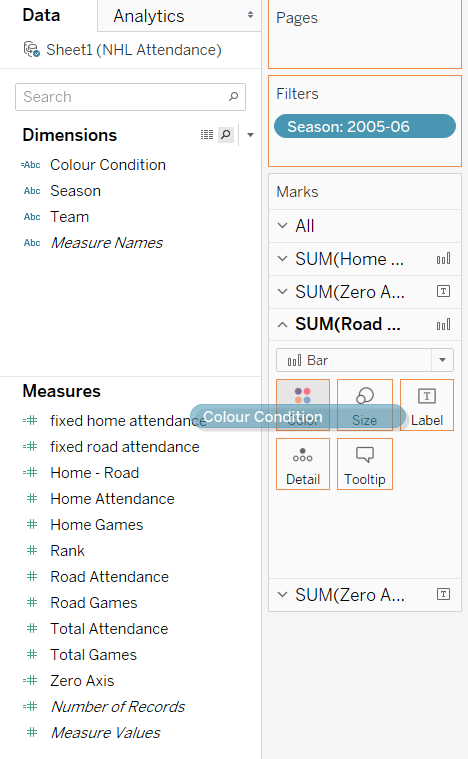
Image 4 – Drag the colour condition calculated field into Colour in the Marks card.
Your Road Attendance side of the chart should now change colours according to the calculated field.
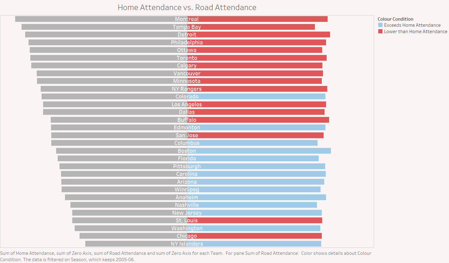
Image 5 – Final outcome.
