Did you know you can let the user choose the date level in Tableau dashboards? I didn’t til yesterday, and it is now top of my list of cool Tableau features (I also didn’t have one of those til yesterday).
To do this, we will use parameters. Parameters add interactivity to dashboards and give users more control. For example, you can let users choose the position of reference lines, let them sort by different fields, decide the level of detail of a graph, etc etc etc.
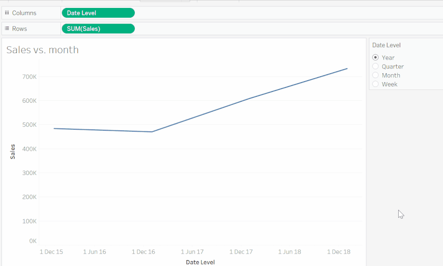
In this post, we will focus on letting the user choose the ‘date level’. What do I mean by that? Say you have a graph like the one below, plotted from the Sample Superstore dataset. The sales are shown for every month in the dataset.
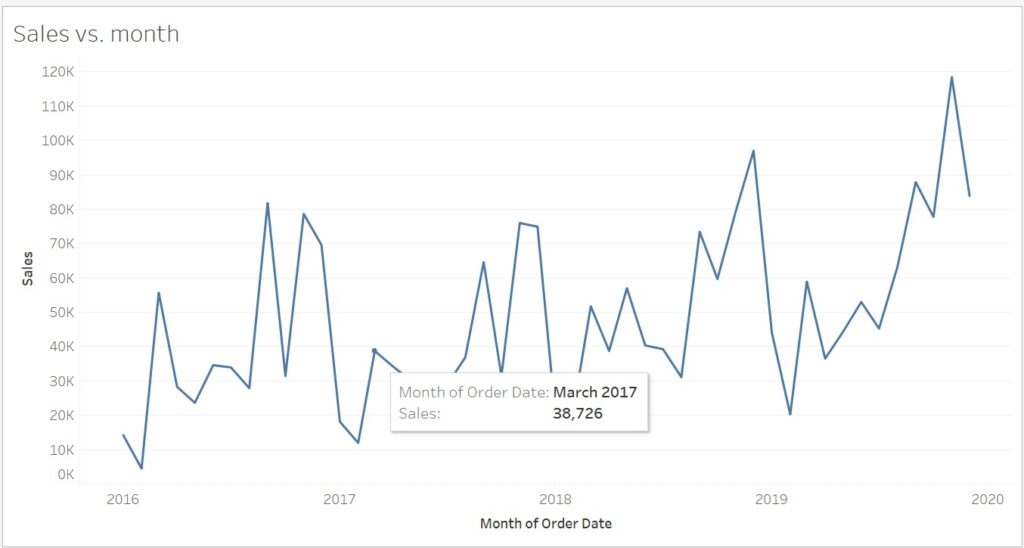
But the dataset includes sale values for every day. So you might want to let the user choose whether they want to see the sales broken down by days, months, or even quarters or years. Luckily, Tableau lets you do this.
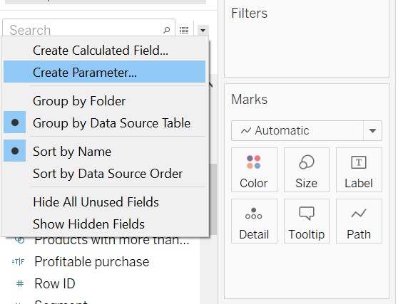
First, create a new parameter by clicking on the carrot to the left of the search box (Fig2). In the dialog box that pops up, give your parameter a name and configure the parameter to be a string (the user will choose between the options ‘year’, ‘quarter’, etc).
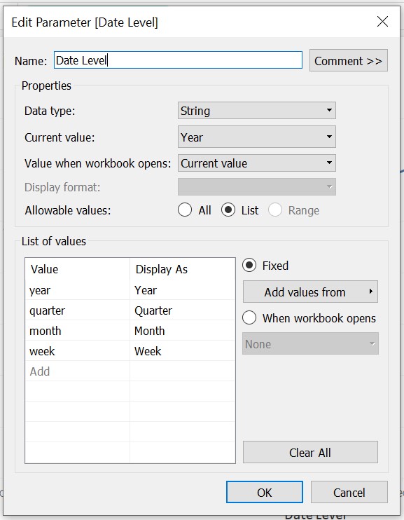
We want the user to be presented with a list of allowable values, so tick the ‘list’ radio button. Now we need to list all the options the user can choose from. It is very important that the ‘values’ be lower case, because that is the syntax used by Tableau to refer to dates. The ‘display as’ column, on the other hand, are the options the user will be presented with, so you can spell them however you like (as long as they are intelligible to the user).
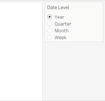
Next, find the parameter you just created in the sidebar and click ‘show parameter’. The parameter control should pop up in your view. There are different ways to let the user control the parameter. For this specific use case, I would recommend the ‘Single Value List’.
The parameter is ready, but if you click on any of the options, it doesn’t do anything …yet. Remember in our initial view (Fig 1), we plotted Sales vs. Month. Instead of the Month field, we want something dynamic that can change between month, week, etc. If we double-click on the month field in the view in Fig1, we can see it is actually a calculated field: DATETRUNC(‘month’, [Order Date])
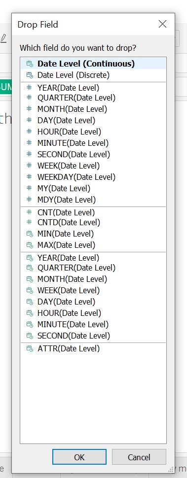
So let’s create a new calculated field by clicking on the same carrot as we did before to create a parameter, and choosing ‘Create Calculated Field…’. Then instead of ‘month’ let’s use the parameter we just created. The calculated field should look something like this: DATETRUNC([Parameters].[Date Level], [Order Date]). Click OK and then right-click and drag the new calculated field into columns. When the menu pops up (Fig4), choose the first option (continuous).
And now, if you toggle the radio buttons, magic happens:
Notice that the axis labels don’t change as you click through the date level options. Check out Steph’s blog for a nifty tutorial on how to do that.
Hope you have fun using date level parameters in you dashboards. Check out my Tableau Public profile and follow me on Twitter at @MBedarida