It is very difficult to talk about dimensions and measures without talking about continuous and discrete fields (also known as green and blue). That is because dimensions are typically discrete blue fields, and measures are typically continuous green fields. But using colors to explain the difference between dimensions and measures can cloud one’s understanding of the latter. So here is my attempt at explaining dimensions and measures without mentioning continuous and discrete fields (starting now!).
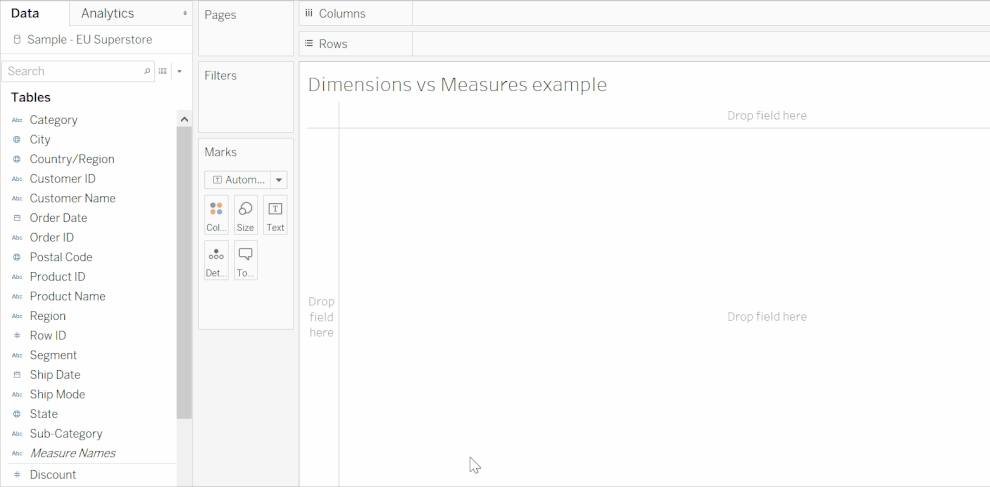
When you connect to a data source, Tableau automatically assigns each field in the data source as a dimension or a measure. You can find these in the data pane which is split into two sections: dimensions at the top, and measures at the bottom. A faint gray line separates D’s from M’s (see Figure 1).

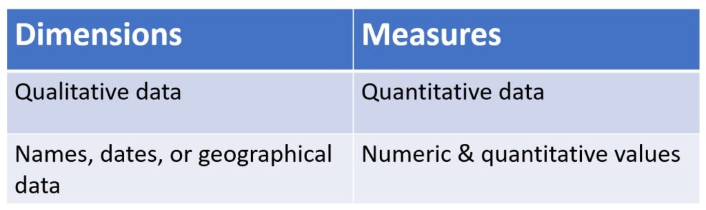
Dimensions typically contain qualitative values (such as names, dates, or geographical data). And measures typically contain things you can measure, like numeric and quantitative values.
But there is a more important conceptual difference. Dimensions split up the data set into different categories and reveal different levels of detail in the data. In order to understand what this means, let’s look at an example using the Sample Superstore data set. Let’s put Segment and Region on the rows shelf, and Order Date (in years) on the columns shelf.
Notice how every time a new dimension is dragged onto a rows or columns shelf, the view is split up more and more.
The status bar underneath the view is a good indicator of what is happening. When the segment field is brought into the view, the status bar says ‘3 marks’. That is because there are three different segments in our dataset (Consumer, Corporate, and Home Office).
When we bring the Region field into the view, there are now 12 marks: one for each Segment and Region (North, East, South, West).
And finally, when we bring in the year, there are 48 marks (12 times 4 years in the dataset).

Now look what happens if we bring Sales (a measure) into the view:
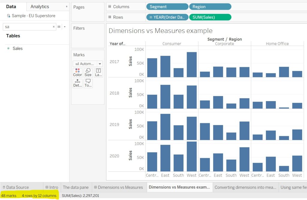
There are still 48 marks in the view. Sales didn’t create new marks because it is a measure. Instead, it populated the already-existing marks.
Notice that ‘Sales’ automatically became ‘Sum(Sales)’ when placed on the Rows shelf. That is because each of the 48 marks in the view is made up of a lot of rows in the data (each row in the dataset represents a single order). When Tableau calculates the total sales for all consumer goods in the central region in 2017, it has to add up all the relevant rows from the dataset. This is another distinguishing feature of measures: they are aggregated.
In this case, Sales was automatically aggregated as a Sum, but you can change the aggregation type by clicking on the carrot in the sales field on the rows shelf. For example, you might be interested in the average or median of sales.
Converting measures into dimensions or dimensions into measures
Sometimes, Tableau automatically classifies a field as a dimension even though you want to aggregate it. And vice versa, sometimes Tableau will classify something as a measure even though you intend to split up the view with it. That is not a problem because we can easily convert dimensions into measures and vice versa. Let’s look at an example.
In the Sample Superstore dataset, Tableau has automatically classified the Quantity field as a measure. It assumes that we will want to know the sum or average of items bought. But what if we want to know how many items were ordered together with other identical items?
We can start by dragging quantity onto rows. We then need to convert quantity into a dimension. We can do this by selecting the quantity field and dragging it above the orange line that appears into the dimensions area. And finally, we drag Quantity (which is now a dimension) onto the columns shelf.
This bar graph shows us that only a minority of items (less than 1k) were the only one of that item in an order. The majority of items were ordered in groups as big as fourteen identical items in an order. For example, 6150 items were ordered as part of a group of 5 identical items. In other words, there were 6150/5 = 1230 orders in which somebody bought 5 identical items. I apologise if this is confusing – the key takeaway message here is that a field can be used as a dimension or measure depending on what question you are trying to answer. And, if after having converted a field into a dimension or measure, you change your mind, you can drag it back to measures / dimensions where it was before.
I hope this blog post helped shed some light on dimensions and measures and how they can be used to your advantage to gain insight into your data.
Thanks for reading, and feel free to check out my Tableau Public profile or contact me on Twitter at @MBedarida if you have any questions or comments.