The last time I heard the phrase “Standard Deviation” was a good twenty years ago during my GCSE Maths classes and to be honest it very much went in one ear and out the other. So this week it was time for me to go back to school again and revisit those long forgotten teenage years, as we learned to build some of more advanced chart types with Tableau. (Special thanks to Carl Allchin for patiently talking me through this and showing us all kinds of funky advanced Tableau tricks this week.)
What is Standard Deviation?
“In statistics, the standard deviation (SD, also represented by the Greek letter sigma σ or the Latin letter s) is a measure that is used to quantify the amount of variation or dispersion of a set of data values” (Wikipedia)
If a data distribution is approximately normal then about 68 percent of the data values should fall within one standard deviation of the mean. For two standard deviations then 95% of the data values should be encompassed. For three standard deviations then almost all the data should be covered.
Look at the bell curve diagrams below and you can see the central line in each represents the mean average line. The blue shaded areas equate to 1 SD in the left image, 2 SD in the centre image and 3 SD in the right.

How would you visualise this on a chart? Here’s one way:
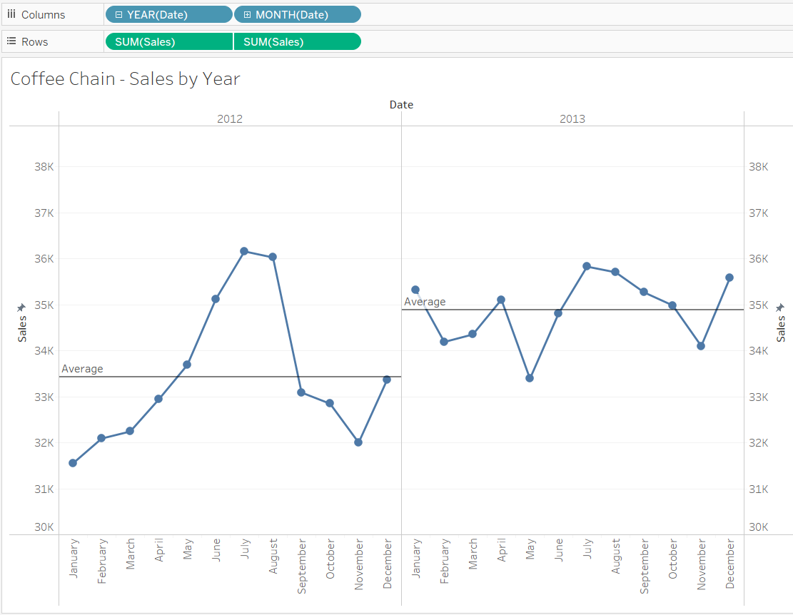
The Control Chart
Behold – the Control Chart. It’s a line graph of sales over time, with the mean average sales shown as a reference line, and the upper and lower limits of 1 Standard Deviation shown as a reference band (shared grey).

Okay, so how do I make one?
I’m glad you asked. First make a normal line graph – the example is Sales over Time.
YEAR(Date) and MONTH(Date) are discrete fields on Columns and SUM([Sales]) is continuous on Rows. This is a dual axis chart so throw another SUM([Sales]) onto the Rows, dual axis it and then synchronise the axis. Turn the second axis Marks card (called SUM(Sales)(2) from a line chart to a circle in order to get the dots. We’ll colour those later. Then go to the Analytics pane and chuck an Average Line onto the view. This should be across Pane rather than Window, since we are looking at two separate years.
Next, we need to add our reference band. This requires two calculated fields – one for the lower limit (i.e. -1 Standard Deviation), and one for the upper limit (i.e. +1 Standard Deviation). We’ll call them “Lower Limit” and “Upper Limit”
Lower Limit Calc:
WINDOW_AVG(SUM([Sales])) - WINDOW_STDEV(SUM([Sales]))
Upper Limit Calc:
WINDOW_AVG(SUM([Sales])) + WINDOW_STDEV(SUM([Sales]))
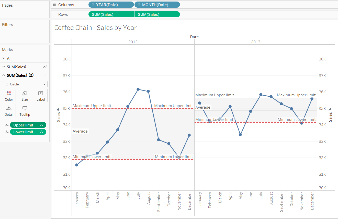
Drag the two fields on to Detail in the Marks card and then drag a Reference Band from the Analytics pane onto the view, remembering to choose Pane since we are still looking at two separate years.
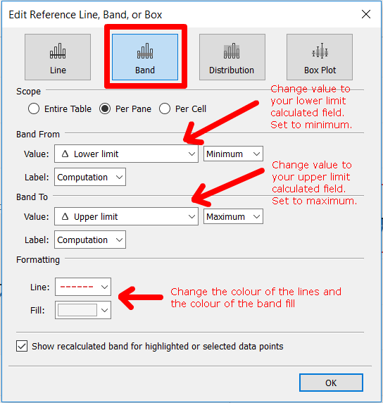
Change the values to match your Calculated Fields and choose ‘Minimum’ for your Lower and ‘Maximum’ for your Upper. You can also change the colours and formatting of the lines and fill here.
Now you’ll have a lovely reference band on your chart but wait, you’re not finished yet! The ref band will undoubtedly not be displaying correctly as it will be calculating across the table by default, rather than across the pane (see my previous blog about table calcs) so you’ll need to change Compute Using in your table calc to Pane (across). Ta Da!! It should look like this:
You can easily add colour to the chart to show whether the data points fall in or out of control with another calculated field and then dragging that onto colour. Call it “KPIs”:
IF
SUM (Sales) > [Upper limit]
or
SUM (Sales) < [Lower limit]
THEN "Out of Control" ELSE "In Control" END
You will then have a lovely chart which shows all data points which fall within 1 Standard Deviation as blue, and all the outliers as orange. Next time I’ll explain how you can add a parameter to the chart in order to control the reference band to multiple SDs, which will also dynamically recolour the points according to whether they fall ‘in’ or ‘out of control’.
