Last time I showed you how to make a simple control chart like this….

….now let’s add a parameter control to it so that we can change the standard deviation limits and make the colours change dynamically depending on what you choose.
Parameters – useful little blighters
Parameters are amazing – they have the potential to add so much to your visualisations. They can allow you to change the data in your chart views without having to build out loads of extra worksheets. Or you can build all the worksheets your heart desires and then use a parameter on a dashboard to switch between them (read about how to do that on Bethany Fox’s blog). Or you can use them to control one aspect of the viz such as your top 5 favourite bands (see Gwilym Lockwood’s blog) or, in this case, the width of a standard deviation reference band.
Let’s make a parameter to move the SD reference band from 1 to 3 and in turn this will change the colours of the points on the chart depending on whether they are classed as “In Control” or “Out of Control”.
Create a parameter
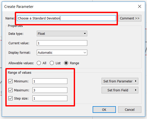
Go to the Create Parameter… option and start by giving your parameter a name. Here I’ve chosen ‘Choose a Standard Deviation’ – although you can edit the name / title later, it’s good practice to name your parameters in a way that gives an instruction to the user and gives you a clear indication of what it is they are intended to do.
Since we are going to be looking at 3 standard deviations you can change Allowable values to a Range with a minimum of 1 and a maximum of 3, and a step size of 1 since we only need to show 3 steps.
Okay, so now you’ve created the parameter it will appear on the bottom left of your screen underneath your list of Dimensions and Measures. Right click and choose Show Parameter Control and it’ll appear magically on the top right of your worksheet view, where the Filters and Legends windows live.
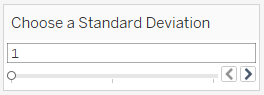 ⇐ It should look like this.
The Loneliest One
Great! Now you’ve made a parameter and added the control to the view. But wait a minute – when you move the slider it does absolutely nothing. What’s going on?
 Parameters are like pets – they get lonely when there’s nothing to occupy them. In Tableau you can create a parameter and give it a job but it just can’t function properly without something to talk to. Here’s where you need to either create a new calculated field for the parameter to receive instructions from, or edit one which you’ve already made to include instructions for the parameter.
Since we spent the last blog creating the control chart let’s go back and edit the “Lower Limit” and “Upper Limit” calculated fields so that they talk to the parameter.
All you need to do is add x [Name of your Parameter] to your calculated fields.
Lower Limit Calc:
WINDOW_AVG(SUM([Sales])) - WINDOW_STDEV(SUM([Sales])) * [Choose a Standard Deviation]
Upper Limit Calc:
WINDOW_AVG(SUM([Sales])) + WINDOW_STDEV(SUM([Sales])) * [Choose a Standard Deviation]
Ta Da! Now the parameter has some instructions so when you move the slider it will change the reference band to reflect the number of standard deviations you’ve chosen. The colours of the KPI dots should change from orange (“Out of Control”) to blue (“In Control”) dynamically depending on whether they are inside or outside the reference band.
Congratulations – you’ve just made your first dynamically coloured control chart. Go make yourself a cup of tea, you’ve earned it.
Handy Hints
Top Tip #1: If you find that you move the parameter slider but still see some “Out of Control” orange dots showing inside the reference band then just drag the KPIs calculated field off the Marks Card and then put it back onto the colour shelf of SUM(Sales)(2) and that should fix it.)
Top Tip #2: Since you used a dual axis for this chart you might see your average line label and upper/lower limit reference band labels appearing twice on each line. Not pretty. Easily solved but formatting the line labels to both be justified to either the right or the left (depending on your preference). They don’t disappear but simply sit one on top of the other so it looks as if you only have one label showing.
