A simple word to describe them is placeholders.
Measure Names and Measure Values are placeholders that try to squeeze multiple things in the same place.
Look at this chart:
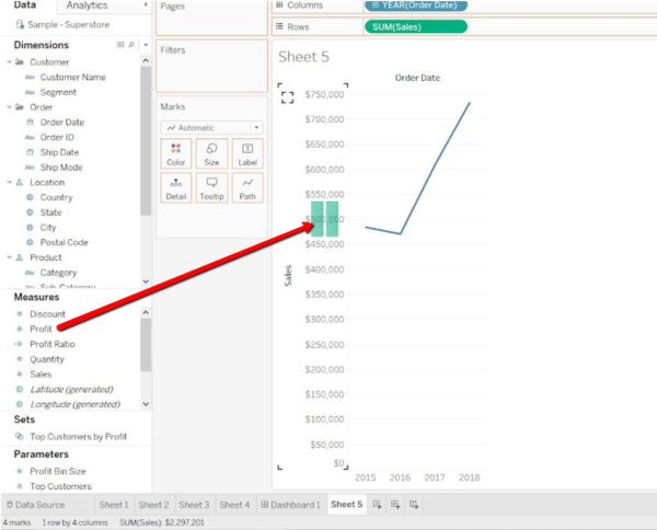
Let’s say I want to show both SUM(Sales) and SUM(Profit).
Option #1: Use Measure Values and Measure Names fields
I can drag Profit onto the pane until I see the two green vertical lines (look at the the picture above) on the vertical axis.
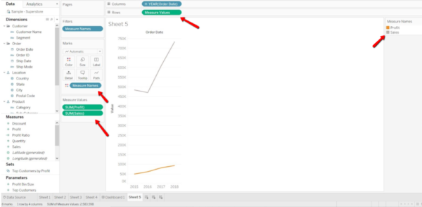
Tableau will automatically replace SUM(Sales) on Rows with the Measure Values field.
The Measure Values field now contains both SUM(Sales) and SUM(Profit), as you can see on the bottom left, on the Measure Values Card.
The Measure Values Card displays which measures are being used in the view.
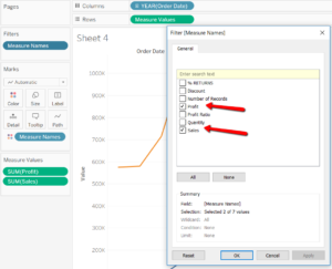
Now, look at Measure Names Filter on the top left. It has picked only the two Measures I want to use.
And now look at the bottom left of the screen. It says:
- 8 Marks
- 1 row by 4 columns.
![]()
Why?
Because the chart shows SUM(Profit) and SUM(Sales) as values split into 4 different months.
I will review this concept in another post on discrete and continuous date fields. For now, remember that the Date field on columns is blue.
This means that it’s discrete and it’s splitting the view into 4 different parts.
Look at the number of marks as well. Keep that in mind for the examples that follow.
Option #2: Dual Axis
Now let’s try to create the same chart using a Dual Axis with both SUM(Sales) and SUM(Profit).

It looks the same.
Let’s create now a simple table like this one.
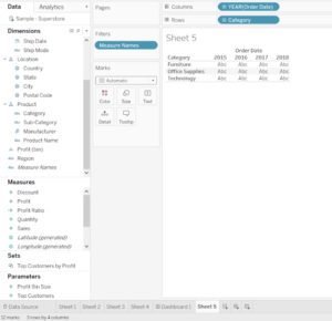
At the bottom left of the screen, you can read: 12 marks, 3 rows by 4 columns.
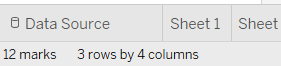
Why 3 rows by 4 columns?
The two dimensions on Rows and Columns are discrete (blue, remember?), which means that they split up the view in 3 (categories) * 4 (years) =12 parts.
Let’s drag Sales onto the table. You should notice “Show me” inside.
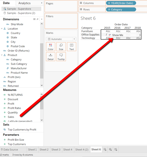
Then drag Profit onto the Text shelf.
This is what the table is going to look like.
There are still 12 marks! Did you expect 24?
The whole pane has been divided by Order Date and Category.
Each cell (as you can see from the Tooltip) contains both Sales and Profit.
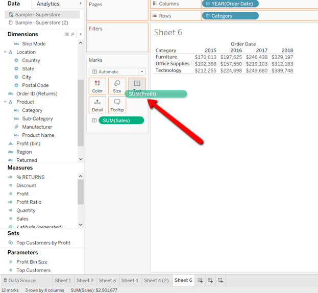
However, if instead of dragging Profit onto the Text shelf, we dragged it onto the pane:
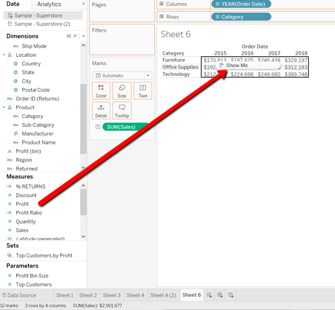
Tableau would place:
- the Measure Names field onto Rows
- the Measure values field onto the Marks Card.
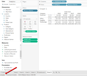
Look at the Measure Names Filter:
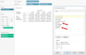
Sales and Profit have already been selected as the only Measures included in the view.
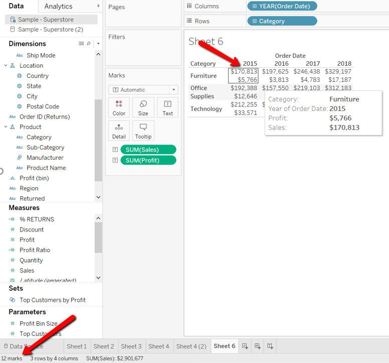
Plus, if you look at the bottom left of the screen, Tableau will now inform you that there are:
- 24 Marks
- 6 rows by 4 columns!
Each cell is now separate from the other ones and the view is split up into 3 (categories) * 4 (years) * 2 (Sales and Profit)= 24 marks.