
Monday.
December 17, 2018.
DS11.
It’s Dashboard Week!
Honestly, I started the day full of great promises.
Yesterday, I spent the whole evening going through DS10’s Dashboard Week blog posts and collecting design ideas.
I was ready to start.
Monday morning – Andy’s blog post – Challenge #1
Andy came in this morning and shared his first blog post with our challenge for Day 1.
The topic:
New York city snowplow coverage.
I was still excited.
Last week, we had a project with a client who’s still using version 10.5.
Therefore, we had already done our part installing and practicing using previous versions! I don’t know if you’ve read DS10 blog posts – You definitely should.
So, before talking about today, here’s a list I made for you:
A review of DS10 Dashboard Week
or When Andy had fun going back to “10,000 BC in Tableau years”,
as Kirsty put it (one of my favorite bloggers here).
ANDY’S CHALLENGE #1: F**k Off As A Service
- Dashboard Week, Day 1: Fuck off. As a service.
- Kirsty: Dashboard Week: Making a Profanity Cloud
- Nick: Dashboard Week Day 1 – FOAAS: An API Adventure
- Lily: Dashboard Week, Day 1: Off to an insulting start
- Louisa: Caress as a Service: Dashboard Week Day 1, Network Diagrams
- Ellen: Dashboard Week – Day 1: Resorting to a F*cking Word Cloud
ANDY’S CHALLENGE #2: National Weather Service Cooperative Observer Program
- Kirsty: Dashboard Week, Day 2: Back to the Tableau Stone Age
- Nick: Dashboard Week Day 2 – NOAA: A Blast from the Past
- Lily: Dashboard Week, Day 2: Less haste, more speed.
- Louisa: Which Site is Best for Space Launches? Dashboard Week Day 2, NOAA Daily Summaries
- Ellen: Dashboard Week – Day 2: Tableau 9.0 – Please let me pad my text boxes.
- Conrad: Dashboard Week Day 2- Visualising Weather Data
ANDY’S CHALLENGE #3: UK Street Level Traffic
- Louisa: Dashboard Week 3: Traffic Patterns in Yorkshire and the Humber
- Nick: Dashboard Week Part 3 – East Anglia’s Busy Roads
- Lily: Dashboard Week, Day 3: We Need To Talk about Tableau 8.
- Ellen: Dashboard Week – Day 3: Tableau 8.0 – Sets do nothing.
- Kirsty: Dashboard Week, Day 3: The One Where Everyone Did a Map
ANDY’S CHALLENGE #4: Bike Sharing
- Lily: Dashboard Week, Day 4: Andy decides to make us ‘appy
- Conrad: Dashboard Week Day Four- API’s inside API’s inside Alteryx Apps
- Gheorghie: Dashboard Week Day 4: Alteryx Apps and APIs
- Louisa: Dashboard Week Day 4: Building a Company in 4 Hours…
- Nick: Dashboard Week Part 4 – COORDinating an API-App
ANDY’S CHALLENGE #5: Meteorite Landings
- Louisa: Dashboard Week Day 5: Kitsch-o-rama with Meteors
- Gheorghie: Dashboard Week Day 5: A notable anomaly in meteorite astronomy
- Nick: Dashboard Week Part 5 – Meteorites!
- Ellen: Dashboard Week – Day 5: Radial Bar Charts and Set Actions.
- Conrad: Dashboard Week Day 5- Flew too Close To The Sun Looking At Meteorites
- Lily: Dashboard Week, day 5: Striking sets
By the way, Andy spared us this one. Thanks Andy…?
Too soon to tell.
The morning started with new challenges. SQL. Creating tables. Connecting to Exasol. What else?
Andrew, Ellie, and Jonathan immediately seized the chance to learn more SQL.
I was a bit more cautious and focused on trying to find an interesting story and maybe some extra datasets to download online.
Dashboard week: Andy’s rules for the week
Andy set the rules for this week.
- “Setting a 5pm finish time”
- “Requiring them to leave their laptops at work” (This would be the first time in 2 months!)
- “Not going back in versions as I have with previous cohorts. They had to work with 10.5 last week for their client project, so that’s good enough.”

I jotted down my personal checklist.
Keep it simple.
Find one story per dashboard.
Don’t try to put *everything* in it.
Learn from the best visualizations.
Big datasets? Filter. Filter. FILTER!
How did it go?
Well….let’s just say that this first day didn’t go as well as I had hoped….! However, there was quite a bit of screaming in the classroom today and it’s always great to feel that you are not alone. 🙂
A look at the case study
In his blog post, Andy shared a link to an article that used that snowplow data (“Data Shows No Increase In NYC Plowing as Storm Picked Up”). As soon as I started reading, I got curious about it.
It talked about what happened in November 2018 in NYC when snow could have been managed better by deploying more resources.
“So in the end, the data shows us two things – First we seemed to have rolled out last week at about half our capacity and that cost us. Second, we did not ramp up our deployment even as things got worse and fell apart.”
It briefly mentioned how the data set was in an odd format.
It was time to have look at it.
A look at the sources
There were mainly two. Ellie quickly managed to share with us a shapefile of the first one.
From that point on, the brave ones kept on working with SQL to get the second (really big) dataset up and running. The latter contained these two pieces of information:
| PHYSICAL_ID | A unique ID assigned to intersection-to-intersection stretches of a street. This unique ID is the key that can be used to join PlowNYC data to NYC Street Centerline (CSCL) data. |
| LAST_VISITED | The date and time when the street segment was last associated with a GPS signal emitted from a DSNY vehicle assigned to clear snow. |
NYC Street Centerline (CSCL)
“The NYC Street Centerline (CSCL) is a road-bed representation of New York City streets containing address ranges and other information such as traffic directions, road types, segment types.”
We found the data dictionary on the right under “About”.
The table contained quite a lot of fields. I wrote down some that I found useful:
SNOW_PRI = the Department of Sanitation (DSNY) snow removal priority designation
V – Non-DSNY
C – Critical
H -Haulster
S – Sector
RW_TYPE = Street Centerline roadway type.
1 Street
2 Highway
3 Bridge
4 Tunnel
5 Boardwalk6 Path/Trail
7 StepStreet
8 Driveway
9 Ramp
10 Alley
11 Unknown
12 Non-Physical Street Segment
13 U Turn
14 Ferry Route
BIKE_LANE = It defines which segments are part of the bicycle network as defined by the NYC Department of Transportation.
1 Class I
2 Class II
3 Class III
4 Links
5 Class I, II
6 Class II, III
7 Stairs
8 Class I, III
9 Class II, I
10 Class III, I
11 Class III, II
Once I saw these first ones, I started wondering whether I could find something useful to combine them with. I also found the NYC Bicycle Lane and Trail Inventory here. However, I couldn’t develop this idea.
I also moved to Twitter. What if I looked at what people had shared on Twitter that particular day in specific areas?
The New York Times also offered updates for buses, trains, airports, and schools. So I thought, what about the schools?
And I kept going and going…
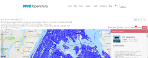
NYC Open Data offered other data sets. Of course. Why not looking for:
- Salt usage?
or
- emergency response? Here it is.
We were stuck for quite some time with the other dataset, so I kept on looking for something else.
I picked up the two tables on salt usage in NYC boroughs and emergency calls and started working on Alteryx to create a shapefile.
One file had longitude and latitude and some rows didn’t have a specific address, so I downloaded a shapefile of the boroughs here and created points.
I really hoped to be able to create a story that made sense…but as time passed by and we were finally able to connect to the second dataset, nothing interesting came up.
This is the “epitome of user friendliness”
At one point, I don’t remember who else screamed out of frustration.
And Tom came up with his perfect comment. Yes, “this is the epitome of user friendliness”. Indeed.
Joining up and loading the two initial files was quite a challenge. Slow is a euphemism.
After hours spent trying to load a file with millions of rows no matter how small the data range I selected, I decided to pick 5pm of November 15, 2018 as my date time.
Then, I selected the values just above and below, from 4.45pm to 6.15pm.
The dataset became a bit more manageable. I tried to combine this data with the ones on salt usage and some emergency calls which, for that specific hour or so, amounted to a few calls in two different areas.
I also found this one, the 311 Call Center Inquiry dataset, which contains information on all agent-handled calls to the City’s 311 information line, including date, time and topic. However, there was no way of retrieving spatial data from it.
Time flew by and Tableau kept on freezing.
Wonderful!
What did I take from day 1?
To sum up, some of us learned some more SQL today. I found it hard to follow most of it as I wasn’t the one who took up that task and we had only had a short introductory session on it.
We also encountered some of the challenges we had dealt with during our second week when we worked on Big Data.
I’d really like to find something that makes sense and create another dashboard, but, hey, Andy set the rules. Publish by 5pm. So…here’s my really bad dashboard. I hate the deadline because this week is one of the few chances we have to create and publish our own work. However, I hope to do better tomorrow!
“Wednesday will be interesting”: time to get scared?
Andy has already mentioned that Wednesday “is going to be interesting”.
We should create a word dictionary about Andy’s speech, too. From mustachios ({}) to “funny”, to “interesting”.
Yes, interesting.
We’ll see!
*********