This week is Tableau Intermediate so Andy took us through some more advanced chart types and analysis you can perform on Tableau. One of which was ranking two different measures in the same view, and colouring the lines depending on whether the rank has increased or decreased. It sounds very word-y but it’s a lot simpler than it sounds (see Fig 1).
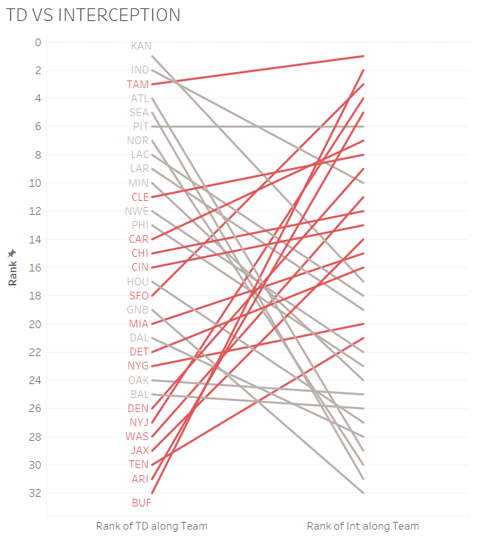
For this example I’ll be using a NFL data source provided to us by Andy which had a variety of statistics for all the different American Football teams and their quarterbacks (I’m not calling it just ‘Football’, sorry Andy). I’m going to look at how each team differs from their passes that led to touchdowns (TD) compared to the passes that were intercepted in relation to each other in the 2018 season.
As you can see there are two measures on the view, so the best place to start I found was by building the view with 1 measure and adding your second in after. I’m also only looking at the 2018 season so will need to filter to only show the relevant stats for that year.
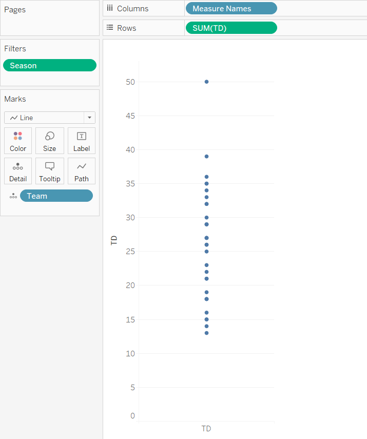
First you want to drag your desired measure (in this case, it will be our TD) onto the rows shelf and it will create a single line bar chart, and also drag measure names onto columns. Next, go ahead and take your desired dimension (as we’re looking at the rank of teams i’ll use teams) and drag it onto the detail shelf. This will split the bar up into 32 mini bars as there are 32 teams in the NFL. On the marks card, change the type of chart to line to give you the view in Figure 2. Now you’re ready for the rank.
In order to rank these teams on their TD, we have to use a table calculation. I won’t go into too much detail about table calcs in this blog post I could be here all day. I’ll go through how to do this, but feel free to refer to the GIF on the right
On the TD pill on the rows shelf, click on the little down arrow and go down to “Quick Table Calculation” and select Rank. Tableau will default to aggregating all the values together and therefore will show just a single value. Go back into the same drop down menu and go to “Compute Using” and select Team. This will now rank all the teams depending on their TD value.
You will need to do some cleaning, so right click on your Y axis and go to edit axis and check reverse axis so your rank 1 will show up first.
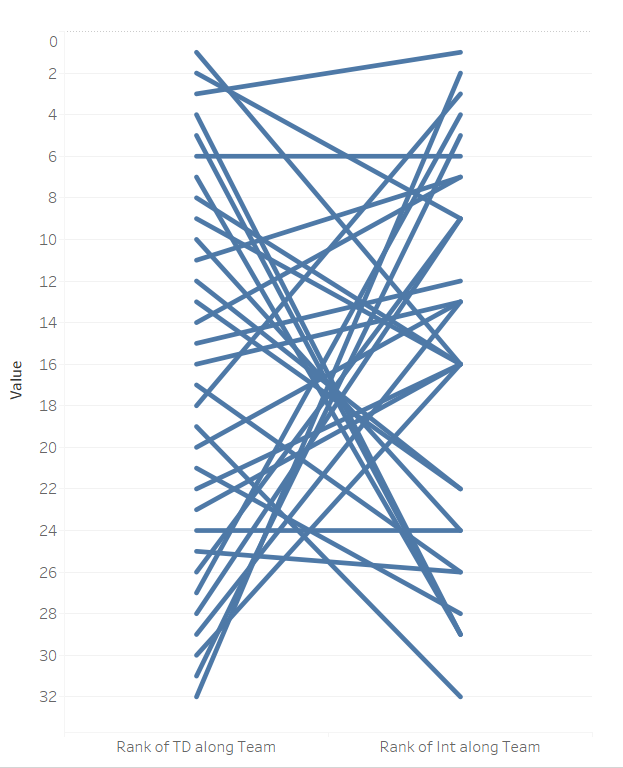
Next grab your second measure, in this case it will be INT and drag it over to the Y axis until you get two green rulers. Drop it on there and DON’T PANIC!. It looks horrible at the moment, but all you have to do is follow the exact same steps as your first measure (Figure 3). Tableau will possibly automatically put measure names onto colour, so just drag that off and I want my view to show TD first and then the INT rank. So essentially I want to see the teams performance in terms of their TD, and if they also have a high number of INT. After those steps you should end up with something like Figure 4.
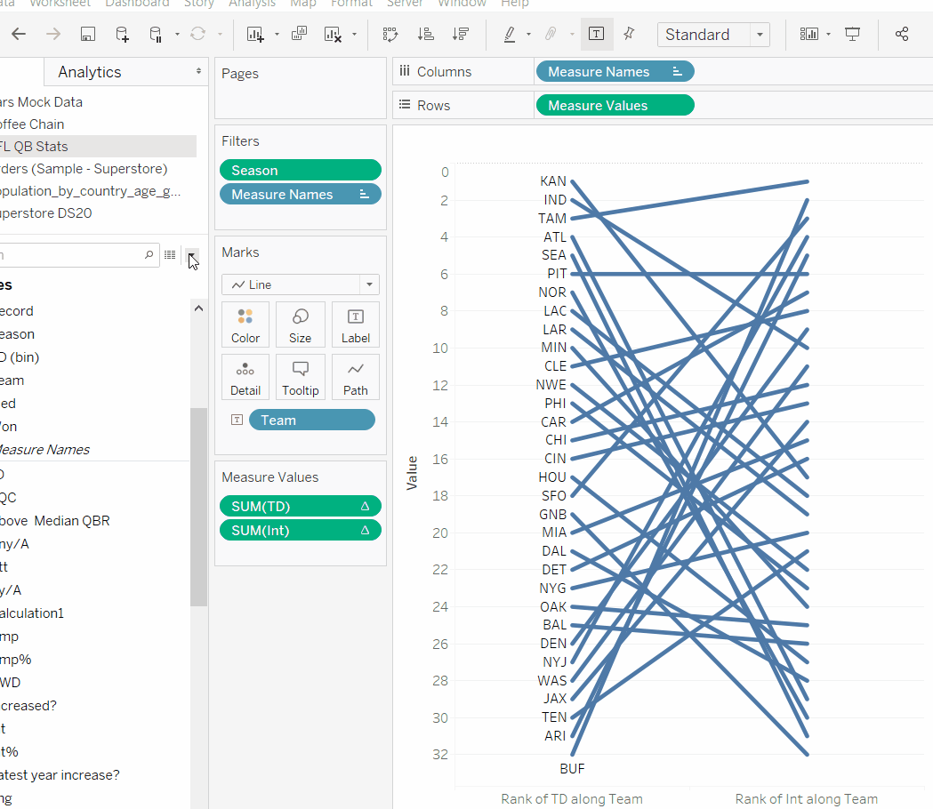
So now we have our slope chart. We’ve got the ranking of each team for each measure, however it’s a little hard to read at the moment so let’s clean it up. On your marks card you should still have team as detail, change that to a label. It may appear on the right hand side so go into label, check “Line ends” under marks to label and then un-check label end of line so you only have it at the start (this is of course personal preference).
Now comes the fun part – colouring each line depending on whether it has increased or decreased rank in the second measure. I already have the information, but I want to make it visually better. If a team is scoring a lot of touchdowns, you would think not a lot of their passes would be intercepted and vice versa, so let’s colour the lines to show us that.
You’ll need to create a calculated field that will return true or false, saying:
RANK_UNIQUE(SUM([TD])) > RANK_UNIQUE(SUM([Int]))
The easiest way to write the syntax is just drag it straight from the measure values into the dialogue box. Similar to the rank we did earlier, you’ll need to again “compute using” team.
There you go! The view now shows each teams rank for TD and INT, and the bars are coloured depending on whether their rank has increased or decreased in relation to INT.
I really enjoyed building this as I’m a huge sports fan, and rankings usually make for great analysis in the sporting world. Happy building!
Whilst you’re here check out my Tableau public for my other work 🙂