This week is Tableau week. After weeks of using Tableau during the application stage with no knowledge other than tutorial videos, it was nice to finally get our teeth sunk into the ins and outs of the software. Whilst we have covered a wide array of interesting things, one thing that stood out for me was conditional filtering.
What is ‘Conditional Filtering’ and when should I use it?
It may sound simple, but conditional filtering is essentially filtering out your data so that you’re left with data that meets a certain criteria. It can be extremely convenient for viewing specific values and stripping back anything not useful or removing values that simply do not answer your question. Example cases could be if you only want to view Premier League teams that had scored more than 40 goals that season, or you’re only interested in seeing movies that have grossed over 500 million USD. Conditional filtering allows you to do exactly that. The example used in this blog is from the Superstore data set.
How to use ‘Conditional Filtering’
You’ve built your chart and are now ready to use conditional filtering, for this example I’ll be demonstrating using a simple bar chart of Sales by Sub-Category, coloured by Profit to enable us to see which Sub-Categories are profitable.
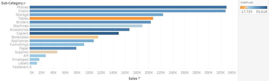
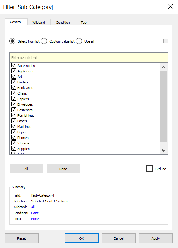
As you can see, the colour of the bar is denoted by the Profit’s value, diverging from orange to blue (whereby the lower the profit, the more orange the bar and vice versa for blue). If we only want to see those Sub-Categories that are NOT profitable, then all we would need to do is put in a conditional filter. To do this, drag your dimension (which in this case is Sub-Category) onto the filter shelf, and you will be met with this dialog box.
To make things a bit easier to follow, I’ll set out this next part in step-by-step instructions:
1. Check the ‘use all’ button that can be seen in Figure 2, this will select every Sub-Category so that the filter will apply to all of these.
2. On the subheadings which read ‘General, Wildcard …’, click on ‘Conditional’
3. Here is where you’ll select what condition you want your data to meet. For this example, I only want to view the Sub-Categories that are NOT profitable, so, check the ‘By field’ box and make sure you have your relevant measure selected in the drop down menu. In this case, it will be ‘Profit’ and as I’m looking at the total profit of each Sub-Category, I’ll use ‘Sum’.
4. Change the ‘=’ sign to whatever will meet your criteria, in this case I’ll change it to a less than sign ‘<‘ as we want to view all the profit values below 0.
5. Click apply to make sure it’s worked and it’s what you want and voilá, you’ve just used a conditional filter!
What if I’m using a colour palette that no longer makes sense?
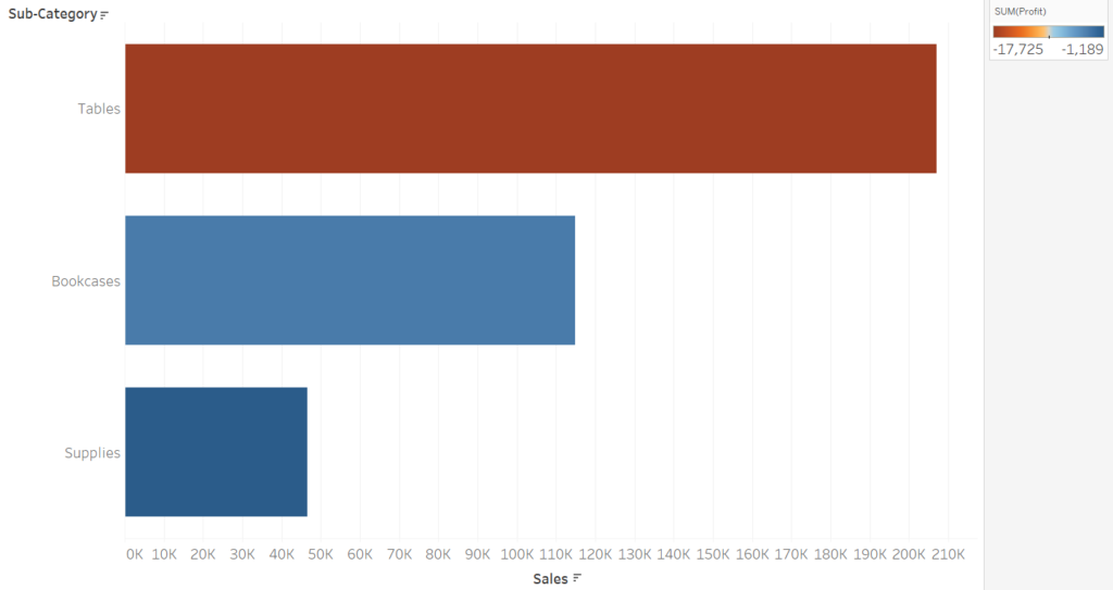
You may find that after the conditional filter, your colour palette no longer makes sense and is just outright confusing. I am using a diverging colour palette, and dark blue means very profitable and orange means unprofitable, Figure 3 could be seen as confusing as we have 2 blue bars in our unprofitable view. To get around this, right click on your colour legend on the right hand side and click edit colours. If you press the ‘Advanced’ option you should see some tick boxes that are labelled Start, Finish and Centre. As we were looking at the profits that were BELOW 0, if you change the centre point to 0 (which means the value that the colour palette starts diverging), it will mend your colour scheme and make the chart consistent.

That’s it! Your conditional filter is working and your chart looks wonderful. I hope this helps and happy filtering!