Adding reference lines to your bar chart can really engage your viewer as well as adding complexity to your story telling. I’ll show you how to add reference lines to your bar chart, as well as how to colour your bars depending on that reference line’s position.
For this blog I’ll be using the Sample – Coffee Chain data set. I’ll be building a simple bar chart (Figure 1) that will show me the total number of sales of the different product lines (Beans and Leaves) for each state.
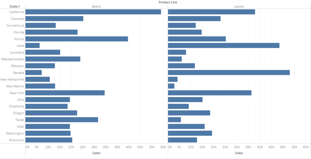
We have our total number of sales, which we now want to compare to the Target Sales to see how well each state is doing in comparison to its target. This is where our reference line comes in, because that will give us a visual indication on whether the target is met.
*Side Note – In this data set, the field is actually called “Budget Sales” so I renamed it by right clicking and pressing rename to change it to Target Sales, in my mind it made more sense*
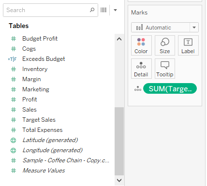
Go ahead and take your Target Sales field and drag it onto detail in the marks card (Figure 2). Detail is distinguished by a filled circle on top of 3 hollow circles.
Dragging Target Sales onto detail will allow us to use this measure for the reference line. Make sure that your Target Sales has SUM before it, this is important and I’ll explain why later.
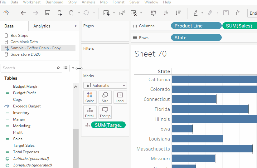
The next step is adding your reference line (why you’re actually here). Here’s how to do that (also refer to Figure 3)
1. Go to your ‘Analytics’ pane
2. Near the bottom under ‘Custom’ you’ll find ‘Reference Line’
3. Once you click and start dragging it, you’ll be met with a pop-up basically telling you at what level you want your reference line to be at. For this example I’ll be using cell, as I want each state to have its own reference line
Now you’ll be met with a dialogue box (Figure 4). Under ‘Line’ you’ll want your value to be whatever you want your reference line to represent, so here it will be SUM(Target Sales). Next to the Value box there’s another box in which you want to make sure says ‘SUM’ as we’re using the sum of Target Sales. It’s important that you choose SUM as we have already aggregated our data to show the SUM of values.
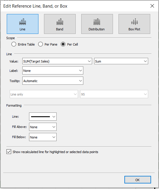
You also have the option to change the formatting of the reference line by making it thicker or changing the colour.
That’s it, you’ve made your reference lines! Now I’ll show you how to colour those bars to show you which states met their target and which ones failed to meet it.
You want to create a calculated field (see Figure 5) which tells you which states met their target and those that did not.
Essentially what we’re saying is we want to know in what states the sum of sales (SUM(Sales)) exceeded the sum of Target Sales (SUM(Target Sales)). Once you click on calculated field you’ll get a dialog box to right your calculation. In this case it will be:
SUM(Sales) >= SUM(Target Sales)
This is what’s known as a boolean calculation, so it will assign a ‘True’ or ‘False’ value to every state, depending on their values which we’ll use to colour the bars. I.E if New York’s total sales is greater than its target sales, it will be assigned True.
You can also give your calculated field a name, something like ‘Target Met?’ so you know what that calculation is doing.
The calculation will now appear alongside your measures, and to colour your bars depending on your calculation, just drag your new calculated field onto colour on the marks card and your chart should look something like this:
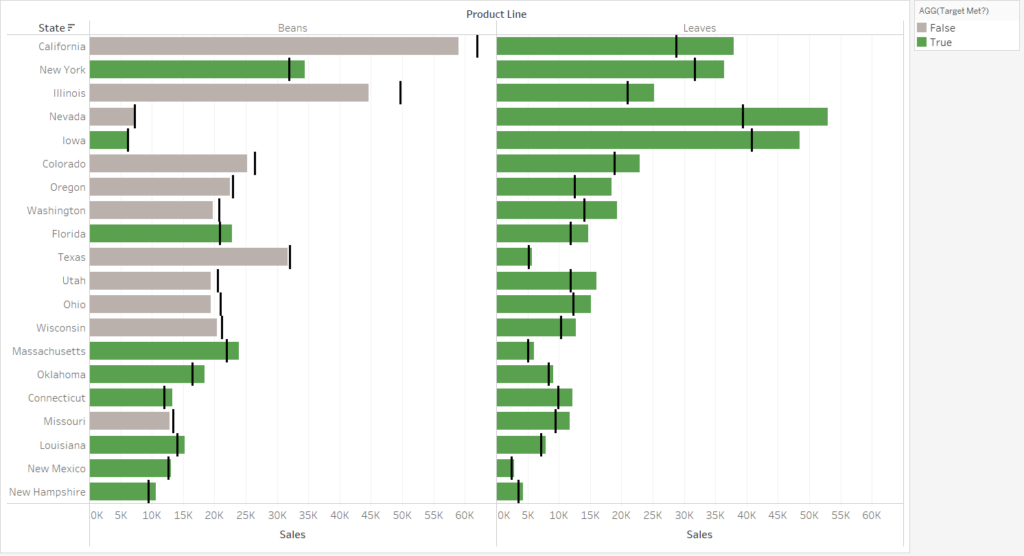
There you have it, you have a bar chart with reference lines and visually it tells you which states met their targeted sales for each product line. Happy referencing and colouring!