My first day of Dashboard Week! Yesterday the rest of DS11 enjoyed vizzing >200M rows of data about snow ploughing while I watched from home (hurray for a coincidental day of annual leave).
The Challenge
This morning I was rested and ready to take on the challenges of the week. Today, Andy set us the challenge of analysing New Orleans Police Department (NOPD) body-worn camera data. Now, this would have been super fun and interesting if there was information on the crime that was being recorded, whether this led to an arrest, etc.. but no. As you can see from Figure 1, the data contained information on the times body cams were used, where, how long each video is, when it was uploaded to the system… not exactly the juicy stuff.
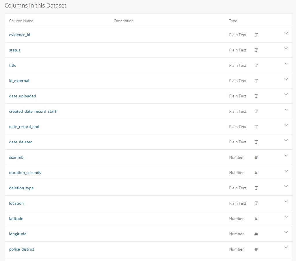
Fig 1. What’s in this fascinating dataset?
My Approach
Supplement the data! The body cam dataset didn’t immediately scream interesting to me, so I decided early on to find something cool to supplement this data with. Now I don’t know much about police procedure or new police tech (besides what I’ve learned from Brooklyn Nine-Nine, e.g. don’t eat Phở near a body cam), so I searched for current news items on body cams. Figure 2 shows a selection of articles that came up.
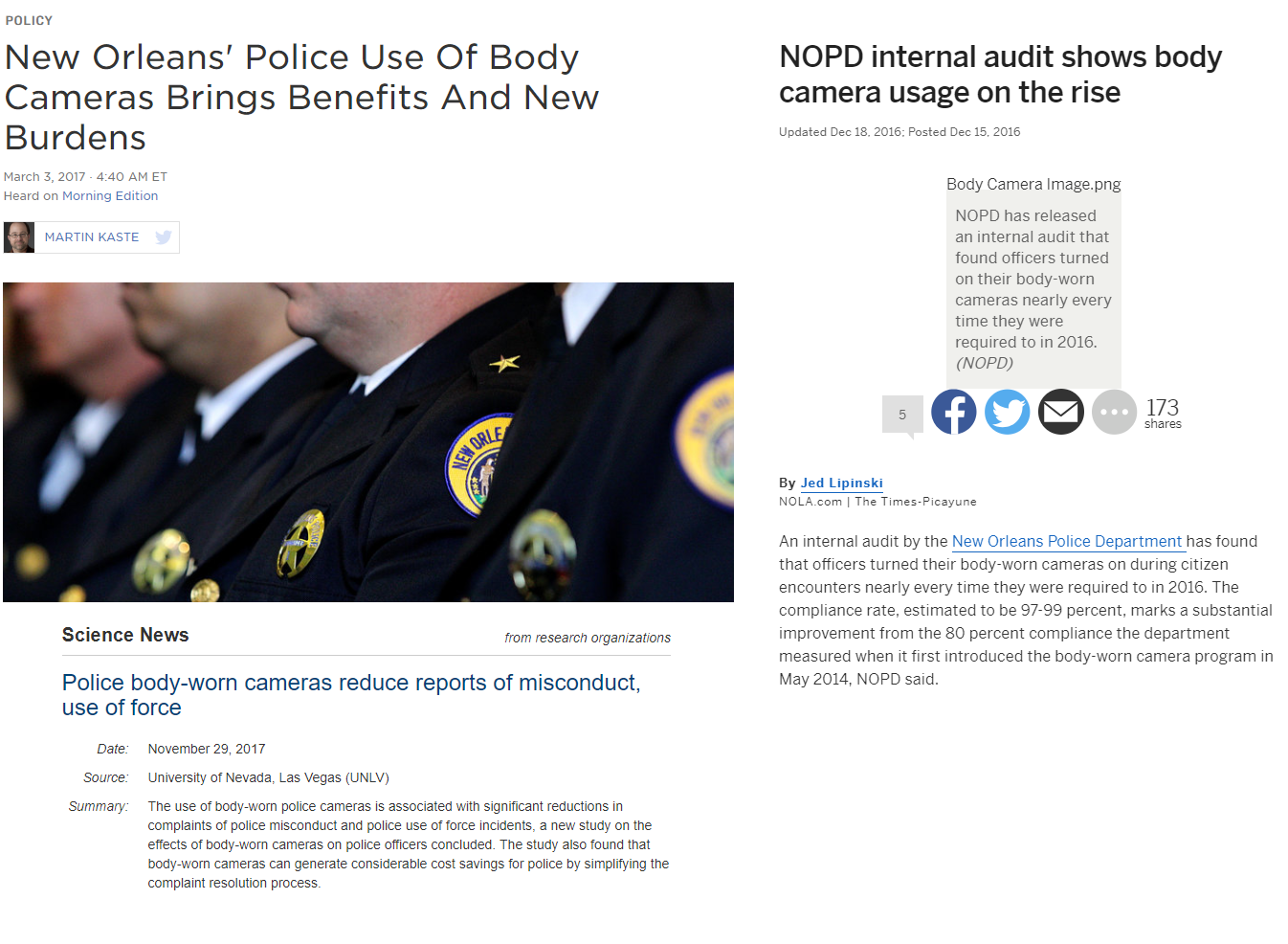
Fig 2. News articles on body cams
Yay! An interesting topic: Do body cams reduce the incidence of police misconduct? The internal audits by the NOPD seem to think so.
Following up on this, I found a dataset on all the complaints filed for misconduct on the New Orleans Open Data website.
How Did It Work Out?
After cleaning my data and putting it into Tableau, I was disappointed to find that the data wasn’t that insightful. All I could really see was that body cams were used a lot in the city centre and that misconduct spikes up and down and sort-of decreases over time. Also, I had spent a lot of my morning trying to force a violin plot to work. At this point in the day, I was panicking because I thought I had no story to tell. After talking to some lovely people at the Data School, I decided to tell my ‘there’s not much of a trend’ story because that’s still good information.
*Fire Alarm!*
A fire alarm after lunch booted me out of my seat (which I had not left all day) and into the cold. It was actually refreshing to take a break and helped me clear my mind. With the advice of DS11’s Ellie, I used a moving average to smooth out my time series graphs, which allowed me to reduce some of the noise and more clearly see the trend in the data.
What’s My “Finished” Product?
As I’ve mentioned in a previous blog (here), no viz is ever finished. So without further ado, I present to you my first viz of dashboard week! (Tableau Public link here)
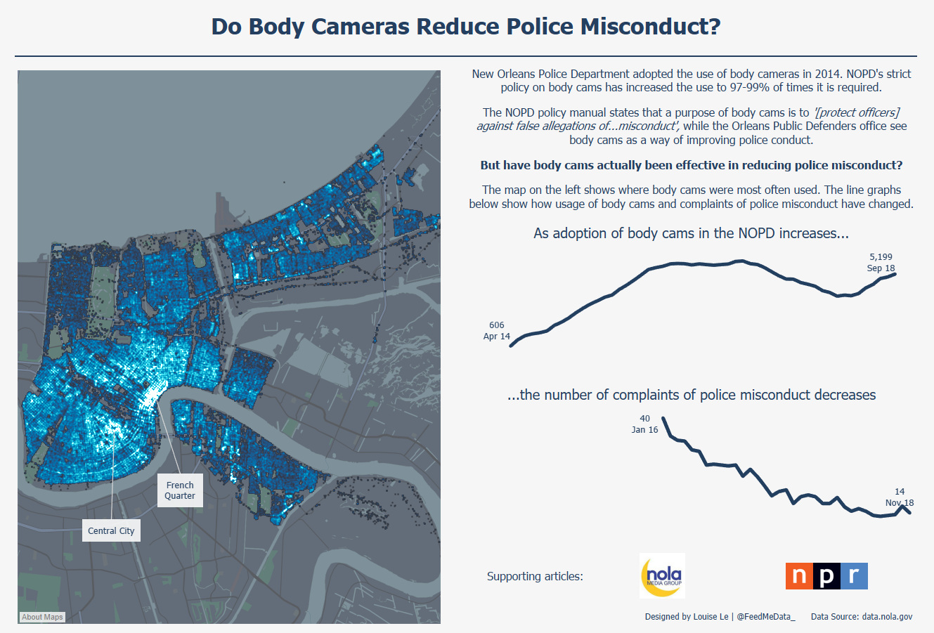
Fig 3. Ta-da!
“Why the density map? What does it add?”, I hear you ask? Not much. It tells you where body cams are most used and it sits there looking pretty.
That’s all, folks!
Louise
Check me out my blog feedmedata and follow me on @FeedMeData_