Last week was learning more about visual analytics – the nuts and bolts of how humans understand information and using that knowledge to create effective visualisations. These focused on ensuring that the visualisation you create fits with the aim, audience and message that you’re trying to convey. We started this week on paper and crayons with Caroline Beavon, whose class and messages I hope to take with me through the rest of my career! One particular lesson that I would do well to pay attention to is the use of colour, as it can be too easy to throw loads of colour into a dashboard, infographic or even just one chart (e.g. to denote categorical data) when this makes the product harder to understand, as well as looking a bit nursery school.
To be honest even 20 is probably too much, Tableau.
The second one I took onboard was drawing out what you want to show before going straight into the tool, as form should follow function and it’s quite common to see a viz that is technically very flashy but quite unclear in the message it’s trying to convey. To practice this, as well as some flash redesigns in class, I decided to use both these tools on my reimagining of #MakeoverMonday for Week 34, which was looking at conflict data (in fine detail) across a large cross section of countries. First things first, have a think about what you want to say. I could see from Sunday there were a lot of people looking at the Middle East and Africa in their submissions, so I decided to focus down to one country: the Philippines.
Next, get the pen and paper out.
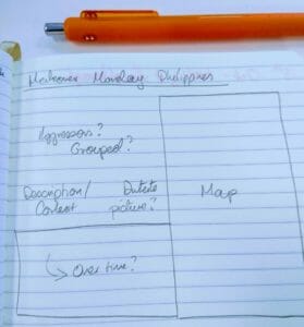
Never mind the handwriting.
My story is focusing on the actions against civilians in the Philippines so I decided that my secondary colour is red – I do want to provoke an emotional reaction in people viewing this, as I think the ongoing actions against civilians in the Philippines does not get the level of attention it needs. Following my initial drawing, a viz emerged pretty close to this outline. After feedback in class to remove some of the visual elements which are supported by tool tips (e.g. axis labels from the line graph), and add some back in which are helpful (the scale for the circles on the map), I opened it up to further comments where @Pablo suggested changing the scale of the circles to a relative setting, which shows the difference between incidents better and makes distinct concentrations of incidents clearer. This presented a problem wherein locations with many incidents (such as Manila or Davao City) don’t show up clearly in tool tips, as Tableau doesn’t know which record should be returned. After a severe amount of googling I returned to my paper and what I really wanted to get across, which was that these incidents were happening over a long period of time. Though I’ve been warned off using pages I realised these may be a more effective way to complement the line chart (which is by weeks) but still show the history of the current state of violence in the Philippines, as each incident should be just that, and not bundled into a large group.
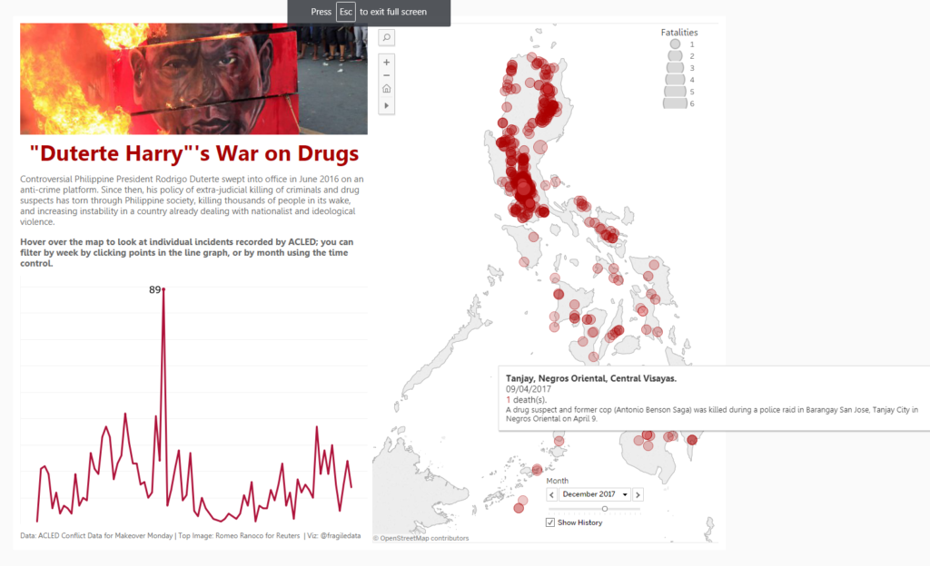
Final Version, available on Tableau Public.
