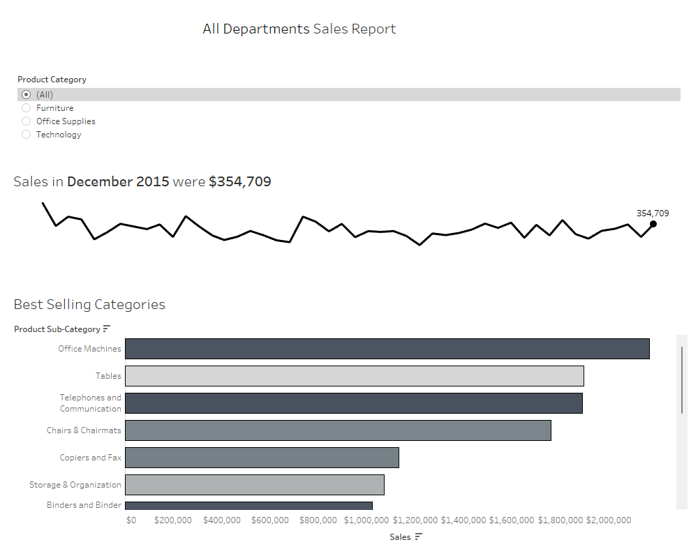
For week 2 , we're creating a line chart to show sales over time and a bar chart to show the best performing categories based on their sales. You'll also notice that the bar chart colour density corresponds with profit - more profit means the bar will be darker. Other than that, there were also some extra twists to add more dynamic aspects in your dashboard:

Starting with the sales over time, we left click on Order Date and drag the pill to 'Columns'. This will give a pop-up where you can choose continuous month. To get Sales on the y-axis we drag the Sales pill onto 'Rows' - by default it will give you the sum of sales, so we don't need to edit or change that.

Next, we need to create the dot on the end of the line and make the label visible so it shows the sum of sales for that specific spot on the line chart. This also needs to be dynamic, so that if/when more data is added to the dataset, that dot will update to always show the last sum of sales on the line chart.
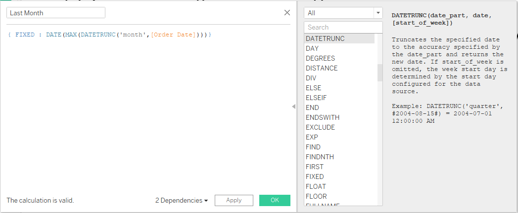
The perfect function for this case is called LAST(). As the Tableau Help page explains, it "returns the number of rows from the current row to the last row in the partition". This means that Tableau labels each row in your data on your sheet from 0-n backwards, so the last row of the data in your sheet will always have the number zero (0). We can make the calculated field an if statement that looks at whether or not LAST() = 0 and then it gives us the entry at that location.
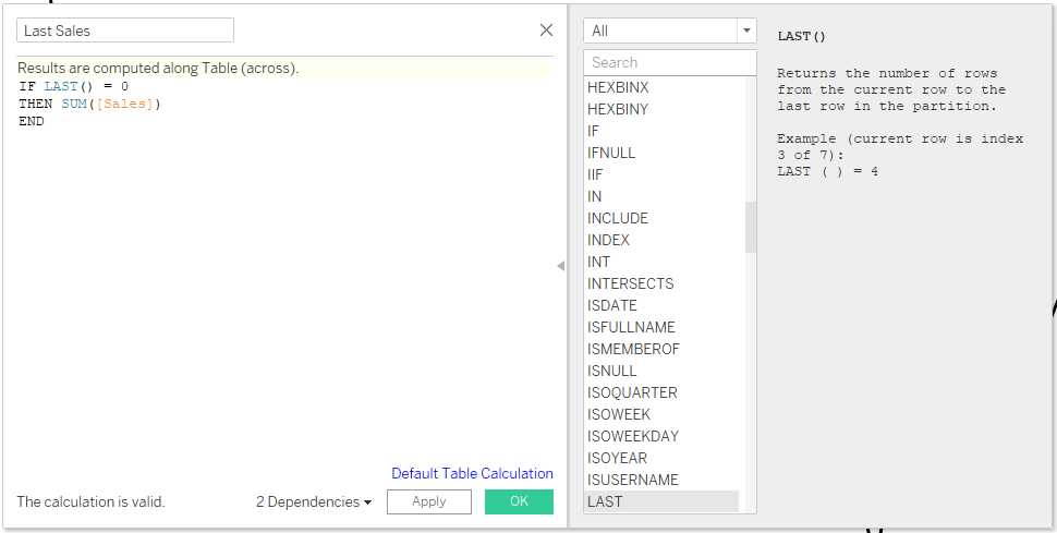
Now that we have a new field we can drag this pill (I named it Last Sales) next to SUM(Sales) on Rows. We end up with two separate charts - a line chart above and a single dot below. You'll also notice in the bottom right corner is a little notification that says we have some null values - that's because our calculation did not have an 'else' statement to specify what needs to happen with the values where LAST() does not equal zero. If you right click on that grey square you can choose to hide the indicator (these null values do not affect our charts).
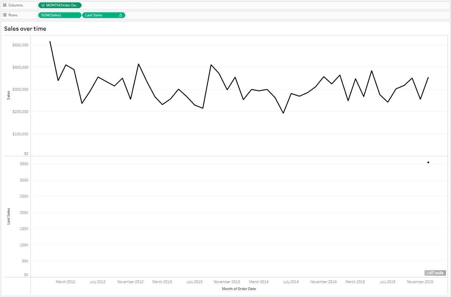
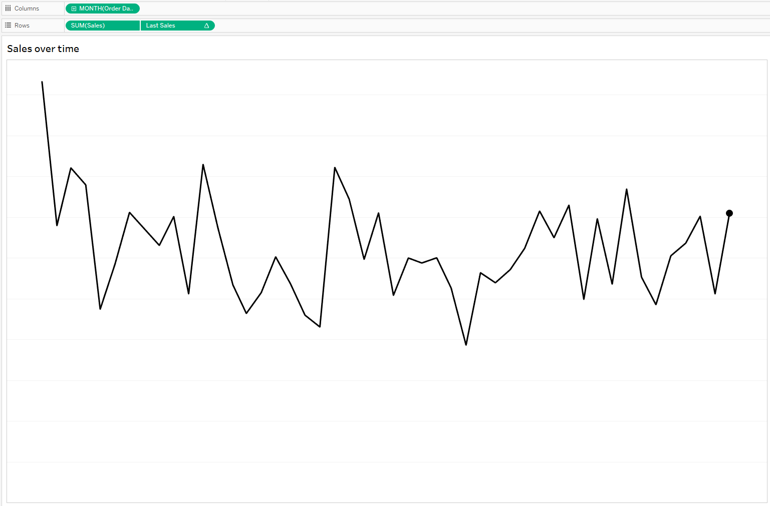
The next step is to click on the Last Sales pill and select 'Dual Axis' - this places the two axis on top of one another. Make sure to right click on the Last Sales axis and select 'Synchronize Axis' - your dot should now be on the end of the line chart. You'll also notice that Tableau has automatically changed the colours of the line and dot chart to distinguish between the two. In the All Marks Card, remove Measure names from colours so it goes back to black. On the Last Sales marks card, change the type to circle and increase the size a bit. Then, right click on each of the axes and uncheck 'Show Header' so your sheet look like this:
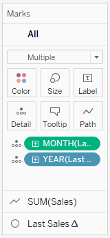
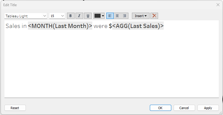
The final formatting on the line chart is to remove the grid lines, show the label for the dot and align it to the top so it shows up above the circle, and make the title dynamic so it will update if future sales are added. First, we need to get the latest month in the data set. To do that, we create a calculated field that gets the max value of the month of Order Date.
Drag this new pill to the details shelf on the marks card so that the information is available on the sheet. Click on your title to edit it and add the Last Month & Last Sales values into the sentence.
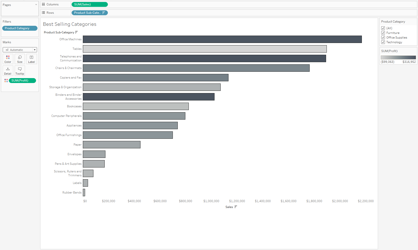
Now we can get started on creating the bar chart to show the top sales per sub-category. Drag the Sale to the Columns shelf and the Product Sub-category to the Rows shelf. Make the graph fit to entire view and add the Product Sub-category to the filters pane (select all values and choose to show filter).
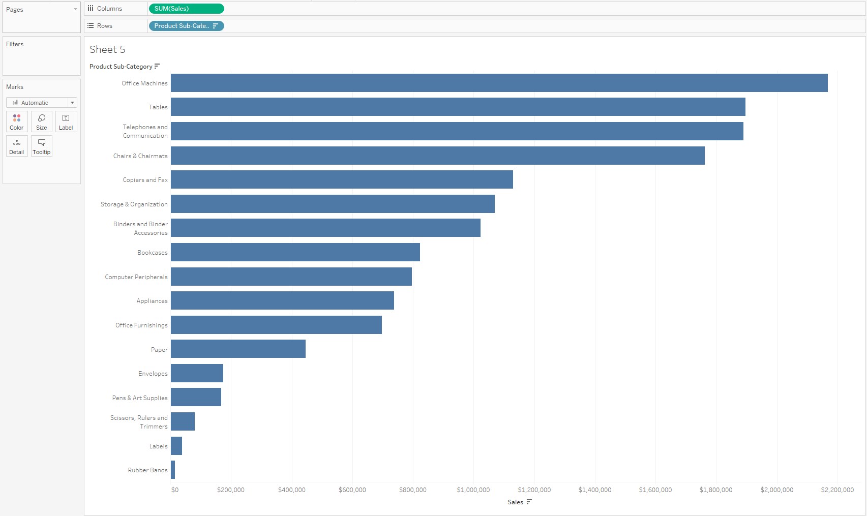
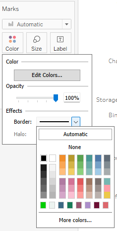
To get the grey scale colour we drag the Profit pill onto the colour shelf of the marks card. This colours each bar based on the value of the sum of Profit for that Sub-category. Tableau automatically assigns an orange-blue colour pallet. Click on the colour icon, edit colours, and choose the grey pallet. Also change the border selection from Automatic to black.
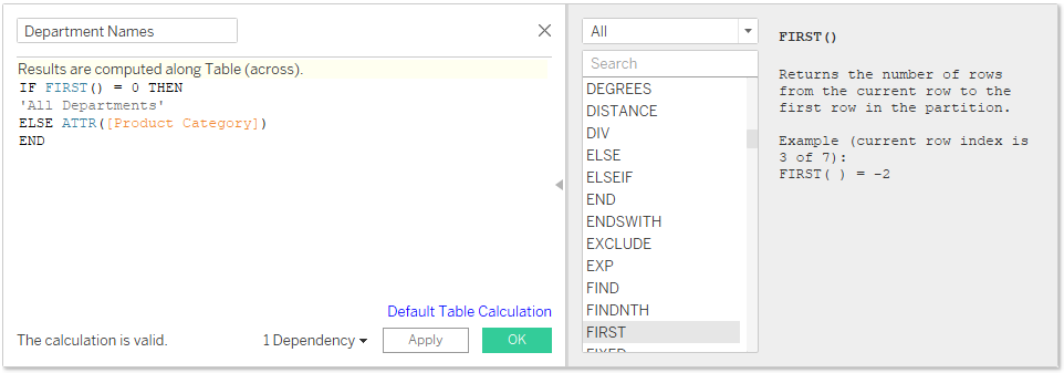
One of the challenging parts of this Workout Wednesday, is creating a dynamic title that updates to say 'All Departments' instead of just 'All' when you select that in option in your filter. At first I thought about using the FIRST() function, but that didn't work because your FIRST() function would always be zero.
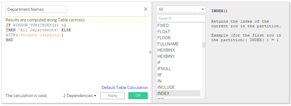
Instead, you can use the INDEX() function to give a number for each entry. It's important to note that even when 'All' is selected, each category in 'All' still only has an index of 1. Now we can get the WINDOW_SUM() of the indices because if it's more than 1, we know that all categories have been selected and we can change how the title will display. When the sum of the indices in the view is not more than one, we display the usual product category. Make sure to edit your table calculation from compute using 'Table (Across)' to 'Product Category'.
Lastly we need the icons to pop up in the right corner depending on the category we choose to display. However, when the 'All' option is chosen, no logos should show. We use the same WINDOW_SUM() logic, but this time we create a Boolean so we can filter out all True options. Once you add it to the filter shelf, make sure to edit your table calculation from compute using 'Table (Across)' to 'Product Category'. Edit the filter to exclude 'True'.

Now you're ready to create the dashboard, format it so it looks like the original dashboard and upload your results to Tableau Public.