


For this day of Dashboard Week we were tasked with taking our initial application viz and re-building it. I had spent maybe 2 weeks on my initial application viz and now after 4 months of intensive training, I have 5.5 hours to re-build it - what a fun challenge!
See my initial application here
The Data
I re-used the dataset that I had previously used. The dataset was based on a research project that I was involved in a few years ago, where researchers observed NYC park visitors during the pandemic (summer 2020 to be specific) and noted whether people wore masks and what activities they were involved in.
The Data Cleaning
Since I used data from my application, I was lucky enough that it was very clean and no further data cleaning was necessary.
The Dashboard Sketching
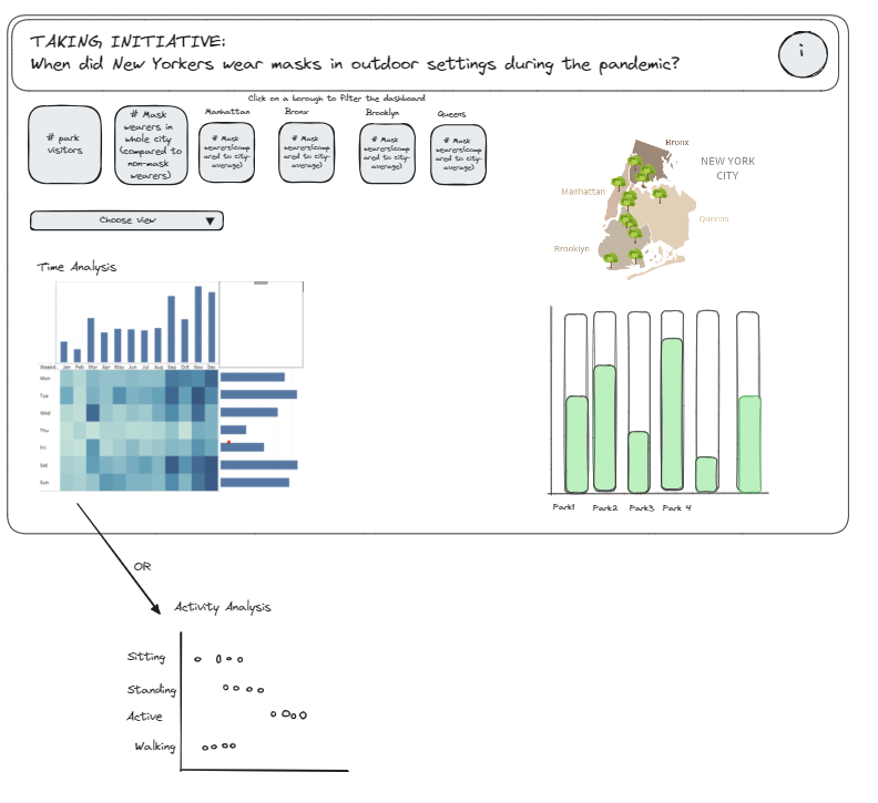
As always, it is good data consultancy practice to sketch out ideas for your dashboard, even if you are re-building an old one. While my initial application was a long-form dashboard, I opted for a one-page format for the re-builded one. I also wanted to include a new type of chart that shows some insights better than some of the charts I chose previously.
At the same time I also created a to-do list with things I wanted to change, ordered by priority.
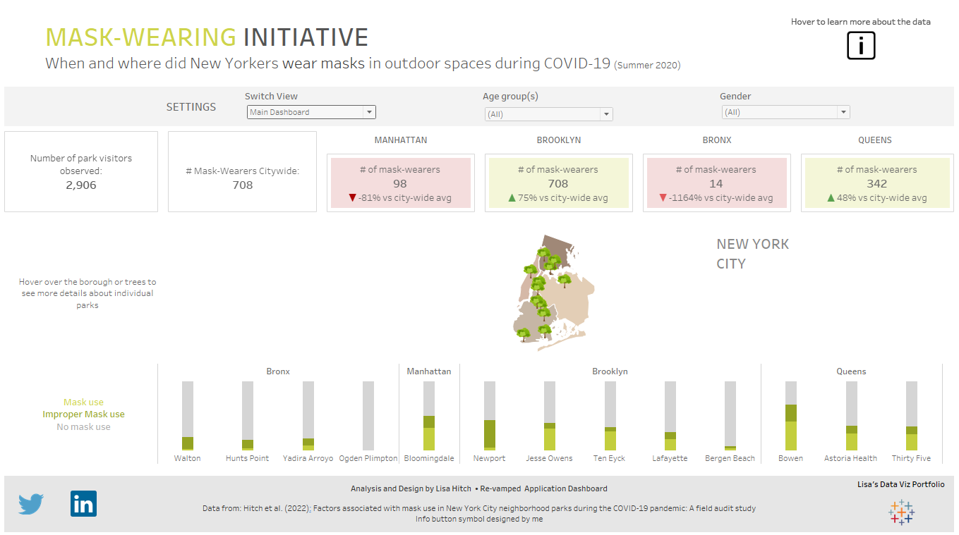
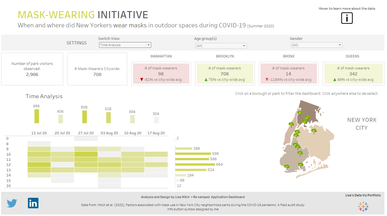
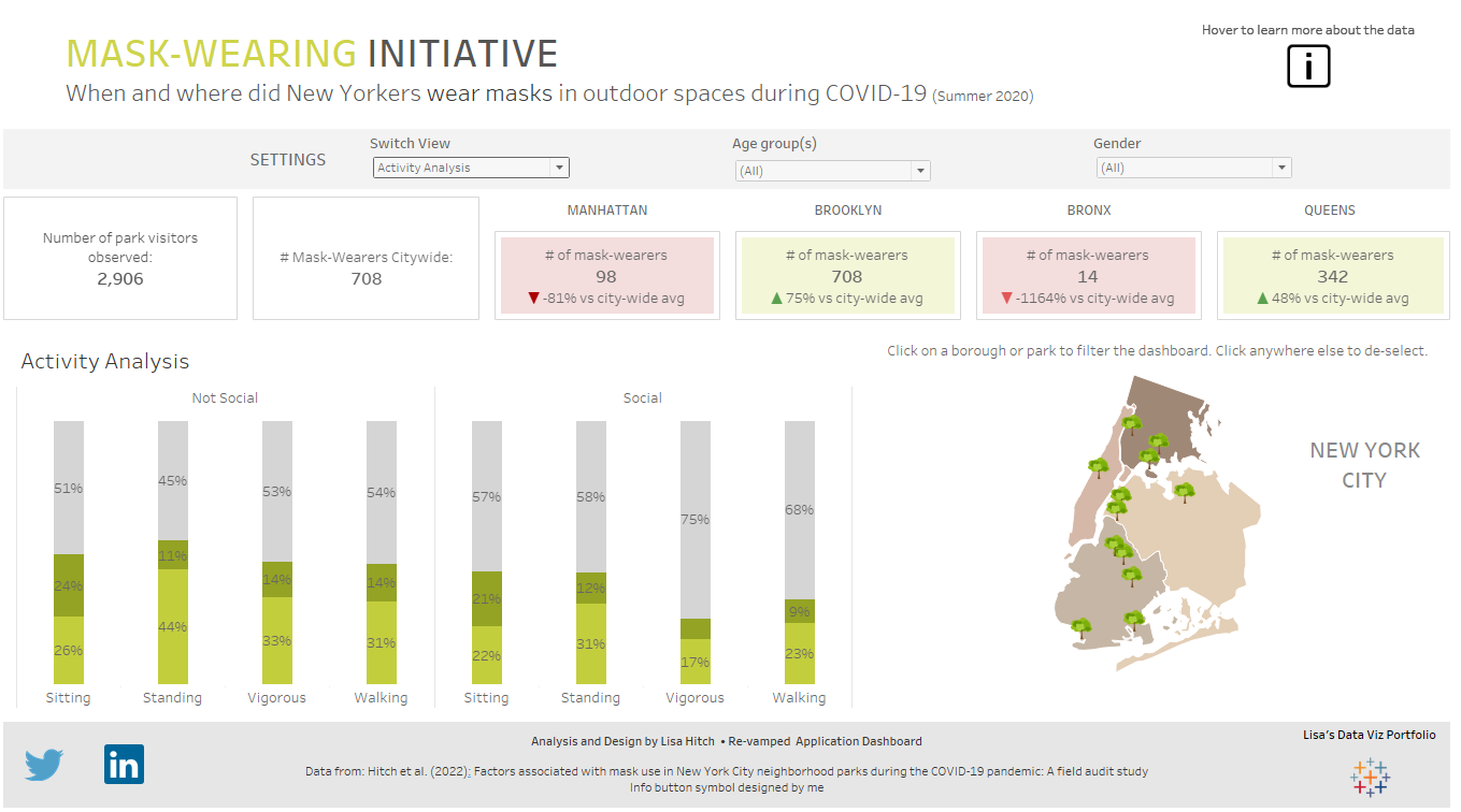
The Dashboard
I then spent most of my time creating new vizzes, re-arranging my dashboard, and thinking about the best way to implement filters and dashboard actions. One thing that I noticed with my initital application was that the interactivity was quite limited and I presented the insights very directly to the user. For my new dashboard, I wanted to provide the user a greater level of flexibility to explore the data themselves.
Because I wanted to fit multiple charts onto only one page, I also opted to use Dynamic Zone Visibility where the user can switch between different analyses. If I would have had more time, I could have turned this dropdown menu into buttons to make it look nicer, but considering that we only had a few hours, I think the dropdown menu does the trick.
The final result looks like this:
What do you think about this exercise to build a dashboard in only 5.5h? Feel free to start a conversation with me on LinkedIn: https://www.linkedin.com/in/lisa-hitch/
Screenshots by Lisa Hitch in Tableau 2023.3