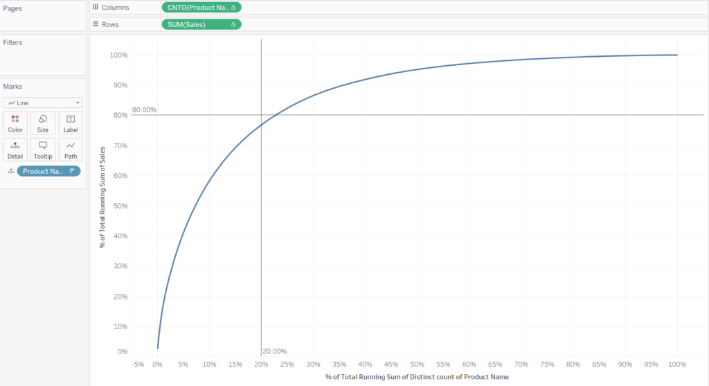
We want to see if the Superstore data set follows Pareto’s Law i.e. “Do 20% of the products make up 80% of sales?”

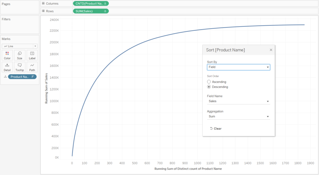
In order to make the graph as seen above we will need to use table calculations. First, however, we need to put the dimensions and measures on the shelf. For this example we will put SUM(Sales) on rows, CNTD(Product Names) on columns and Product Name in the details mark. We will get the graph as seen below.
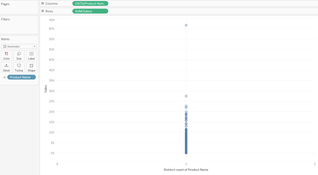
All the products are shown as distinctive dots since we have put the Product Name on the marks card, however, since we have told Tableau to do a distinctive count of each Product Name they will all have a value of 1. We therefore need to do a running sum of the count of the Product Name. This is performed with a table calculation. For the distinct count of Product Name i.e. CNTD(Product Name), we want to compute the running total sum by the Product Name (1+1+1 … for each product name)
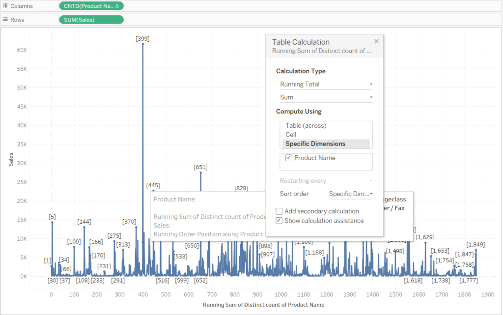
We next want to do the same table calculation on the SUM(Sales). The running total of the sales by product name.
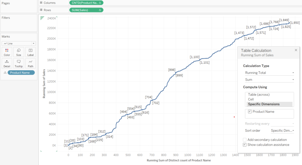
This view looks a bit jittery and not the smooth Pareto plot that we were expecting. It is because we have not told Tableau how to sort the Product Names. We want the Product Names to be sorted their sales.
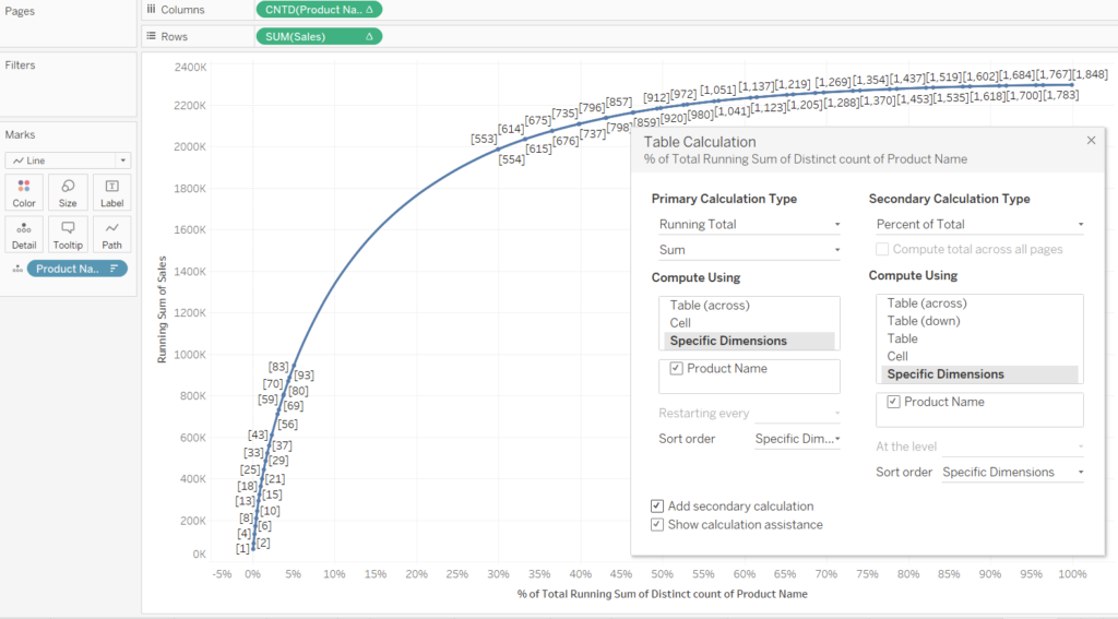
To investigate Pareto’s Law we should add a second table calculation to both Sales and Product Name to convert them to a percent of total. The configuration for both is going to be the same, check the ‘Add secondary calculation’ box then check the ‘Product Name’ box with the secondary calculation type being ‘Percent of Total’.
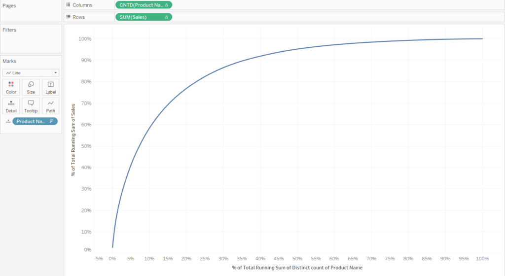
We are then left with the graph below.
It would be useful if we included reference lines to show where 20% of the Products occurred and 80% of the sales occurred. We first drag a reference line from the analytics pane onto the SUM(Sales) box. After select the line to be a constant equal to 0.8.
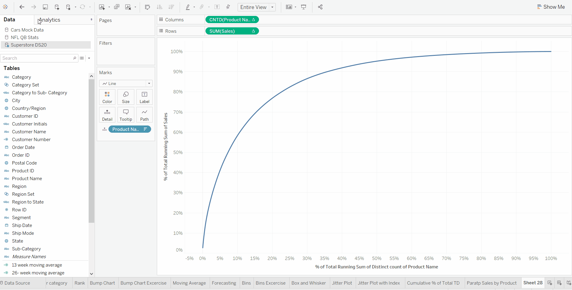
For the above GIF we need to do the same for the Product Name, however we make the value for the reference line 0.2 (20%). After applying both reference lines we get the final view.