Most of you have probably seen a chart or a data visualisation with overlapping data, piled one on top of each other. These are made using a dual axis on Tableau.
The idea behind a dual axis is to put two different graphs on the same view to allow you to compare two measures together.
The typical route
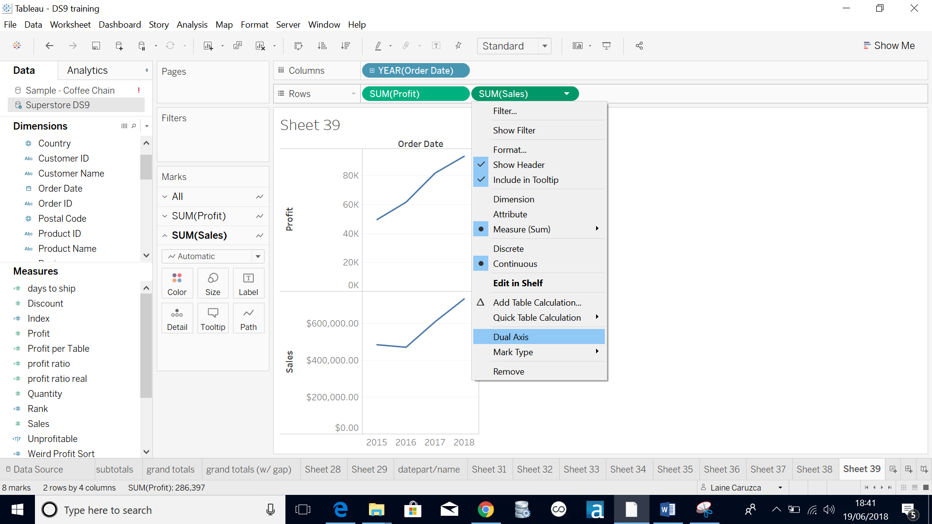
When making dual axis charts, most of you probably dragged the second measure next to the first one in either your column or row marks card. Then, you probably right-clicked and selected the dual axis option.
The faster route
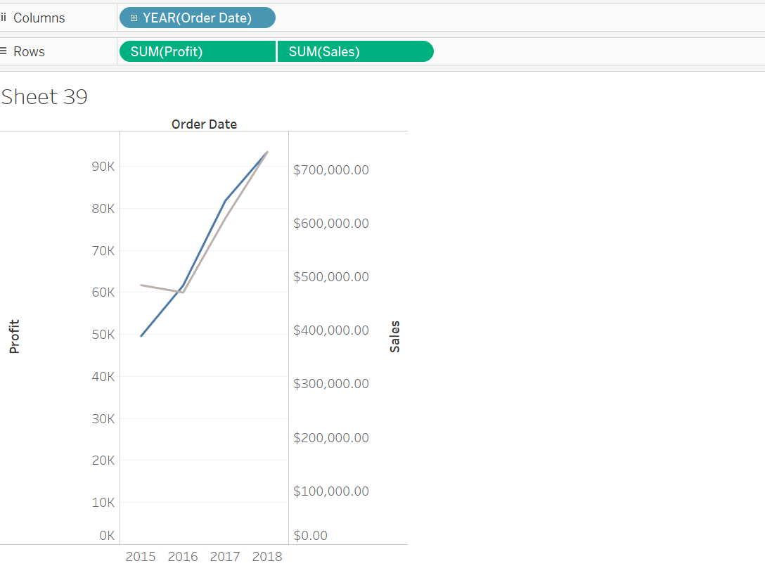
Did you know that you could do all this in just one click?
This tableau top tip allows you to create this dual axis with just one click! Again, this is all about efficiency and learning to do things in new and better (faster) ways.
Instead of dragging the second field into the marks card, you just need to drag and drop to where you want it to go. For example:

More, you say?
You want to add more fields into the view, you say? Well, you’re in luck because, it is possible!
To add more fields into the same axis, just simply drag the ‘Measure Values’ into your marks card and add as many fields into the newly created measure values marks card, as your heart desires. This is called a ‘shared axis’.
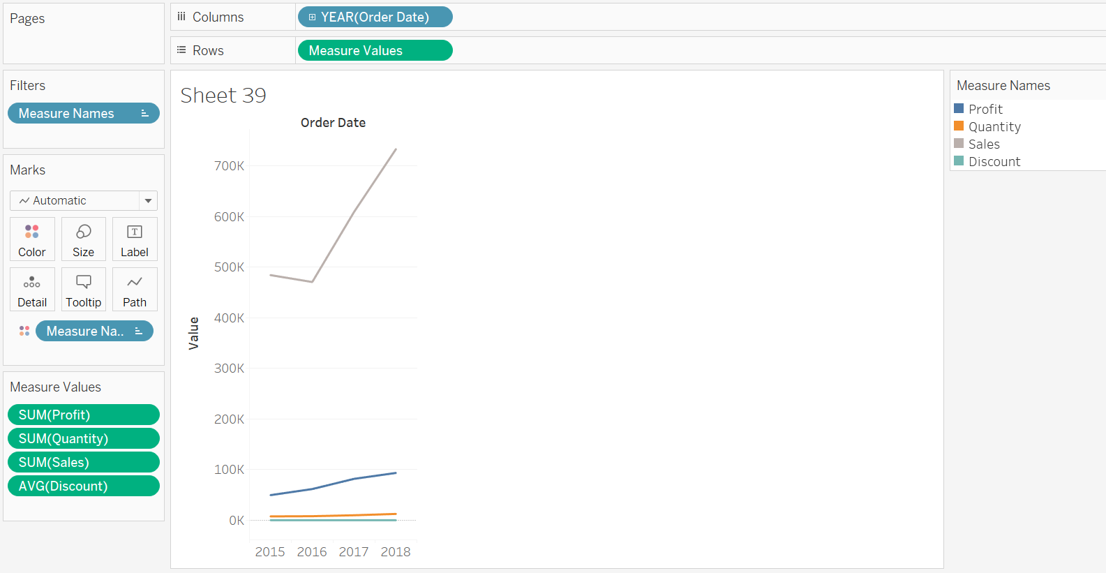
As you can see, on the bottom left hand corner, you can see that 4 fields have been dragged into the measure value cards, which draw the 4 lines onto the same axis.
With this simple tip, you can go crazy and layer up as many times as you want! Why settle for a dual axis, when you can get ‘infinity axis’?