Donut image source
Hi all! This week I decided to have a bit of fun with my visualisation for Makeover Monday and wanted to find a way to include images as a part of the charts themselves. Check my viz out here. Makeover Monday datasets can be found here if you want to try creating a visualisation yourself!
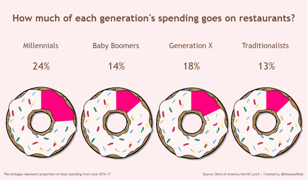
Week 13’s dataset was from the Bank of America Merrill Lynch, which looked at proportions of total spending on different categories for each generation. I decided to focus on one of the categories; restaurants. In this blog post I will be taking you through creating a normal donut chart, which will be the skeleton for the next part of this 2 part series where I’ll show you how to make them look like actual donuts!
Step 1:
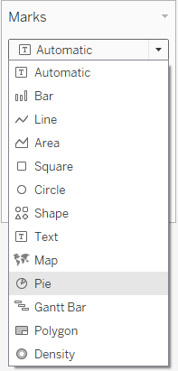
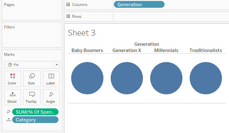
Once you’ve loaded the dataset on Tableau, open a new sheet and change the Marks type to Pie.
Step 2:
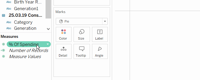
Drag the measure pill that includes the percentages for each pie slice onto the Angle marks card. This will give you a circle with no slices, and the value will be the sum of your measure. In my case the measure is ‘% Of Spending’ and I have already changed the default format of this measure to be in percentage form.
Step 3:
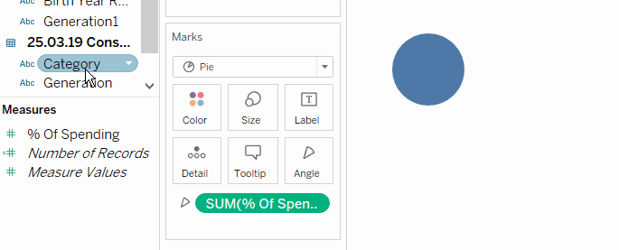
To get the slices for our pie, we need to add a pill from the Dimensions pane. I’m splitting by ‘Category’ so I dragged this pill onto the Detail marks card.
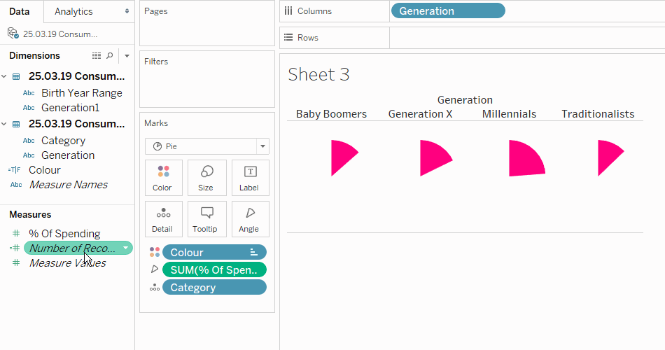
Step 4:
To get a pie chart for each generation, we need to drag the Generations pill from the dimensions pane onto Columns.
Step 5:
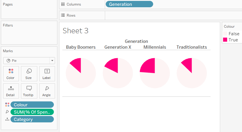
I wanted the slices for restaurants to be coloured one colour, and all other categories another. So I created a calculated field called ‘Colour’ with the calculation:
[Category]='Restaurants'
This returned a boolean (true or false) field on my dimensions pane. I dragged this onto the colour marks card. You can choose the colours by double clicking on the colour legend on the right-hand side.
Step 6:
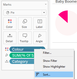
It’s best practice to have the slice you’re interested in to start at the most north point of the circle. To do this, right click on the Colour pill on the Marks Shelf and click Sort…
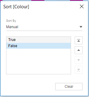
In the next window, you want to Sort By Manual and make sure True is above False. (True = restaurants, False = other categories)
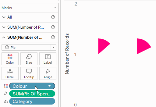
Step 7:
To create the donut hole, we need to get the Number of Records pill back. Drag it from your measures pane onto your Rows. Drag it again onto Rows so you have two Number of Records pills on Rows. Right click on one and select Dual Axis. This has made two identical pie charts on top of each other.
Step 8:
On the Marks shelf for the second pie chart, remove the Colour pill and use the Colour marks card to change the second pie chart to your background colour (I’m using white for now). Use the Size marks card and reduce the size to your liking.
Step 9:
You’ve already created the donut charts at this point! All I did now was add some formatting.

Thanks for reading! Part 2 will be up soon.