This week we’re focusing on Visual Analytics and how best to aesthetically convey information. We had a class with Infographics Designer Caroline Beavon (go find her on Twitter and Instagram @carolinebeavon) who gave us a really interesting presentation which showed common mistakes designers make when working with datasets (overcomplicating it, adding too much information and just showing off at times). We were then shown more infographics which we critiqued (when I say “we” I really mean DSX’s professional Viz critic Gheorghie).
Then it was time to have a go ourselves! The poster was about a homelessness charity, we worked in pairs and then presented our idea to the class. Here is Andre and I’s artistic masterpiece:
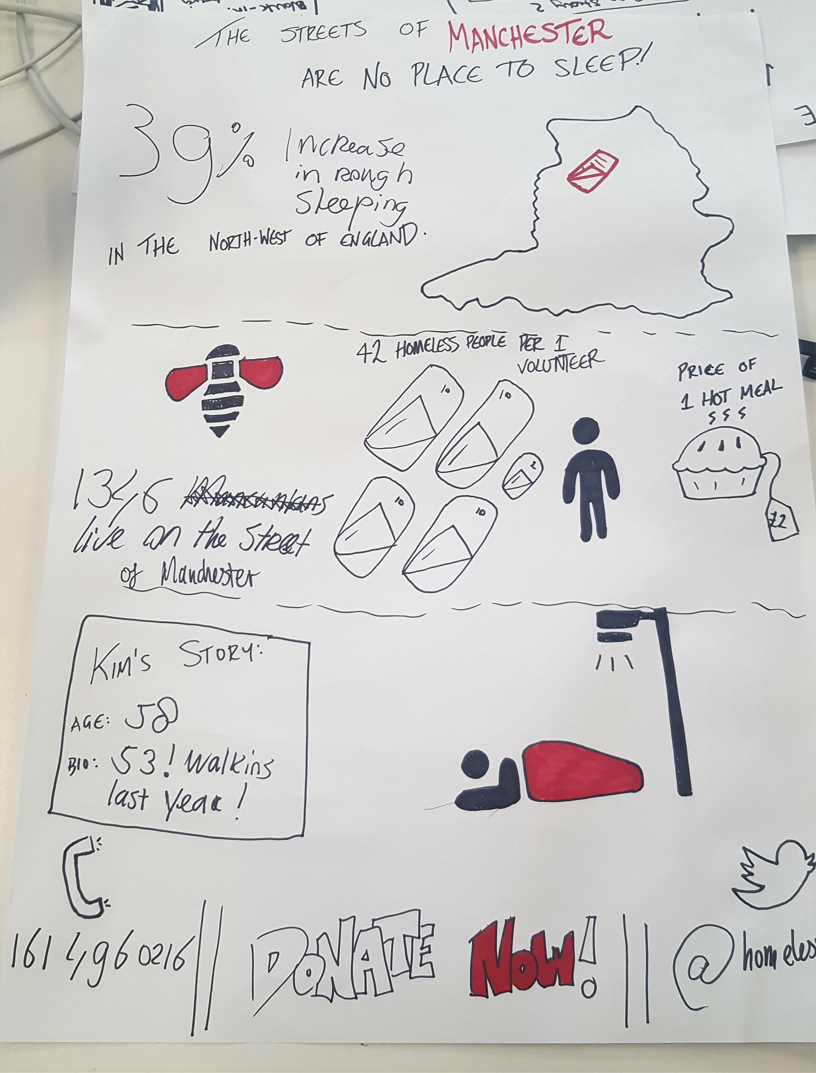 (At the bottom it’s meant to be a lamppost- not a showerhead)
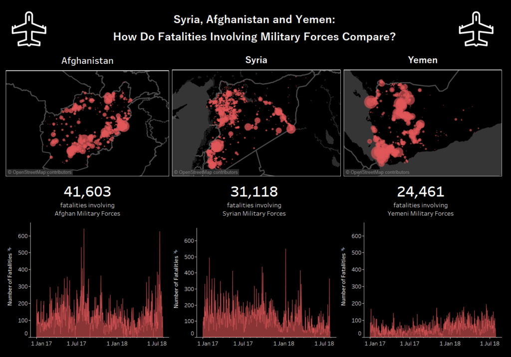
Then it was Makeover Monday time! The dataset was pretty vast and detailed various conflicts around the world, I decided to specifically focus on instances with the most fatalities where the country’s own military were involved- which were in Afghanistan, Syria and Yemen. I wanted it to be striking and simple and used just black, white and red to make it *pop*.
As someone who really enjoys art and design, I’ve found this section of the teaching really enjoyable. The top tips I’ve gathered so far are:
- Sketch your idea before you try it
- If you can, keep it simple!!!
- https://coolors.co/ is a fab website for colour themes if you’re struggling for inspiration
- https://thenounproject.com/ is another grade website for images to add to your design (imagine clipart but… good)
- Just TRY things, failure and critique ultimately helps you improve so don’t be afraid to just give ideas a go!