Well, well, well, here we are at day 3! After presentations we set about working on the project which would hopefully be better than yesterd- oh wait we have to use Tableau version 8 this time!! Of course!
The task was as follows:
- Go on the Department for Transport Website.
- Choose a region.
- Download the data from the local authorities within that region, ideally using a macro in Alteryx.
- Prep and visualise in Tableau 8.
As it turns out, a macro was unnecessary, downloading all the local authorities and using a wildcard input did the trick!
I decided to do my project on Scotland (obviously). Once I had all my data I made the following workflow in Alteryx:
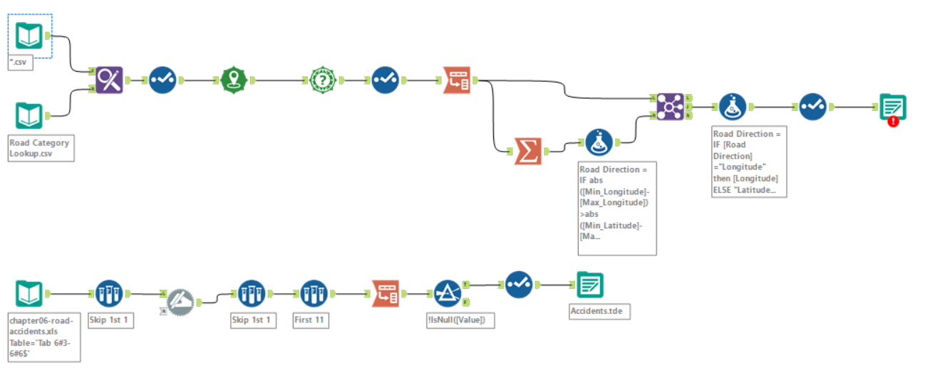
The main issues encountered when making this were:
- The locations of the roads within the local authorities were in the form of Easting and Northings, so needed to be converted into Longitude and Latitude in order to make recognisable points in Tableau. This was done with the “Create Points” tool and was relatively straight forward.
- Tableau 8 does not recognise centroids and will not input any dataset containing them, so the “centroid” field created by the special tools used needed to be removed.
- All the vehicle types were logged as individual fields, so I combined them all into a single field called “Vehicle Type” using the “Transpose” tool.
- All the road descriptions were written as codes, to overcome this I used “Find Replace” with another CSV containing a list of what each code meant. It’s the first time I’ve used this tool and it’s actually very handy!
- I attempted to create a vague visual representation of the roads by creating paths between the points created. Conrad came up with an ingenuous way of doing this and talked me through it. However, it didn’t work quite as well with my data… see below.
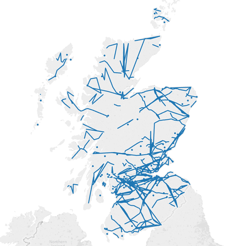 Yikes
Yikes
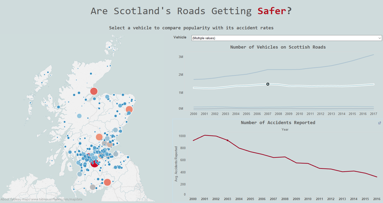
After examining the data and playing around with it a bit, I was struggling to find anything of interest. I decided to source another dataset, which is the second workflow in the picture. It describes the frequency of accidents in Scotland by the different vehicle types. I noticed there had been a significant increase in the number of light goods vehicles in Scotland since 2000 and wondered if there had also been an increase frequency of accidents.
Long story short, the answer is yes! And this is true in general, despite the number most vehicle types either increasing or remaining steady, numbers of accidents seem to be dropping.
This is my final dashboard: