


Client projects are a core part of the Data School Training program. They happen eight times during the 17-week course.
Cohort members showcase the power of Tableau and/or Alteryx within a week. One person is assigned as project manager to lead client communications and support the rest of the analysts. One part of the project manager’s role is designing a dashboard template.
In years past, there were eight weeks of training and eight unique project managers.
Ironically, DSNY8, my cohort, did not have eight members. As we later saw as an advantage, we had four.
Instead of leading client projects as green trainees, the first half of our client projects were guided by consultants who already completed DS Training.
They had different management styles and approaches to dashboard design. When it was my turn to be PM, I was excited to put their lessons to work.
The Dashboard Template I designed was one of the most successful aspects of my PM week. I followed these steps to make it:
- Research the Client
- Create a Color Palette
- Share a Detailed Tableau Template
- Be Present during development
I have shared a version of this template on Tableau Public that I think is a good starter file!
Client Research
My cohort found it helpful to research their industry to learn more about how our analysis fits into their business.
A part of this is asking the client plenty of questions. Their expectations could, and should, shape the flow of your dashboard.
To compliment client research, read reflective logs on Convo, search the Notion wiki, or ask someone in the office about anything from the client’s industry to layouts and color schemas.
The true advantage of being at the Information Lab is the easy access to information from experts.
Color Palettes
On the topic of colors, I should note that I did not come to TIL with any working design experience. I was nervous about leading everyone on design. The standard of client projects is that everyone’s dashboard should look like one person made it.
Prior to my PM week, the coaches had shared a bit about choosing a white background, black text, primary/secondary colors, and color-blind sensitive positive and negative hues. The other consultants kept consistency by defining guidelines for borders and padding.

With this knowledge, I built a simple color palette in tableau. Across three rows of horizontal containers, I used text boxes to share hex codes and color assignments. One box was reserved for information about borders and padding. For those who like to use the Pick Any Color eye droplet, I made sure to color the text boxes, accordingly.
You could easily add more colored text boxes to customize your own palette!
Dashboard Templates
The point of the template is to allow analysts to think about the data rather than the design.
Before you begin, choose a sample dataset that everyone has access too. Superstore is what I use and then format the workbook.
Ideally, the team would share their sketches so you know exactly which charts to make. If they haven’t you can build the basics: a bar chart, pie chart, line chart, map, and, maybe, a heatmap.
You can continue to do styling while you build the chart examples:
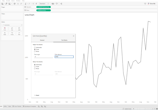
Format dates and axis tick marks.
Format numbers using default properties.
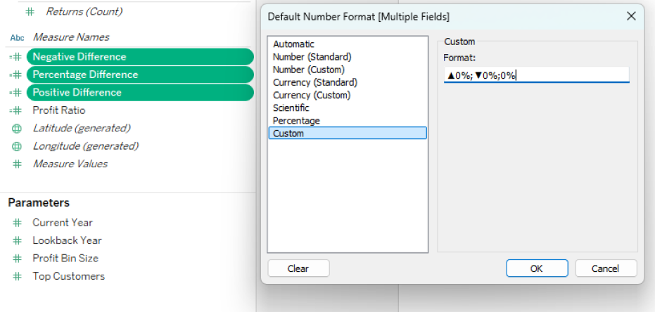
Make sure to define a consistent level of accuracy (decimal places). For example, Display Units as Thousands (K) for BANs and whole numbers for tooltips. You can also add prefixes and suffixes, which are useful for up/down arrows without calculations.
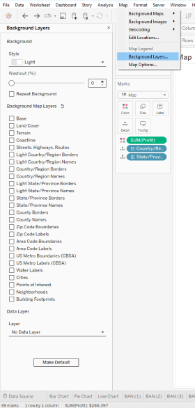
Adjust Background Layers and Map Options. I often do this to remove chart junk.
You can bring all these charts together in a couple dashboards. Lay them out based on your team sketches using Tableau Containers.
One thing I forgot to do during my PM week was add buttons to the dashboard. There are a couple ways you can do this:
- Create a button sheet for each dashboard and use a URL Action.
- Use a Navigation Object for each dashboard.
We stored our data and dashboards on Tableau Server. Since we were all connected to the same data sources, it made linking and combining workbooks easier.
You can improve this process by getting on the same page about calculations and naming conventions.
The template was delivered at least half way through the project.
If you’ve made a useful template, then your team should have no problem swapping sheets with their own visualizations.

Last, but not least, be present.
Even before giving the team the template, you should be by their side. I don’t mean standing over shoulders and watching screens. But, be involved in the process.
- Why will different users navigate from one dashboard to the next?
- Compare and connect different parts of the analysis.
Asking these sort of questions may help with storytelling and your future design.
While the team customizes the template, be there for any questions or design decisions. You may even be able to help out with any broken calcs or unexpected interactions.
If you have any questions or comments feel free to reach out on LinkedIn or Convo (if you’re a TIL-er).
Stay tuned for future posts about data and productivity!