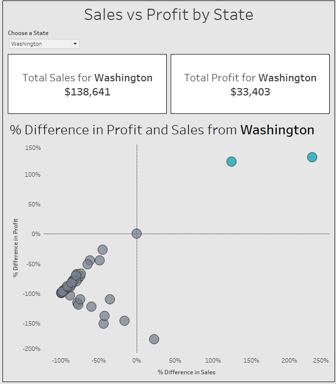
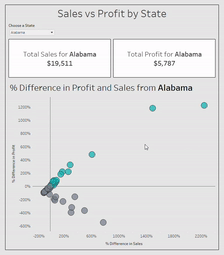
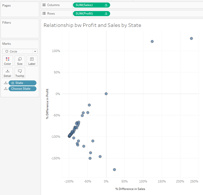
Today DS14 was experimenting with the latest, beta version of Tableau Desktop (2019.2). In this short blog post, I will describe how to use some of the new features of this beta version to build a scatterplot that shows the relationship between profit and sales percent difference relative to a state chosen by the user. I will be using parameter actions in order to do this, which allow you to change a parameter’s value visually – for example, by clicking on a mark in the view.
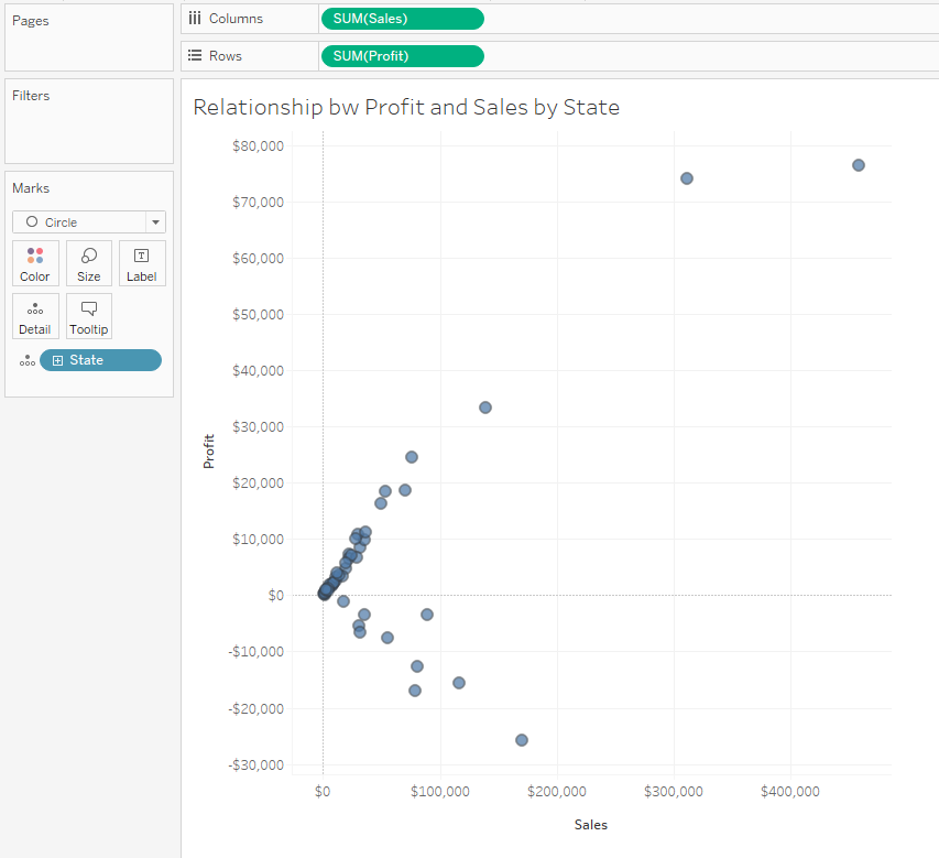
Step 1 – Create your scatterplot
As I am using the Sample Superstore data set, I have decided to look at Profit and Sales so I put these values on the shelves. Put the State dimension on the Details mark to show a mark for each state and change the mark type to Circles (it just looks nicer if you’re using filled circles).
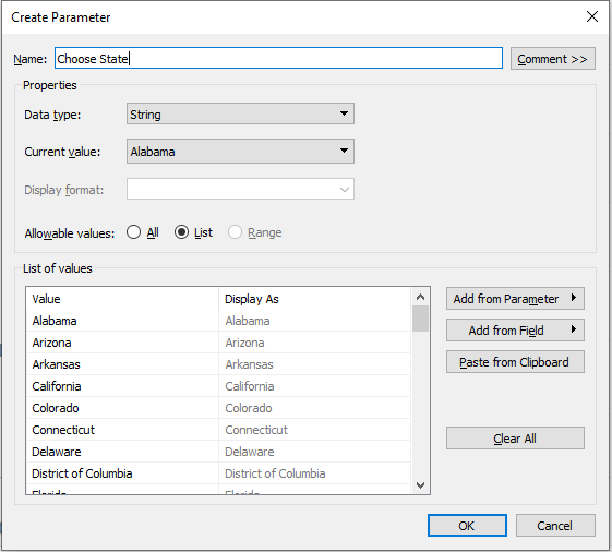
Step 2 – Create a parameter based on your State dimension
Right-click the State dimension, choose Create-> Parameter to create your State parameter. Put it on the Details mark and show the parameter control.
Step 3 – Table Calculations
For both measures, add a ‘Percent Difference From’ table calculation, calculate it using the State dimension and change the Relative setting to your State parameter. This will calculate the percent of difference between each state and the state you specify using your parameter.
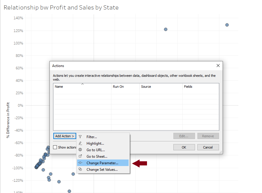
Step 4 – Add Worksheet Action
Click on the Worksheet tab on the top left, choose Actions… and add a ‘Change Parameter’ action. Here, set your State parameter as the Target Parameter and the State dimension as the Field Value that will get updated. This will allow you to visually change your State parameter’s value – by simply clicking on a circle.
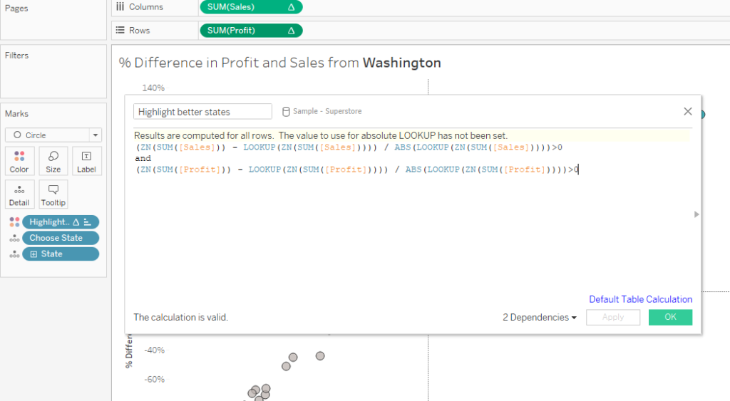
Bonus Step – Highlight states that perform better than your chosen state
Create a new calculated field that evaluates whether each of the states in the view perform better than your selected state. To create this, I simply dragged in my two measures from the shelves to keep the table calculations. Now drag this field onto the Colour mark, right-click and set it so it is computed using your State dimension relative to your State parameter.
And you are ready! If you want to use this sheet on a dashboard, you will have to set up the parameter action again in Dashboard -> Actions.