On the last day of Dashboard week, DS14 and DS15 had the same task – create a dashboard about the history of powerlifting (data can be found here) using a visualisation tool of your choice. I cannot express in words how happy I was to be able to use Tableau Desktop again!
Getting the data
Fortunately, the dataset was clean and ready for visualisation so I did not need to prep it at all.
Creating the dashboard
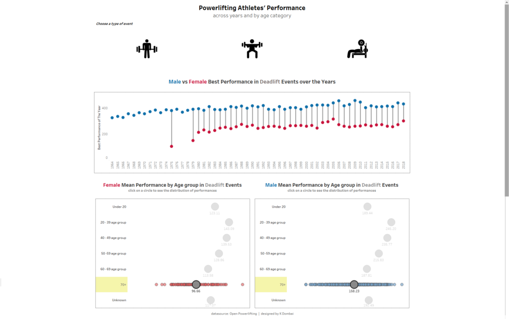
For today’s viz, I wanted to see how the best powerlifting athletes perform year on year – I looked at the heaviest lift for each year by gender and wanted to see if the actual weight of the heaviest lift increases year on year. I thought about this as a question – have we reached the limit of what the human body is capable of?
I also wanted to look at at what age performance peaks so I created a chart that shows the average lift by age category and gender. This was my final dashboard
It’s been an incredibly long week but it was a good one.