On the third day of dashboard week, we were tasked to collect data from the Survey of Income and Program Participation (SIPP) Database to work on.
We were given some topics to choose from, including economic well-being, family dynamics, education, assets, health insurance, childcare, and food security. I decided to focus on the topic childcare and then went on to figure out how to collect the data.
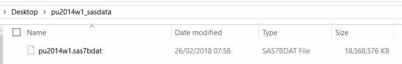
The data came in a format I had never seen before. Andy said that was SAS and that Alteryx and Tableau could read it.
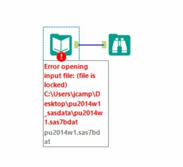
I didn’t manage to open it in Alteryx. It would keep saying that the file was locked doesn’t matter what I did. Other people in my cohort experienced the same thing and we could not figure out how to fix it. Then I tried to open it in Tableau. It took so long to load (about half an hour) and then crashed.
Because we had our presentations this morning, we were given less time to work today. And all of this trying to figure out how to access the data took me almost 2h. I then gave up on it and decided to work on a different data set, from the same Census data but from some tables that are made available through another link.
The tables didn’t have anything in childcare.
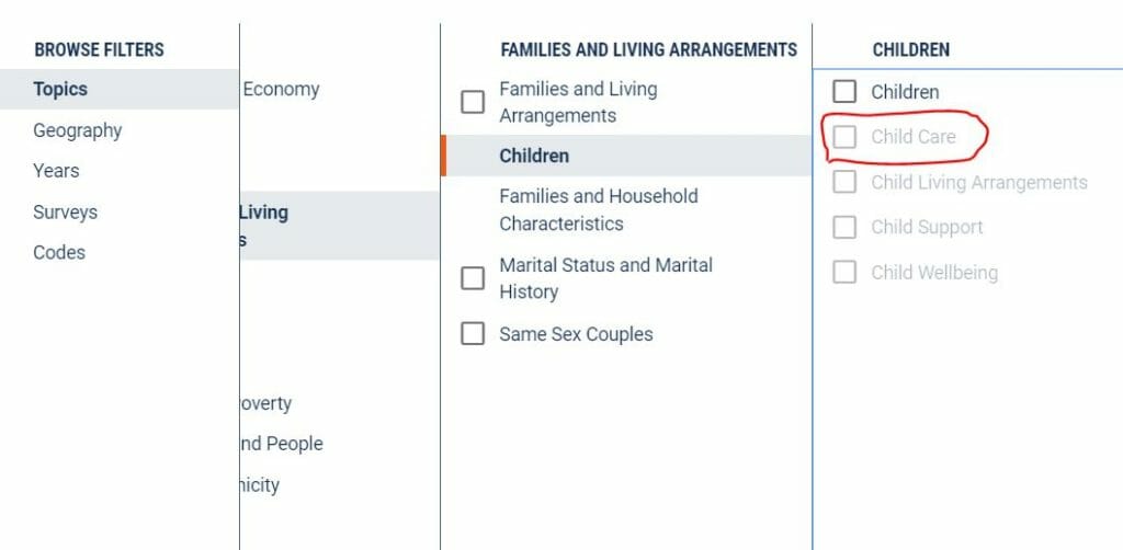
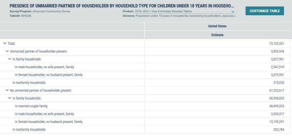
So I filtered it by Children instead, and among all the tables available, I chose ‘Presence of unmarried partner of the householder by household type for children under 18 years in households’.
The table online did not have much information, but I thought I could get some visualization out of it. It looked like this:
I downloaded all the nine years that were available (from 2010 to 2018). It came in a zipped folder with 2 csv files and a text file for each year. After studying what contained in each file, I learned that all I needed was one of the csv files for each year. I put them all in a folder so I could load it easily to Alteryx all at once. My workflow was pretty simple and straight forward.
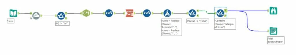
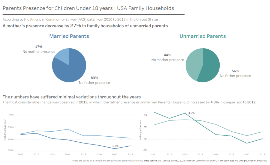
And here is the final outcome:
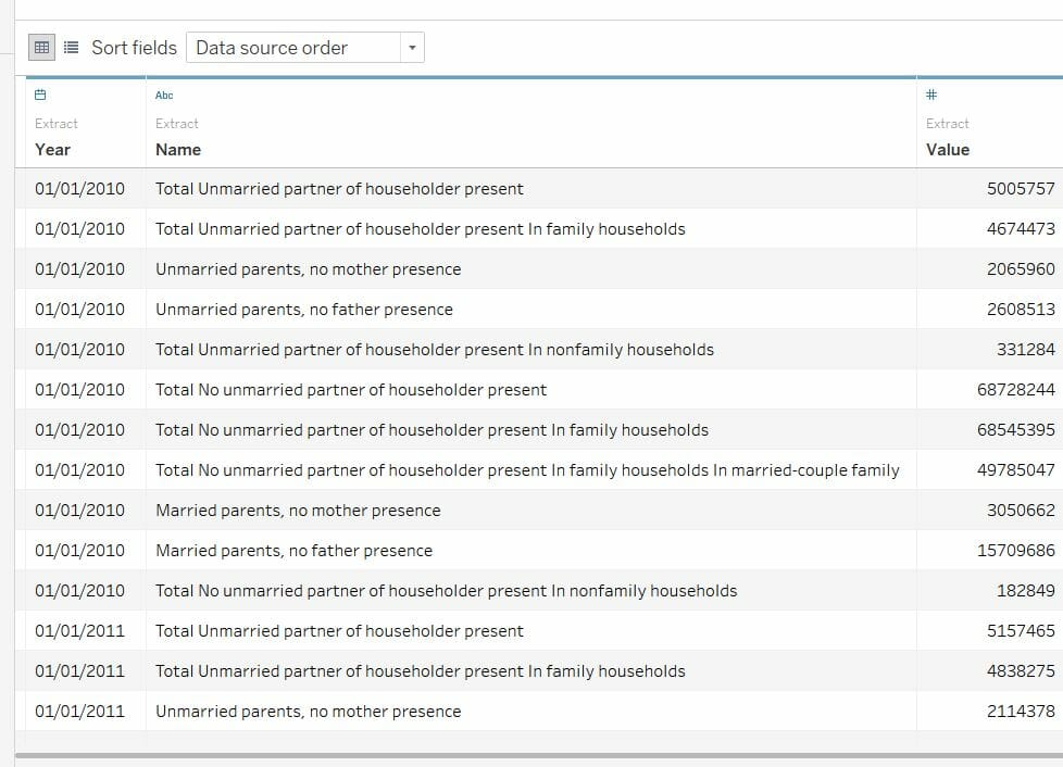
The outcome had some total values in it, and I didn’t take it off because I could easily filter it out in Tableau.
Because there was not much information in my data set, the options to visualise it was limited. All I wanted to show was the difference in children’s attention between married and unmarried parents. So I created 2 pie charts to show the difference between mother and father presence when they are married or unmarried, then 2 line charts showing how the numbers have changed very little throughout the years. It was not my best dashboard to date by it was a good outcome from the limited data source I had.