


As part of our duties during my P1 at PwC DA we were required to make gifs of helpful tips in Tableau, Alteryx and Power BI. I thought some of the ones for Alteryx and Tableau might be useful to others so decided to include some good ones in this blog. The gifs I have shared have been made by a variety of people who have completed the PwC DA placement.
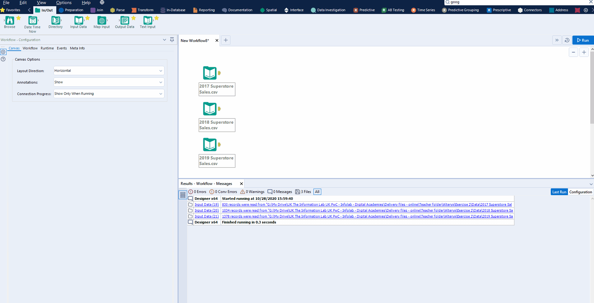
Alteryx
Align tools
Create workflow groups
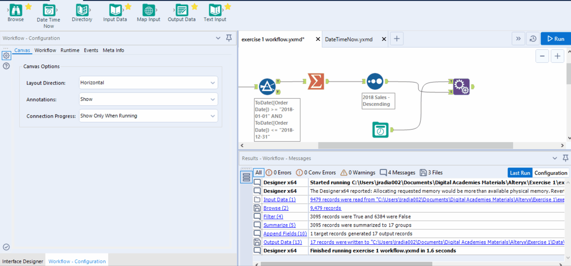
Adding the date and time to a filename
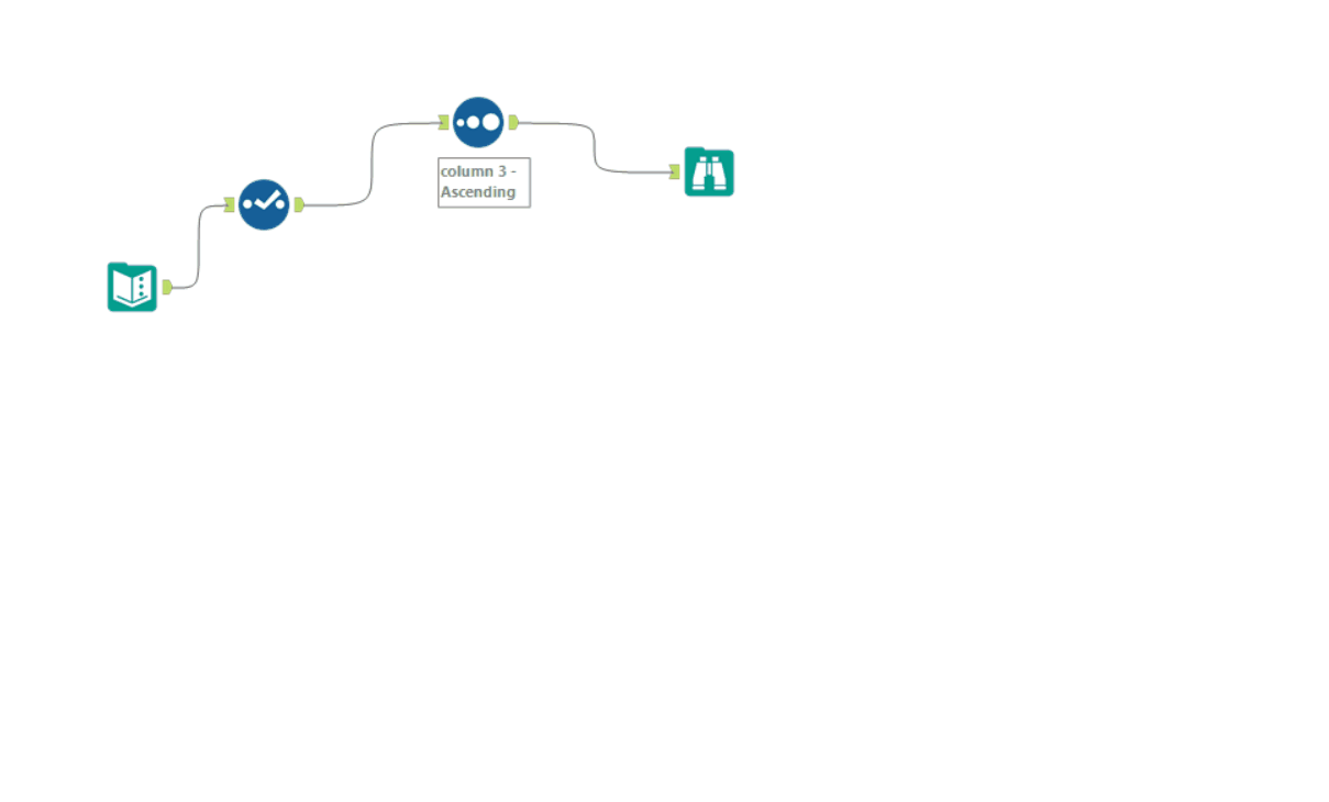
Output a column range
Show possible connections
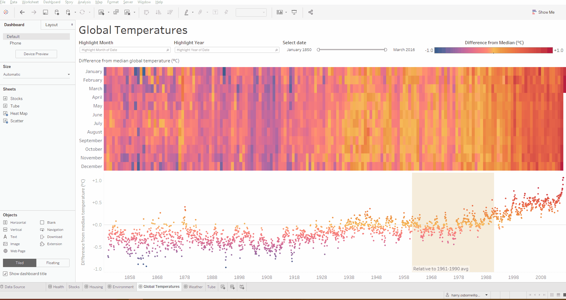
Tableau
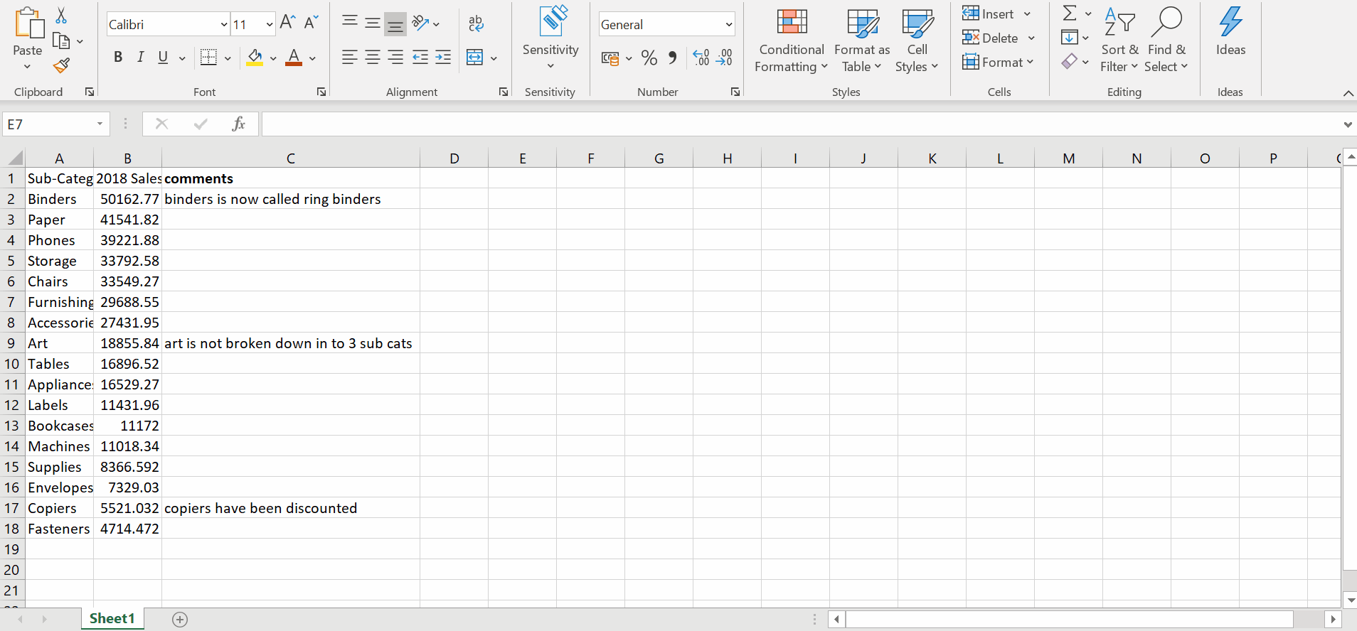
Add comments to a field
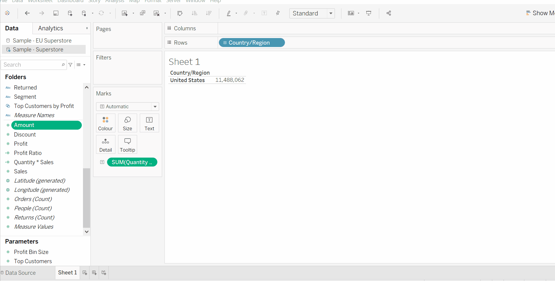
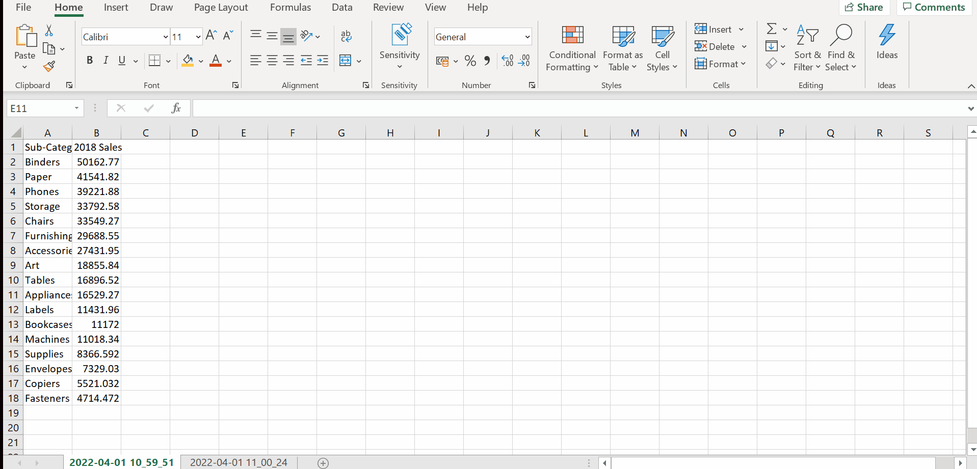
Copy and paste data
Copy and paste sheets across workbooks
Copy and paste formatting across sheets
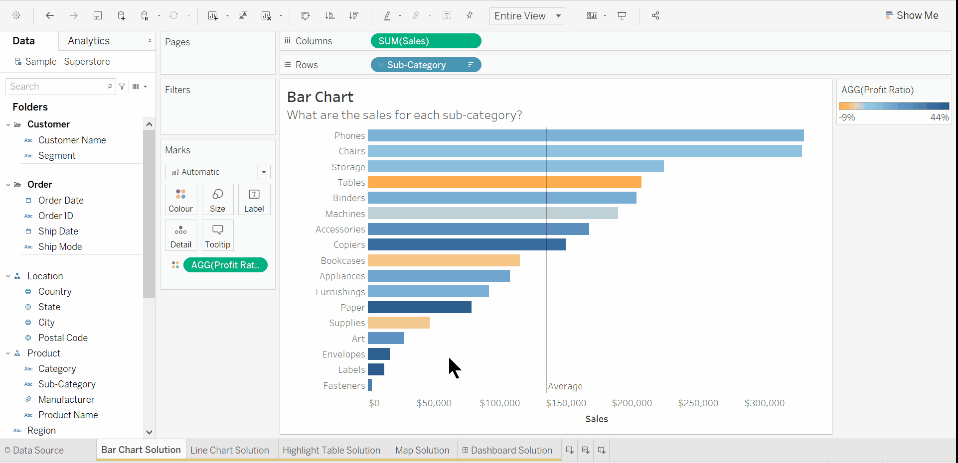
Creating hierarchies
Viz in tooltip filters
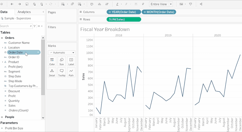
Choose start month of fiscal year
Organise fields in the data pane in to folders rather than tables
Swap sheets in dashboards

Remove highlight
Remove breaks in an area chart

Below are some extra tips I have come across but haven't been able to create a gif for.
Updating data source from an Alteryx workflow
Save your Tableau workbook > Close data source in Tableau (don't save!) > Run Alteryx Workflow > In Tableau click undo to bring back the data source > Data source Tab > Worksheet > Right click and refresh data source
If you need to replace references but the fields have been renamed in Tableau. Right click on field > describe to find out it's original name so you know what to replace it with.
Move X axis to the top
Analysis > Table layout > Advanced > Uncheck 'Show innermost level at bottom of view when there is a vertical axis'
Disable workbook legend highlighting
Little crayon in tool bar > 'Disable workbook highlighting'
Once disabled, when you select a colour in the legend, the corresponding values will no longer be highlighted.
Copy data in to excel
Right click on a cell in a table in Tableau > Copy > Cross Tab > Paste in to excel
Some clients often like to view the tabulated in excel to generate reports.
Column Selector
I've only been asked for this once but you can create a column selector if you are using measures in your table by putting measure names on filters and measure values on the rows. If you are using dimensions/string fields in your table you will have to pivot your data before bringing it in to Tableau in order to have the same filtering functionality.
Multi Row in Tableau
If you are looking to use a multi row formula in Tableau, you will need to create some sort of record ID in your data set and use LODs to fix your multi row calculation to each record ID.
Label the ends of bars
Create the bar chart > Drag the same metric on to the rows/columns > dual axis > synchronise axis > change the mark type of this field to Gantt > drag your labels on to the Gantt marks card
I hope this was useful.