The control chart is a graph used to study how a process changes over time and determines if a manufacturing or business process is under control.
I believe this is a beneficial tool for every company, so in this post, I will try to explain how to create one in Tableau. We will be using data from “AirBnB London”, which you can find here. The goal of this example will be to highlight months where the average price for each type of AirBnB listing (Entire house, private room and Shared room) behaves differently than usual.
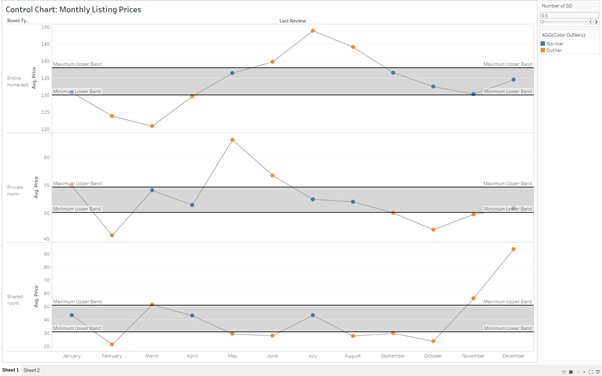
For it to work, we will need to create some reference bands or lines that will show distance from the mean. We will set the range for these reference bands, based on what we consider to be the control threshold.
The threshold distance will be defined in Standard deviation units.
So for example, the Control Chart will show that a specific month the average price was 3 standard deviation away from the mean, and we did set the limit in 2 standard deviations, highlighting the anomaly in that month.
How to create it
1 – First, we will create the timeline showing the average price per year, right dragging “Price” and selecting “Average”.
Also, do not forget to drag “Last Review” date field into columns. For this example, we will also exclude nulls.
We are also going to split the chart showing for each type of listing.
2- Let’s create the dots for each value using double axis.
First, you need to duplicate the average price field (CTRL-Click & drag), setting its mark to circle. After that, you need to change to a dual axis (right click in the field and select “Dual Axis”), synchronize axis (right click in the field and select “Synchronize axis). Move the new field to the left of the previous, so the points are shown in front of the line.
The last thing will be to set each left axis to independent and not to include 0. This will allow each type of AirBnB to have its personal axis limits.
3 – Create a parameter, “Number of SD” which will decide what’s our threshold distance in standard deviation units. Set the maximum value to 3, as 99% of your data falls within 3 SD units.
After creating the parameter, click on “Show parameter” so it will appear on the right of the chart.
4 – We will now make use of the parameter ( [Number of SD] ) we just created, using a calculation field to build our Upper threshold (Upper band) and our lower threshold (lower band).
The formula we will use is:
Upper Band: WINDOW_AVG( AVG( [PRICE] ) + [Number of SD] * WINDOW_STDEV( AVG( [Price] )
Lower Band: WINDOW_AVG( AVG( [PRICE] ) – [Number of SD] * WINDOW_STDEV( AVG( [Price] )
Be aware that we have changed the “+” and “-” sign, which will allow us to draw a line over and under the mean.
5 – The next step will be adding the reference band that will limit our threshold.
In order to be able to use our just created upper and lower band, we need to add them into “Details”.
Once we have done this, we will go to “Reference Band” within the Analytics tab in the right top corner.
When adding the reference band, be sure that you are adding the “Upper band” as the Maximum and the “Lower Band” as the minimum.
6 – We will end our Control Chart, colouring the dots that are out of our thresholds, which will point out the outliers that we need to focus on for further analysis.
We need to create a new calculated field that will use an “IF” Statement.
If AVG([Price]) > [Upper Band] THEN “Outlier”
ELSEIF AVG([Price]) < [Lower Band] THEN “Outlier”
ELSE “Normal”
END
7- To finish our Control chart, we can highlight some border for your reference bands. Also, be aware that you right now we are looking at year level, but we can change to Month level changing our field in Columns.
And now you have build a Dynamic Control Chart.
Hope this is helpful and thanks for reading. Comments are welcome!
Jose Valero.