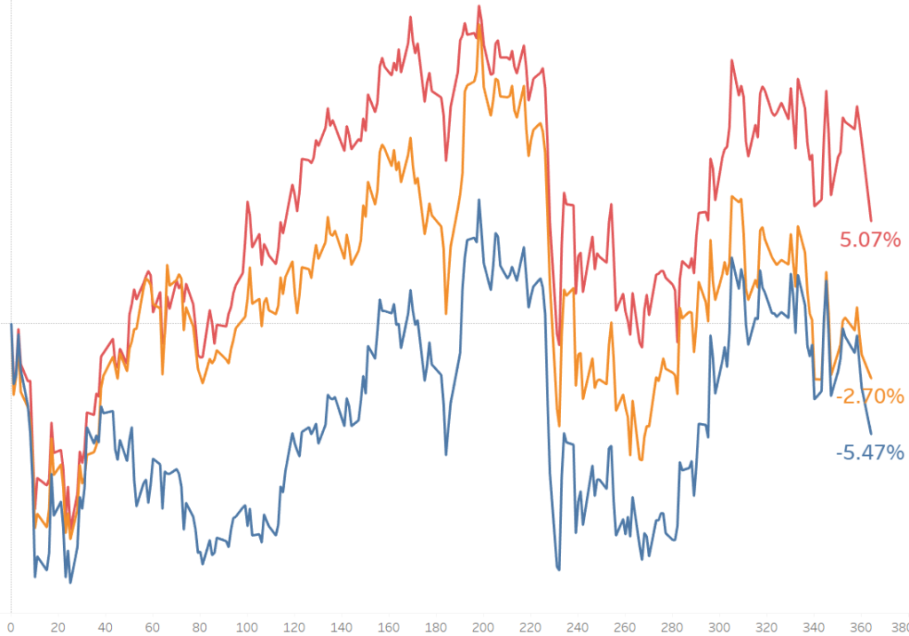
Some call them Rocket charts, although they’re not known by any name. It is a way to shows the progression of a variable from a base date time. It is commonly used in Finance, helping them to compare the progress of stocks since they got listed.
It can also be used by companies which want to compare the total running sales for different products after a certain number of days since first sold.
For this tutorial, we are going to use stock data from the New York Stock Exchange (NYSE), that you can download clicking here.
We are going to compare the closing price on the first day of 2015 and after one year (364 days) for the following Banks listed in NYSE: JP Morgan, Citigroup and Bank of America. This way we will able to see which company has increased its value more during 2015.
See below the final chart for our example.

In order to create this chart, we will need to make use of Level of Details (LOD) calculations and Table Calculations. First, we will calculate the first day (Day 0) for 2015 and then we will return the percentage difference relative to Day 0.
Let’s Start!
1. Filtering the data
Our first step will be to prepare the data for our chart. We will filter the date range we will use, from 4th January 2015 until the 4th January 2016.
Also, we will filter only the three symbols (companies) we are interested in: JPM, C and BAC.
2. Looking for the First day or Day 0.
The chart will tell us, by 4th January 2016, the percentage variance in the close price for each companies stock value, relative to the first day in 2015. Therefore our first day and day of reference should be 4th January 2015.
To calculate the first day, we will create a Level of Detail Calculation that will take the minimum date for each symbol.
{Fixed [symbol] : min([Date]) }
Because Fixed LOD calculations do occur before our Date filters are applied (you can check Tableau’s Order of Operations here), the LOD returns 2010 as the minimum date. To solve this, we will need to add the filters to context, so they are activated before the LOD runs.
3. Create the axis with days from 0 to 364
Now that we have the first day, we can calculate the position of each day in the axis. For example, the first day, 4th January 2015, will be day 0, 5th January will be day 1, 6th January will be day 2 and so on.
To calculate this, we will count the days from day 0 until each row’s date, using the DATEDIFF function.
DATEDIFF(‘day’,[First Day],[Date])
We will need to move this calculation to Dimensions as we want it to break the graph in sections (days), and convert it to continuous, so it does not skip any days in the date range.
4. Create the Close price percentage difference
Once we have the axis created from 0 to 364th day, we can create the percentage difference relative to the first day.
To do that, we will drag “Close” (close price) to rows and right-click on it. Select “Add Table Calculation” and select “Percentage difference” from the dropdown menu. Also, and very important select “Relative to” FIRST. This will compare every day’s closing price to the price on Day 0.
5. Format the chart.
To finish the chart, we should split into “Symbols” (Companies), dragging Symbols into Colour so that we can compare between them.
Also, you can add labels, only to the end of the line.
We can see now how JP Morgan has been the company with the highest performance during 2015, out of the three of them, being the only one with a positive increase in its value.
Until here the post. Hope you liked it and comments are welcome.
Jose Valero
