Recently the members of the seventh cohort of The Data School undertook a project for PATH. This global health non-profit organisation works in a number of different countries and areas and came to us with some business questions.
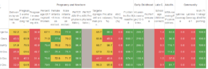
The part which I took on was remaking a red-yellow-green heat map/highlight table. Jonathan Drummey, our contact at PATH wasn’t too keen on how this data was being presented and wanted our take on how this could be different, particularly looking at ways to bring in change over time. This was the original:
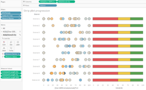
For this I went through a couple of iterations and with feedback I was able to come up with something… a bit different. Each dot in the strip plot represents the results for a different measure so we can get a sense of overall performance across each district:
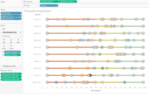
This view enables the comparison to target with the red-yellow-green background line whilst illustrating the change over time with the colour on the dots. So instead of colouring the cells, backgrounds, or dots with the red/yellow green I produced Gantt bars showing this. As there are many measures on the chart I have also included a highlight action for each measure allowing comparison between districts.
So how did I build it?
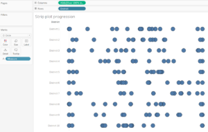
Firstly I needed to create a strip plot with all the measures on the chart.
Next was to colour the dots by the difference over time. This was done by using a quick table calculation and then ensuring the calculation was on the previous month.
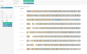
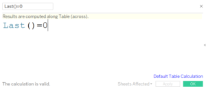
You will notice that the number of marks have multiplied greatly as we have now plotted every date. For this chart, we only want to plot the most up to date position and we do this by putting the following calculation on the filters and computing on the period:

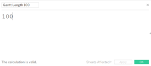
Next was to build in the assessment criteria. For this I wanted to have bars underneath the circles which were coloured but not too obvious that they would draw the eye away from the different measures. I used Gantt bars, three of them in fact. One with the value of 100, one with 75 and the other 50 (these were the values of my boundaries). For these I had 3 fields of these values:
I created a dual axis with an inline calculation: Sum(0.0) then added measure values onto size. The order of the pills on the measure values shelf is important as we want the 50 at the front, the 75 behind that and then the 100. Then colour by the measure names.
Finally, make the chart a dual axis and sync your axis. To make the Gantt bars not stand out too much, make them smaller and fade the colour a little.