This week at the Data School is dashboard week. For those of you not in the know (such as myself at 8.59am this morning), this is when Head Coach Andy Kriebel distributes some data which can be described only as a ‘wee bit of a mess’; you have to clean it; Viz it and then write a short piece about the day.
So we were given data from the American Housing Survey of the US Census Bureau which was a wee bit of a mess. This file didnt have any metadata that was east to find, we had no idea what the column headers meant or what the codes within the columns meant! Fortunately we were able to find two files with these pieces of information contained within.
My first step was to label up the column headers so that they were something meaningful and I would have some idea of what was in the data. To do this I used the field info tool in Alteryx to give me a list of my column headers and joined this to the first metadata file. I was then able to use a dynamic rename to assign these labels back to the columns of the original file.
Once I joined the second metadata file (with the labels for the codes within each column) I was able to then put the first iteration of the data into Tableau.
With the data in Tableau I was able to have look at each field and their specific responses and I was able to form part of a story in my head. I could see in the data that you could identify military vets. Furthermore I could see that their was a disability flag too. Having seen many reports about the US military and the treatment of their vets after military service I thought it would be interesting to explore this further.
Once I had decided which fields I would like to use I was able to slim down my Alteryx workflow and produce the following in Tableau.
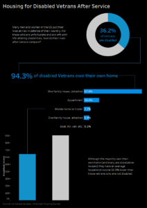
Although this does not use the most complicated of charts it certainly shows a bittersweet story for those vets who are disabled. There is more than likely a better way to show this story but there was certainly an element of fatigue (or as I may call it from now on ‘Viz-tigue’) which is something I will be working to improve on. However I do like the lines which guide you through the viz from one point to another.
Tomorrow I am shadowing a member of the team who is currently out in placement which I am very much looking forward to. Back to the Data School on Wednesday for another day of dashboard week!