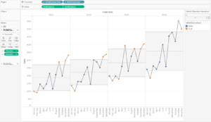
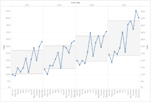
This week I built my first Control Chart. It is a great way to show outliers in your time series data which can prompt further investigation. You can view my workbook here. A video detailing how to build this chart can be found at the bottom of the page.
When building this Control Chart there were a few things we had to pay attention to:
- We needed a dual axis chart to allow the dots on the line to be coloured differently.
- We want to include a grey zone which fits around the average for each year (the standard deviation).
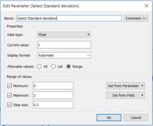
- We also want this zone to be dynamic so we have to build a parameter and then have this act on the upper and lower limits of the grey zone.
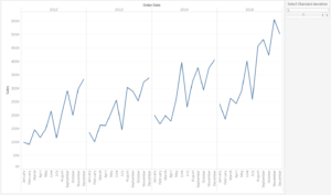
First thing we want to do is set our worksheet up as a basic line chart, a discrete year pill and month pill on the columns shelf and sum of sales on the rows.
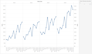
Next, we want to duplicate the sum of sales on the rows shelf and turn this into a circle on the marks card and make the chart a dual axis we will colour these later.
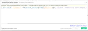
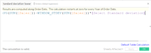
Normally for the standard deviation we would drag a distribution band onto the view but as we want this to be dynamic this would not work. Instead we need to construct these limits via calculated fields, one for the upper limit and one for the lower limit:
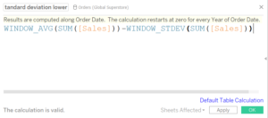
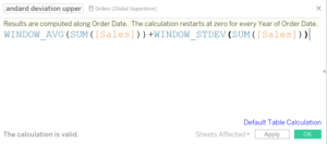
On both of these we need to define how these are calculated, we do this by clicking on the default table calculation button and set both fields as follows:
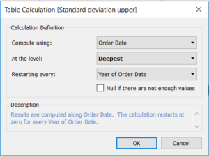
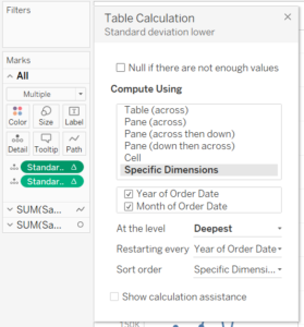
To put both of these on the view we drag them onto the details tab of the ‘All’ marks tab. Right click and go into the Edit Table Calculation… and ensure they are set up as shown below.
This then allows us to use them on two reference lines which you drag onto the view from the analytics menu.
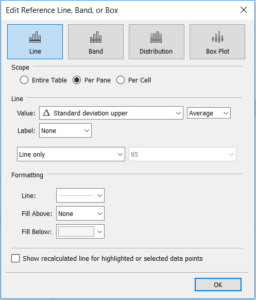
The only difference between this one and the Standard deviation lower is the fill below is white. And our chart should now look like this:
Now we have our band in place we want to make this dynamic. To do this we create a parameter set up in the following way:
To apply this we open up our lower and upper limit calculated fields and multiply the WINDOW_STDEV part of the calculation by the parameter.
When we adjust the parameter this should now increase or decrease the size of our band. The final thing we need to do is to colour our dots.
For this we want to say that the sum of sales is less than the lower limit or greater than the upper limit:

This will leave us with a True/False value which we put on the colours tab of the circle marks card. Now when we adjust the parameter we should see the relevant circles changing colour.
The only other thing I have done out of personal opinion was add in an average line for reference on each pane.
Video: