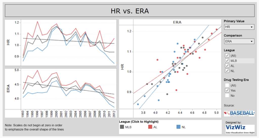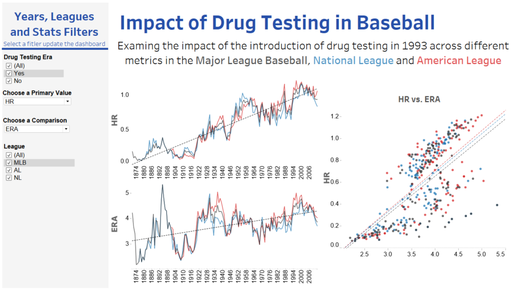
Today we were tasked with evaluating one of Andy’s first tableau public posts, so here goes. I was given this dashboard about the impact of drug testing on baseball. There are a few elements that I like and think work well, there are also lots that I don’t.
My main issue is the title, it provides no information about the data below, and also does relate to the name it was published under “Impact of Drug Testing in Baseball”. For those not interested/familiar with baseball (like myself) the title means nothing and so does not draw the reader in. However I do like the fact that the title updates with the selection of the data, but feel that this should be used as a section title rather than the overall title.
The second issue is the lack of text. There is nothing to explain the topic being analysed, this would improve the overall flow of the viz as could help to direct the reader through the information. However the small note bottom left provides useful guidance for understanding the data. Something similar to explain the filters would have been very beneficial and would have helped guide the user through the viz to maximise their understanding gained.
Due to the amount of chart combinations available it is difficult to decipher the key take away from the viz, from the title of the dashboard; Impact of Drug Testing in Baseball, my initial thought was that the run rate would reduce over time as drug testing increased, however it seems to have increased over time but this could be due to wide range of factors,such as improvement in equipment, rather than influenced by drug testing.
I have mixed feelings towards the filters, as they allow for a lot of comparisons to be made, but I had no idea what most of the terms meant and what should be compared to what. I also missed the Drug filter within my first pass over the viz, considering the title is about drugs that filter needs to be glaringly obvious to the reader. I think shifting the filters to the top left of the page to ensure the reader spots them would be very beneficial.
One thing I do like is the highlighting between the three graphs, making it easier to just look at the league you are interested in. The legend is also well placed but i think it could have been a good opportunity to use a legend within the opening sentence.
Generally I think the labels could be improved, it took several minutes for me to realise that the axis for the bottom chart applied to the one above, though that could be blamed on the early morning. With the right graph, the x-axis label for the would benefit from being on the axis as it currently looks like a chart title.
As I said before i think the viz would benefit from more text, this could be done through annotations and tooltips. Annotations may be difficult due to the range of graphs available. The tooltips could definitely be improved upon from their default format.
As well as slating Andy’s work we had to come up with an improved version, which i’m sure he will slate in return.
I have generally tidied up the dashboard, and feel the flow has been improved, by making the filters more prominent. As simple as it is I think the addition of the text at the top is the biggest improvement, as it provides context to the rest of the dashboard. I wanted to add a reference box around the data post the introduction of drug testing but just ran out of time.

