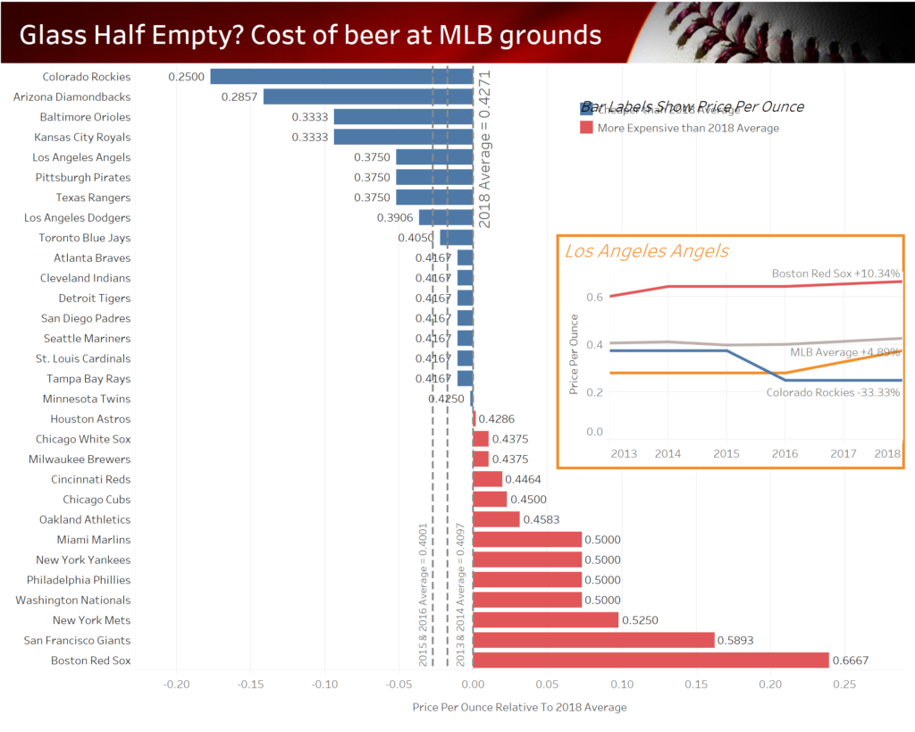
Last week I wrote about my ideas on redesigning my second ever viz on the cost of beer at MLB games. The original looked like this…
This was my redesigned viz…
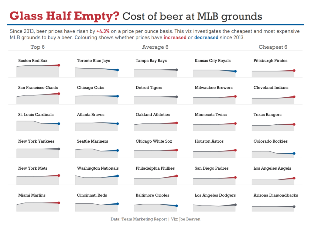
This ‘small multiples’ style of viz allows the user to quickly lookup the overall trend though time for each team. The trends are reinforced by the line colour which shows the direction of price change since 2013.
The area chart wasn’t something that I had planned to use but I decided to include this after seeing Brian Delahanty’s viz (https://tabsoft.co/35dQqiW). In my redesigned viz, the areas allow the user to get a sense of the most and least expensive grounds through contrasting the areas under the lines. This is reinforced by the top left to bottom right sorting.
Similar to last week, this viz pairs back the information on the dashboard to only the essential elements, without showing detailed labels etc. The price per ounce metric is not detailed as it is less useful as a number in itself and is better used to allow comparison between teams.
My third #justrevizit:
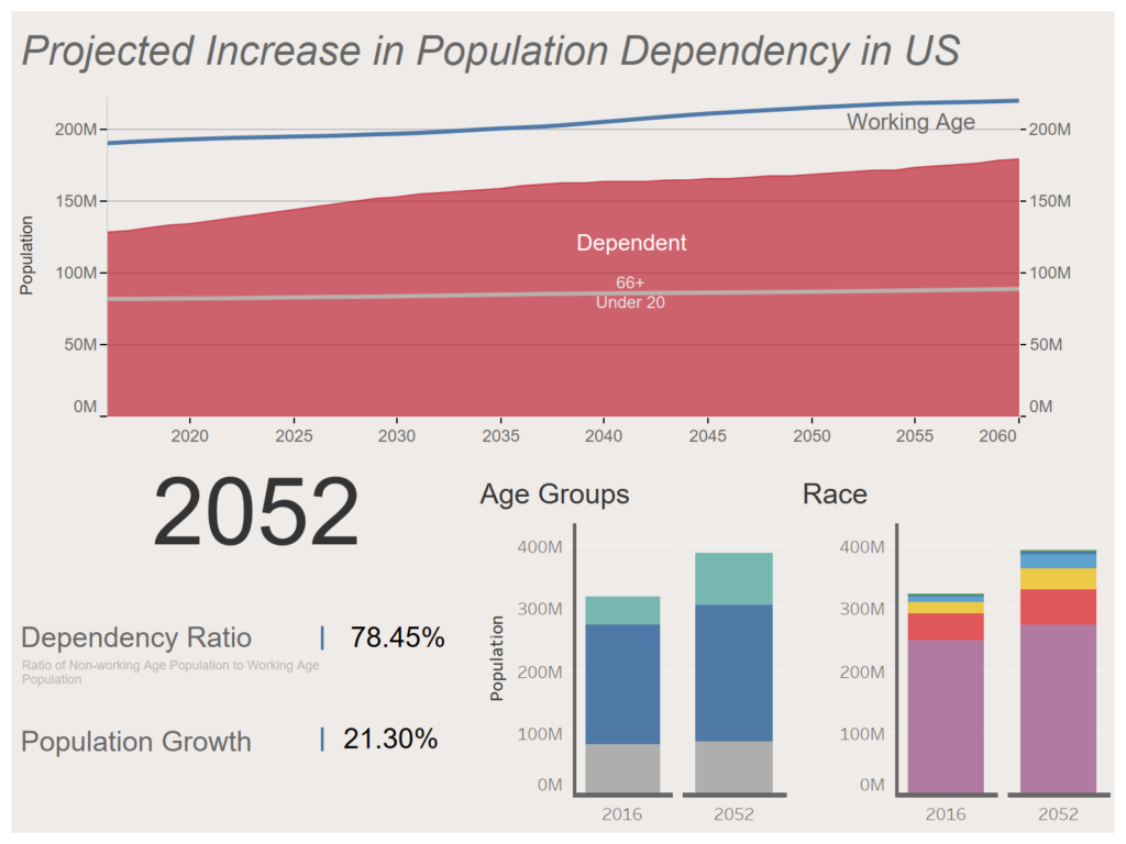
My next viz to redesign used US population data:
My initial thoughts:
- Despite the title, the main chart does not address population dependency directly. This can only be inferred by contrasting the red area and blue line.
- The red area (dependent populations) is divided in two to represent over 66+ and Under 20’s. This could be done more effectively by using two different colours.
- Clicking on the top chart loads a ‘profile’ for that year on the lower charts – this is not made obvious to the user
- The Population Growth number is unclear – is it since previous year or first year on record?
- It is not clear what is being represented on the stacked bars (this information is contained within a tooltip)
- The Age Groups bar chart shows the same information as the main chart and uses a different colour scheme
So, here’s my idea for how to reviz this dashboard:
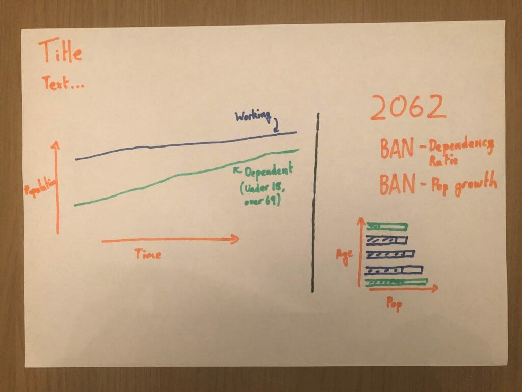
For this reviz, I want to bring the message to the fore – America’s dependency ratio (non-working population/working population) is increasing. Similar to my initial effort, the right hand side will be an info panel of any year selected on the main chart (left). By stacking the two sections side-by-side, the main chart will be less horizontally stretched, making it easier to see the closing gap between the dependent and independent population lines.
As always, let me know if you have any thoughts! Sadly my time in training has come to an end (although I’m still in denial about this) so this will be my last One-year-on blog. However, keep an eye out on Twitter (@Joe_Tableau), I’ll be re-designing more.
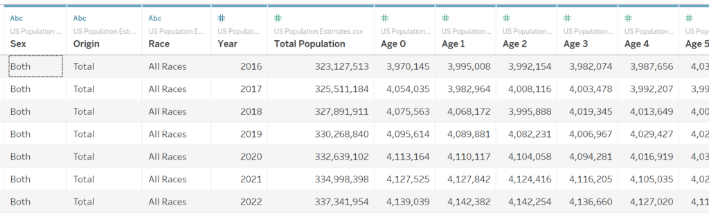
The original data looked like this:
Thanks and signing off!
Joe (@Joe_Tableau)